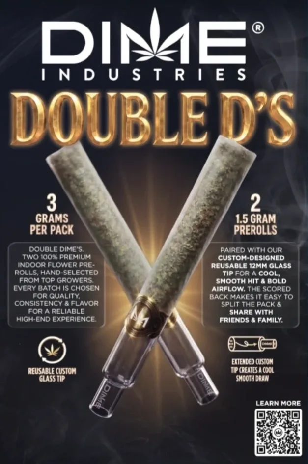
Structural packaging and launch design
A custom split pack for two glass-tip pre-rolls, from the first dieline through the launch.
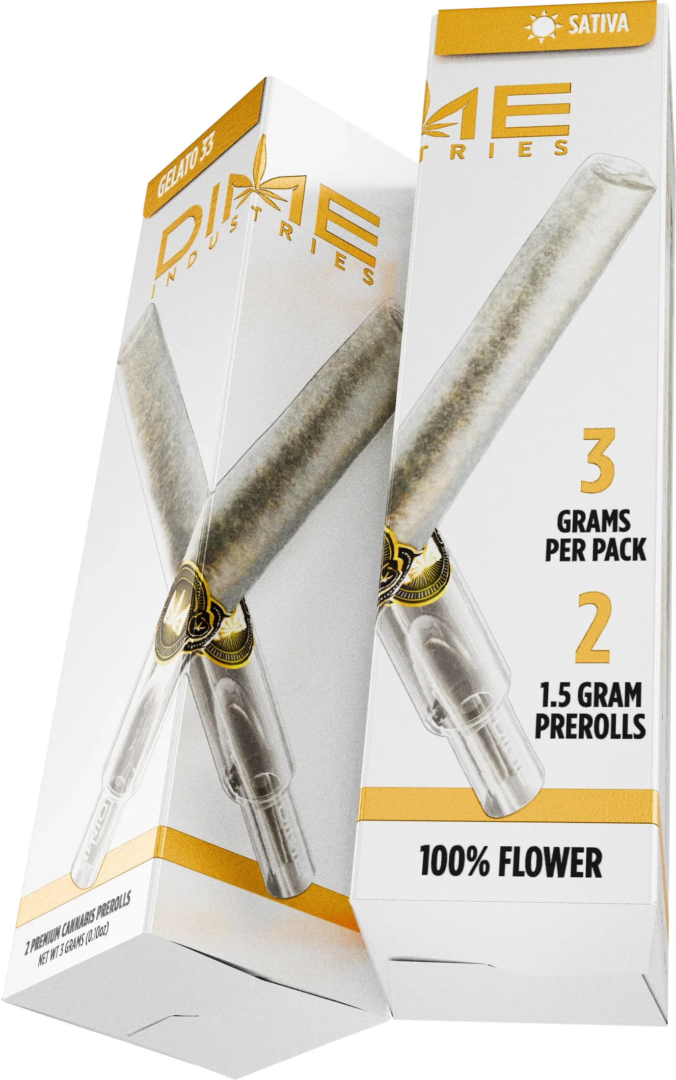
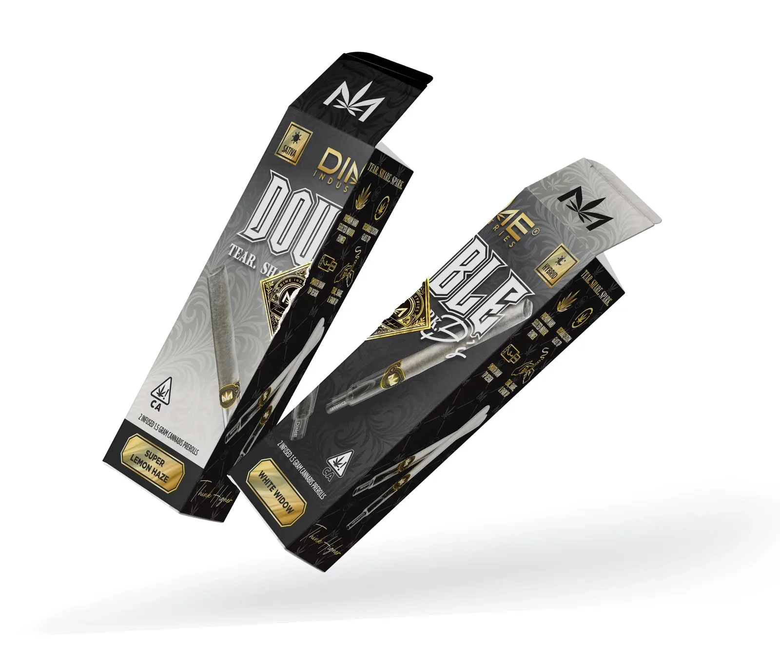
Watch product showcaseDime needed a two-pack that would read as one product on the shelf and split cleanly into two. Each half had to hold a glass-tip pre-roll in its own tube and make sense on its own.
The center seam set the rules for the artwork, from where the imagery crossed the perforation to what each half needed to show. I carried the finished packaging and product renders into the retail launch materials.
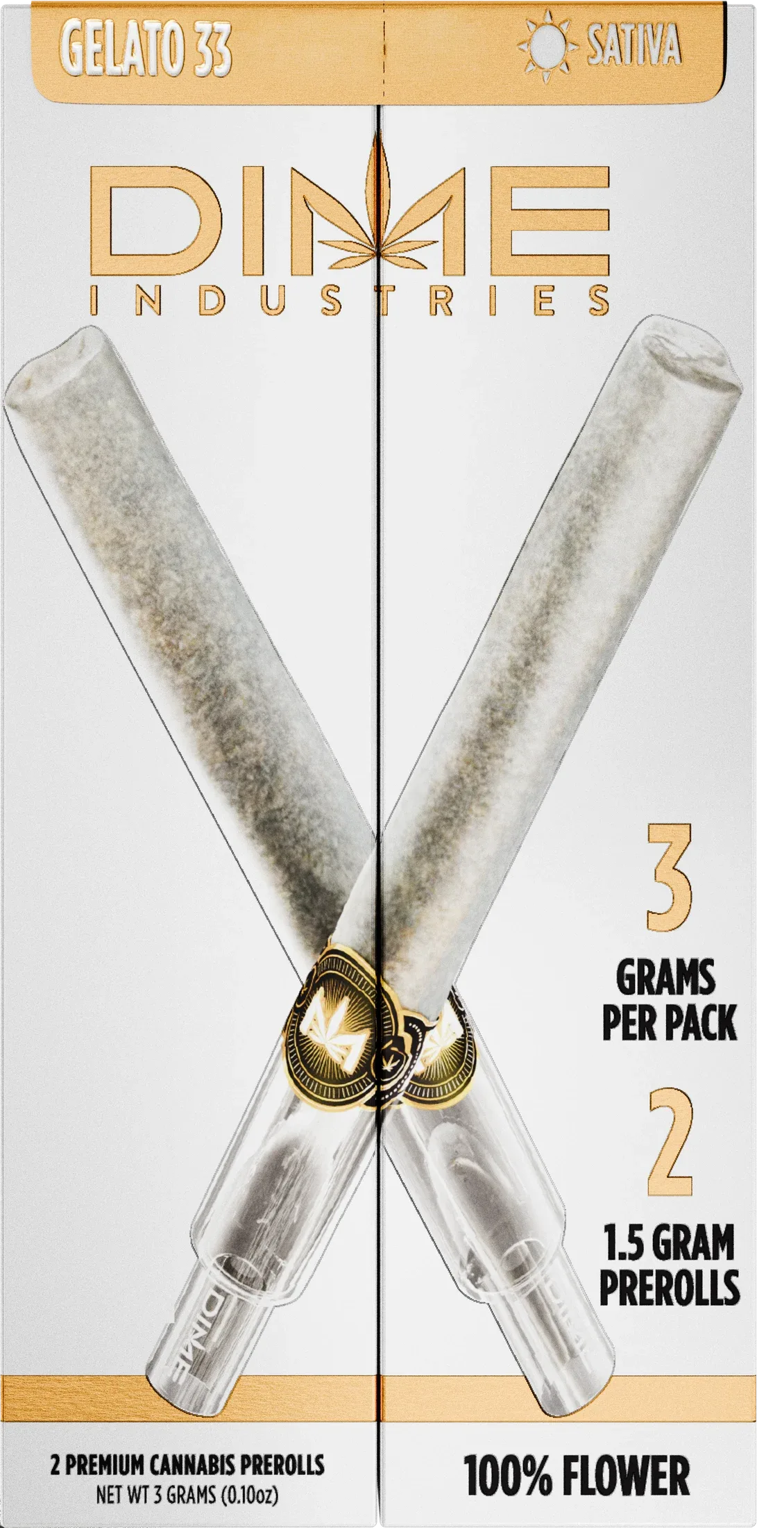
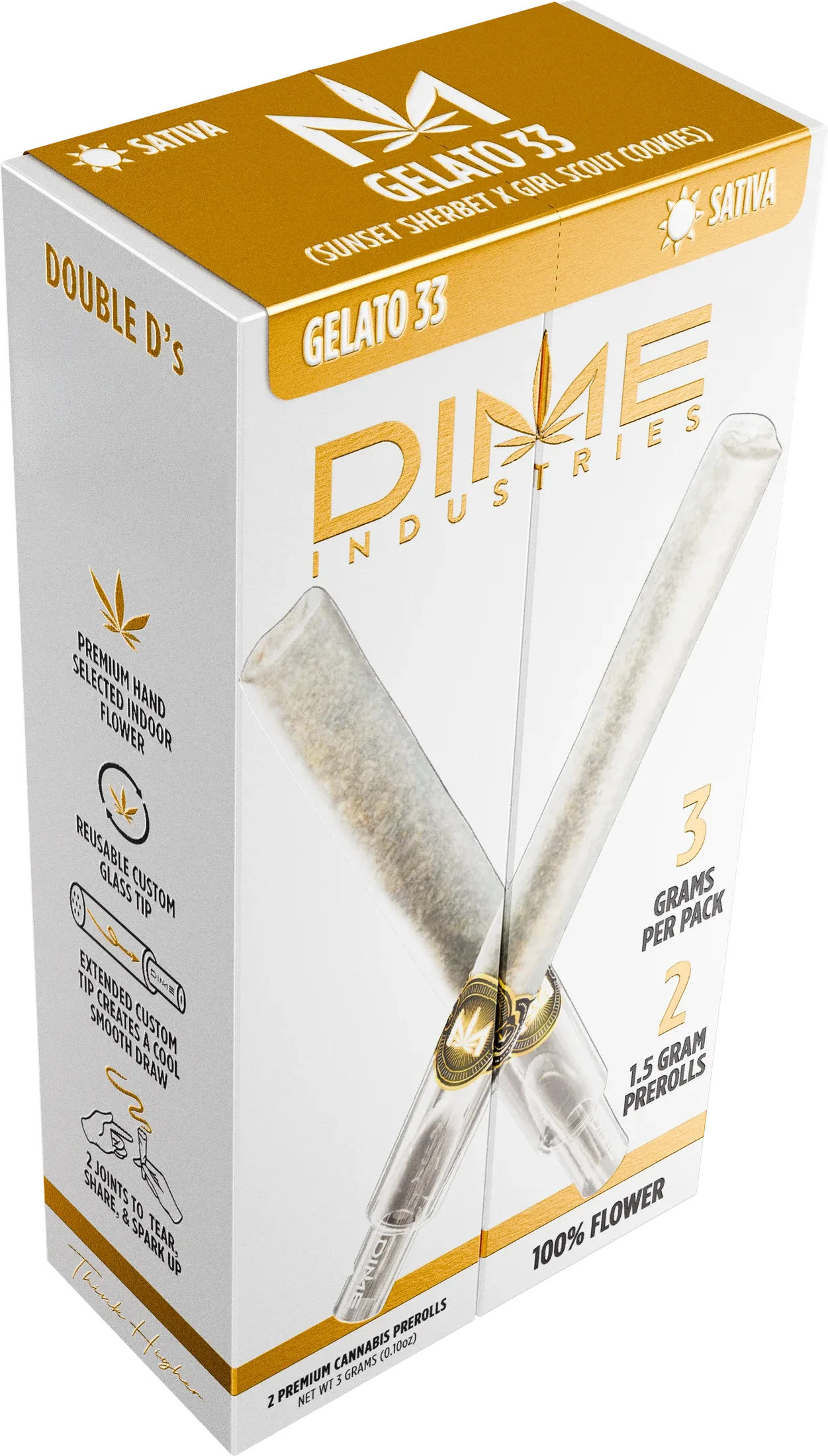
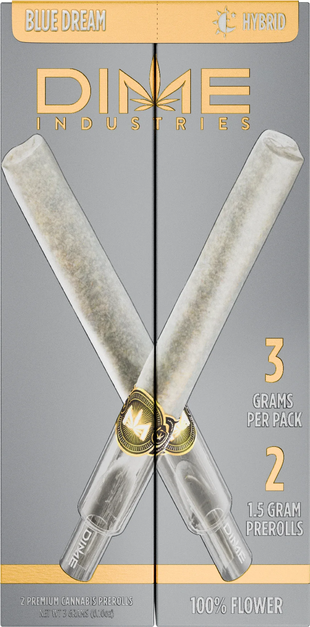
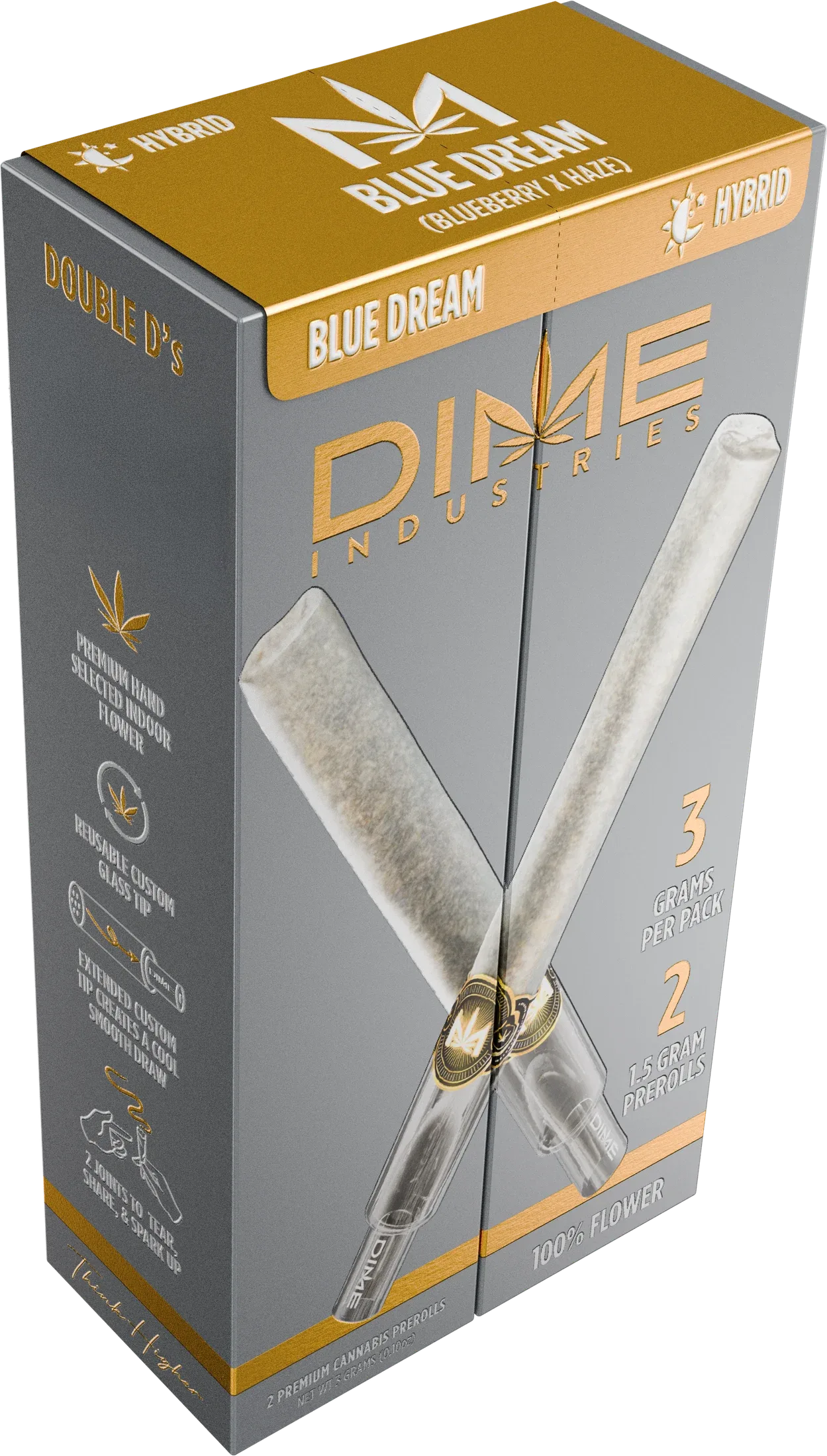
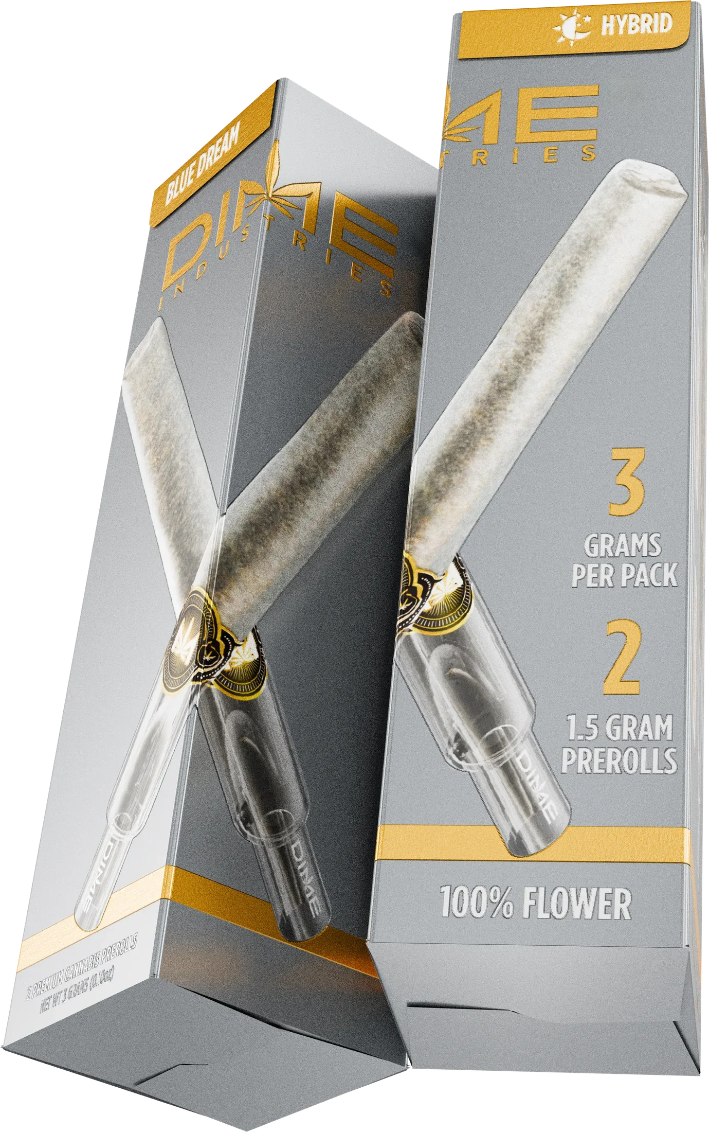
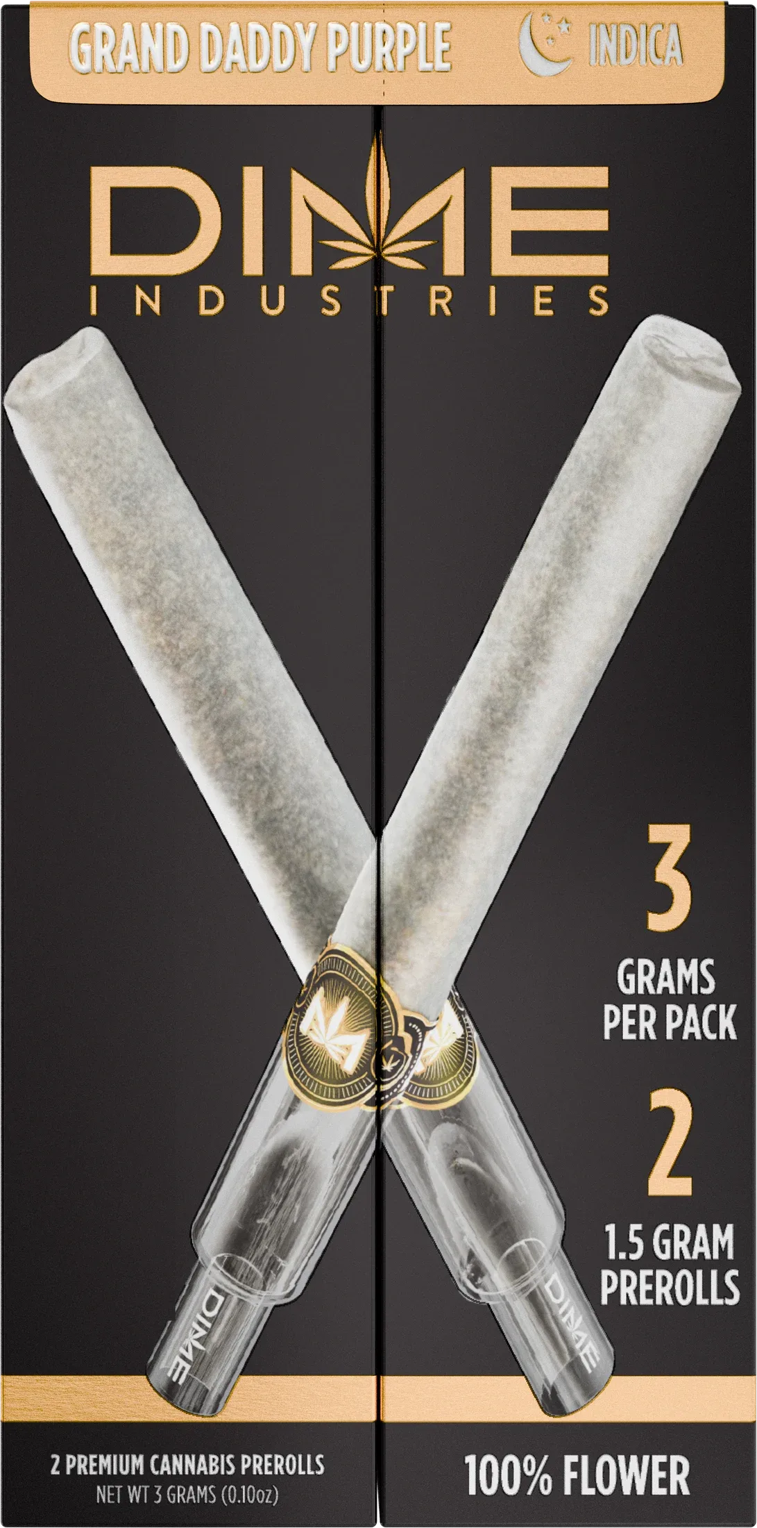
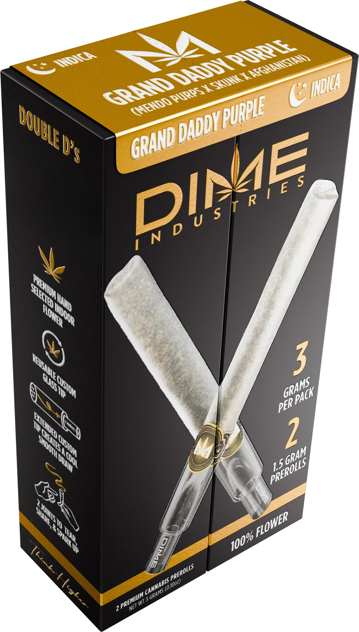
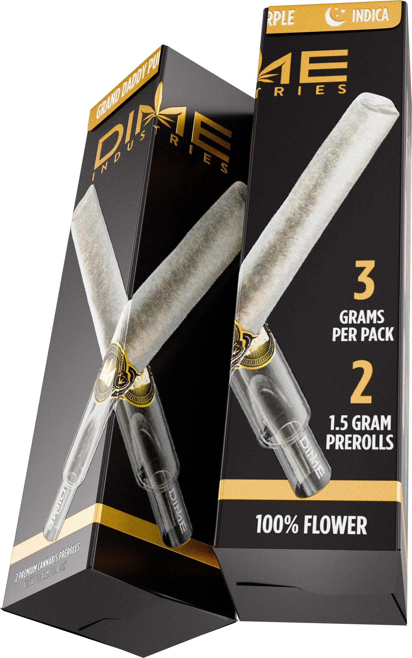
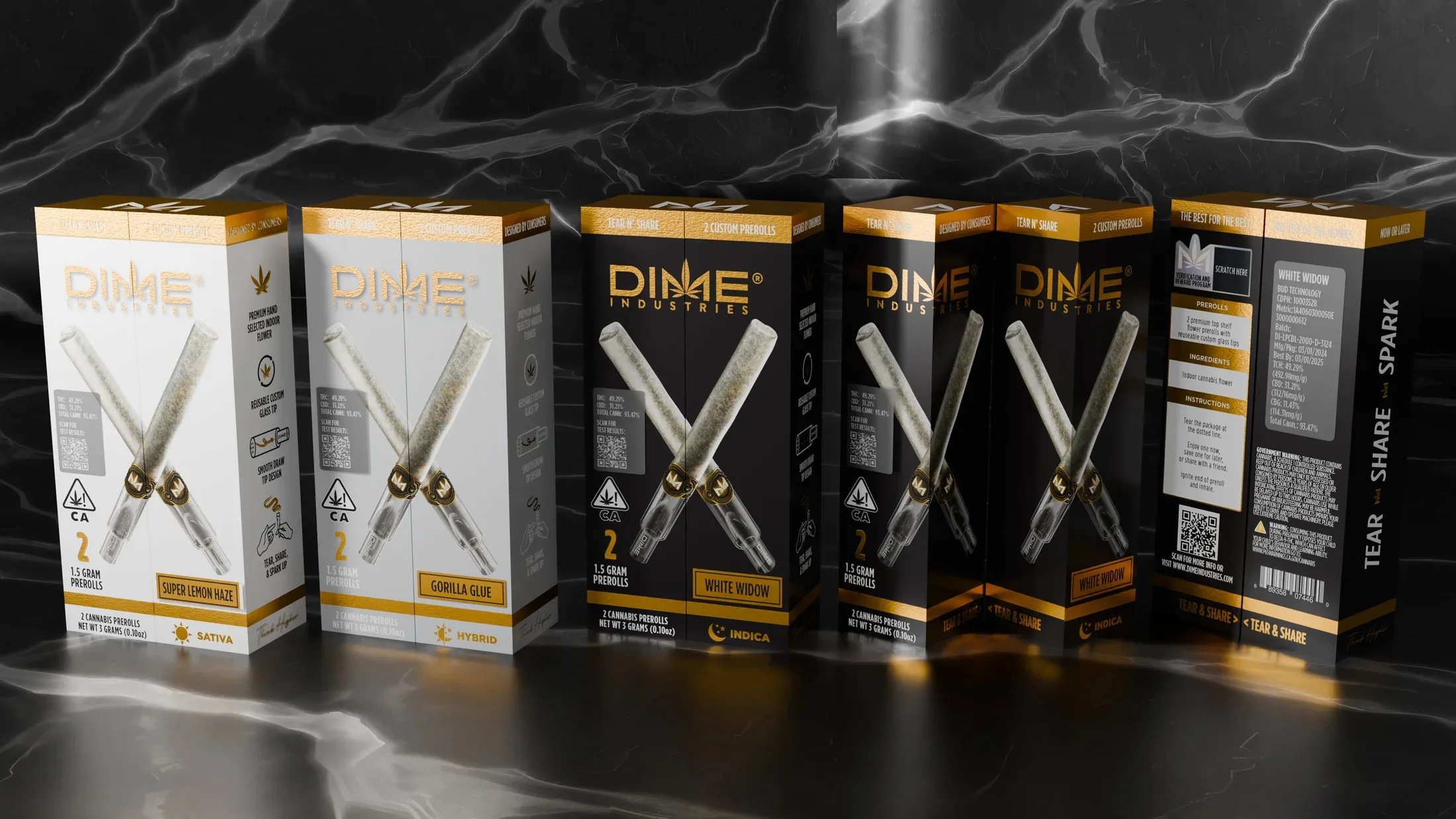
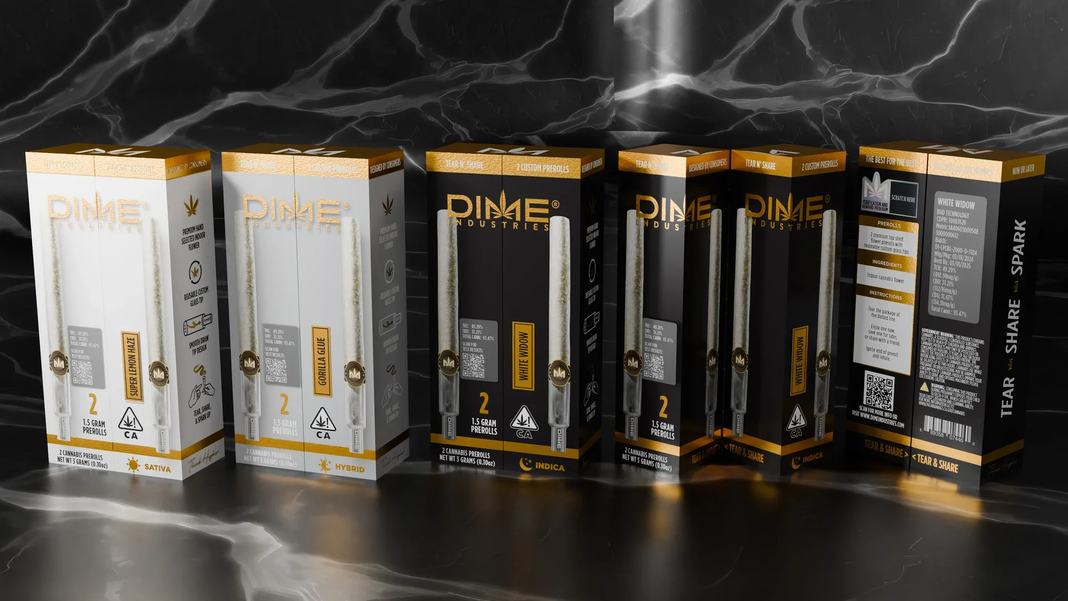
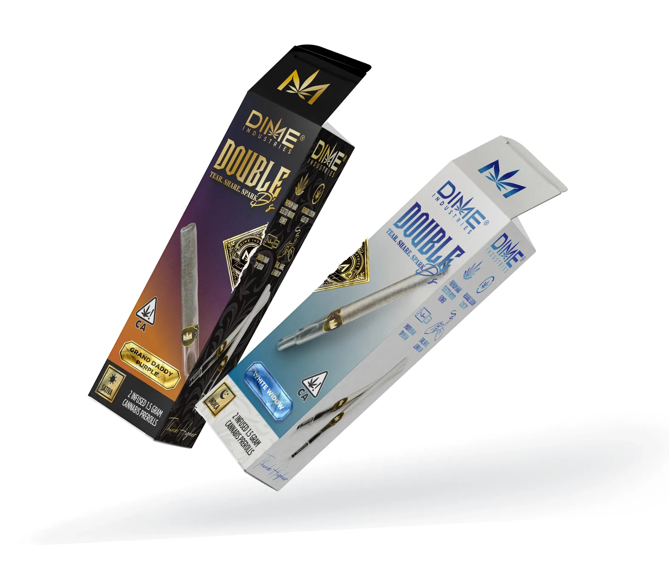
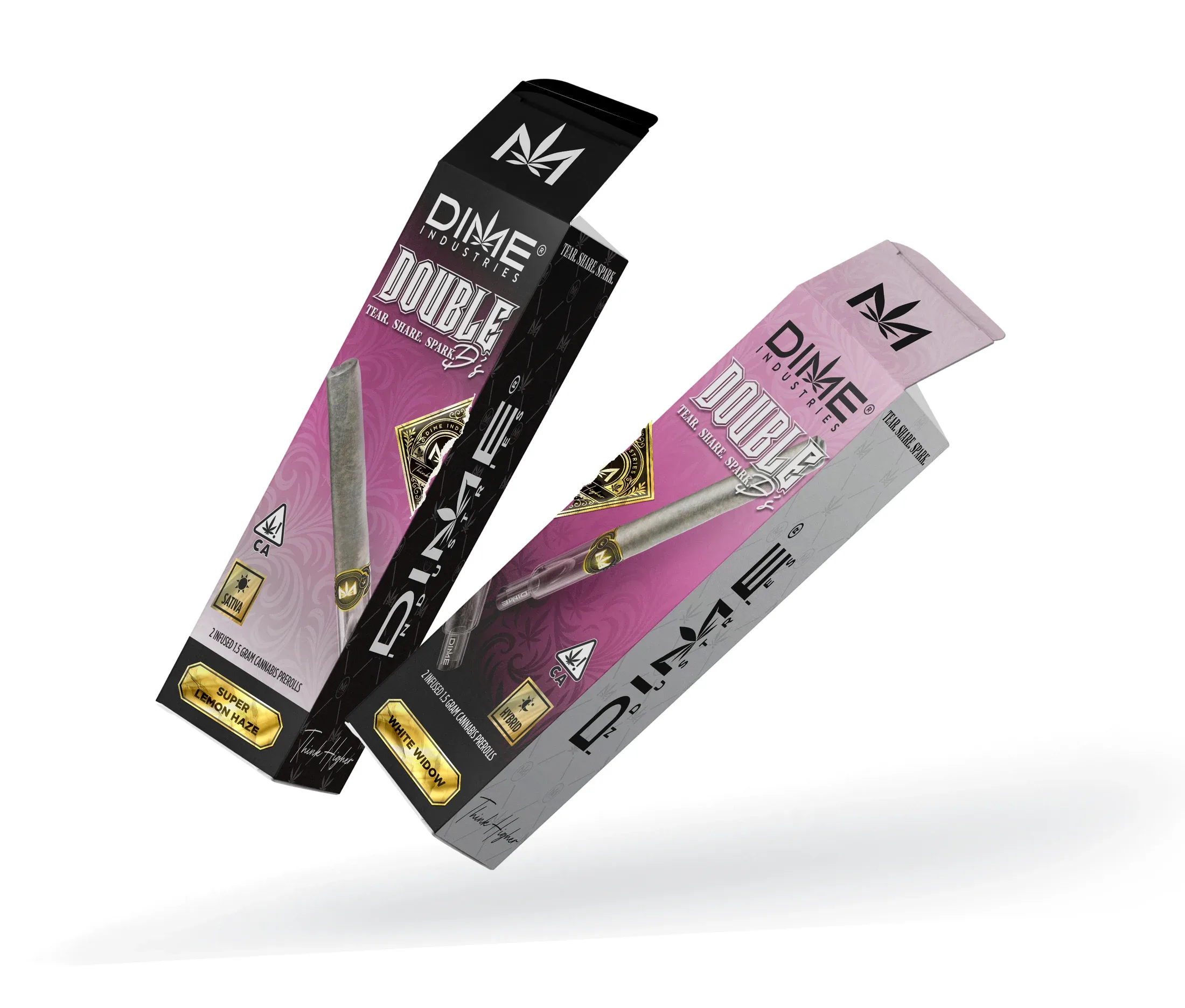
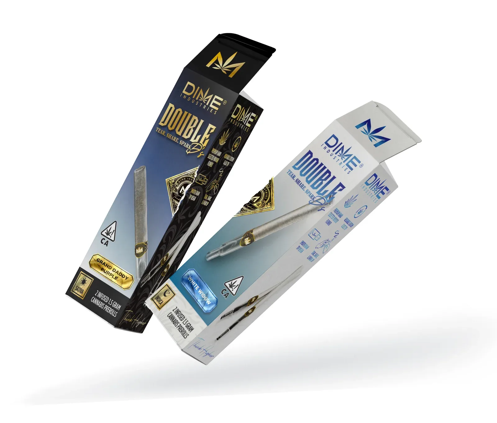
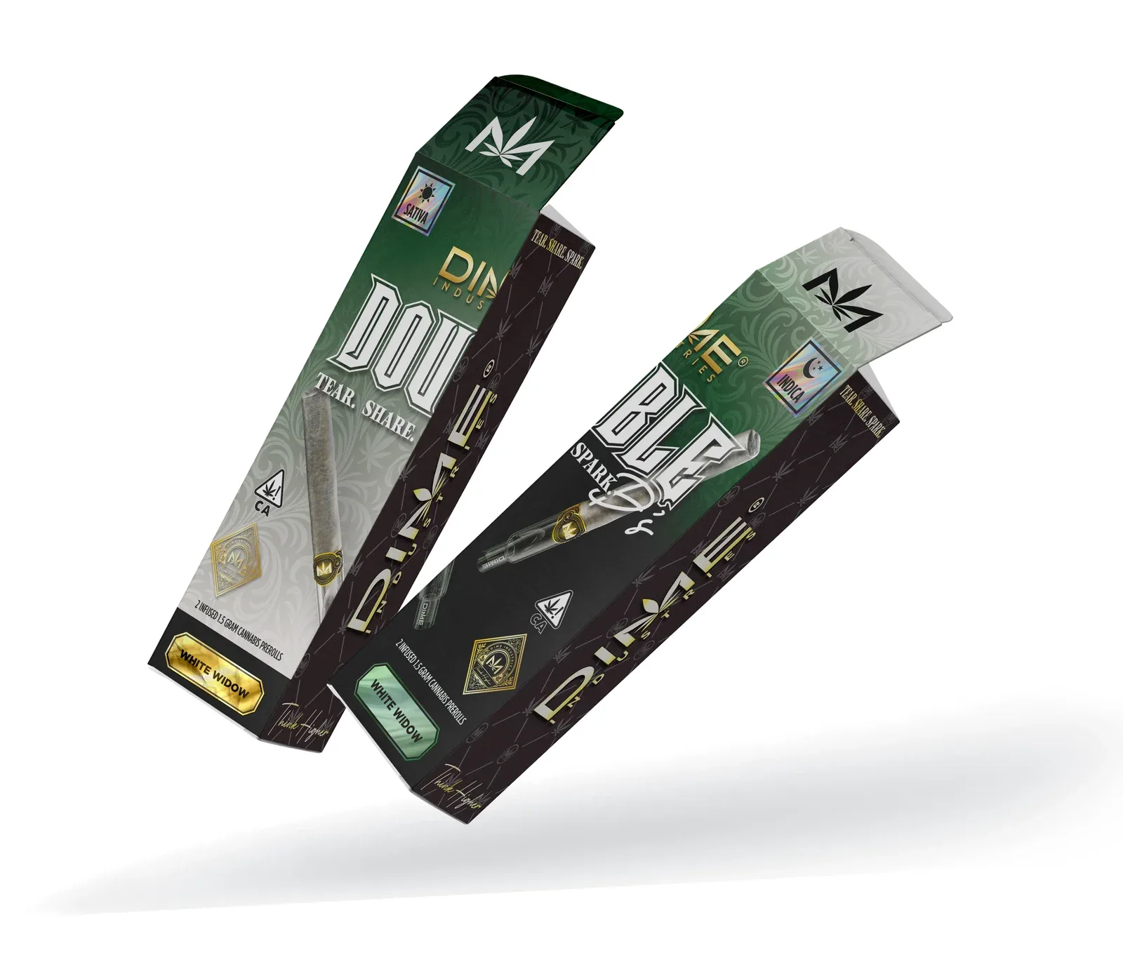
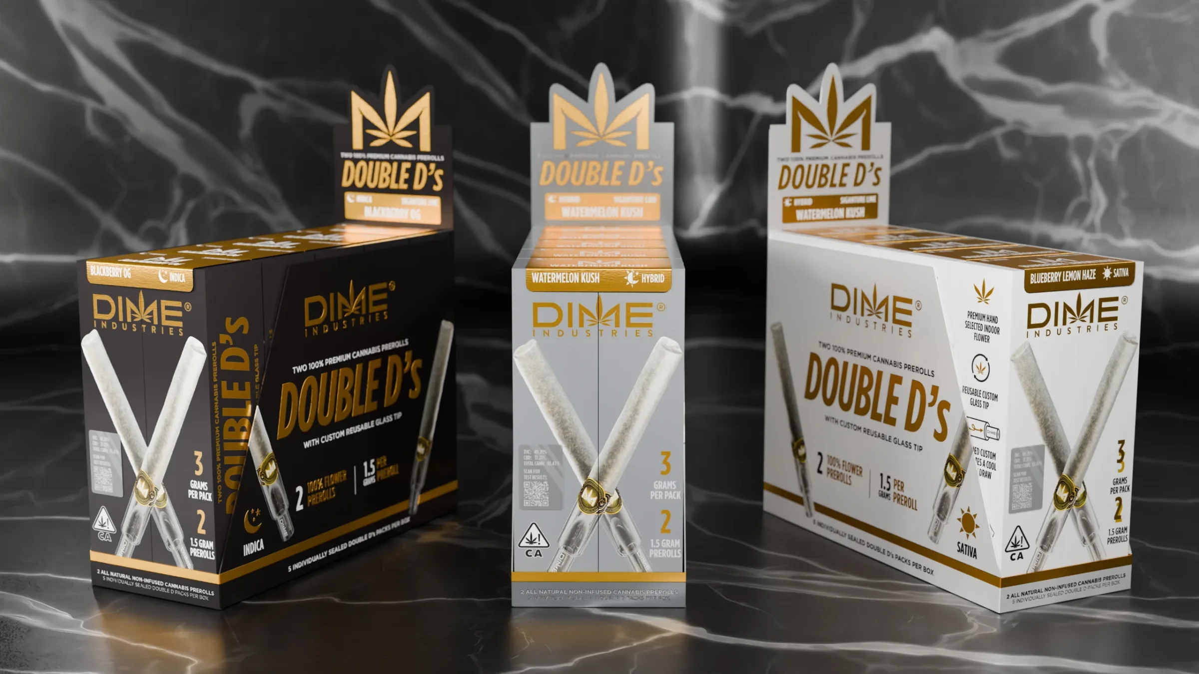
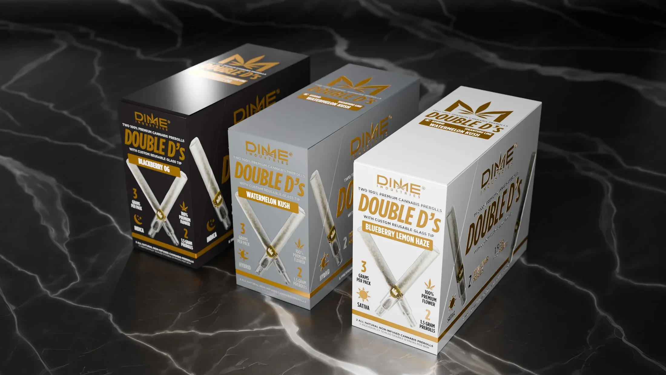
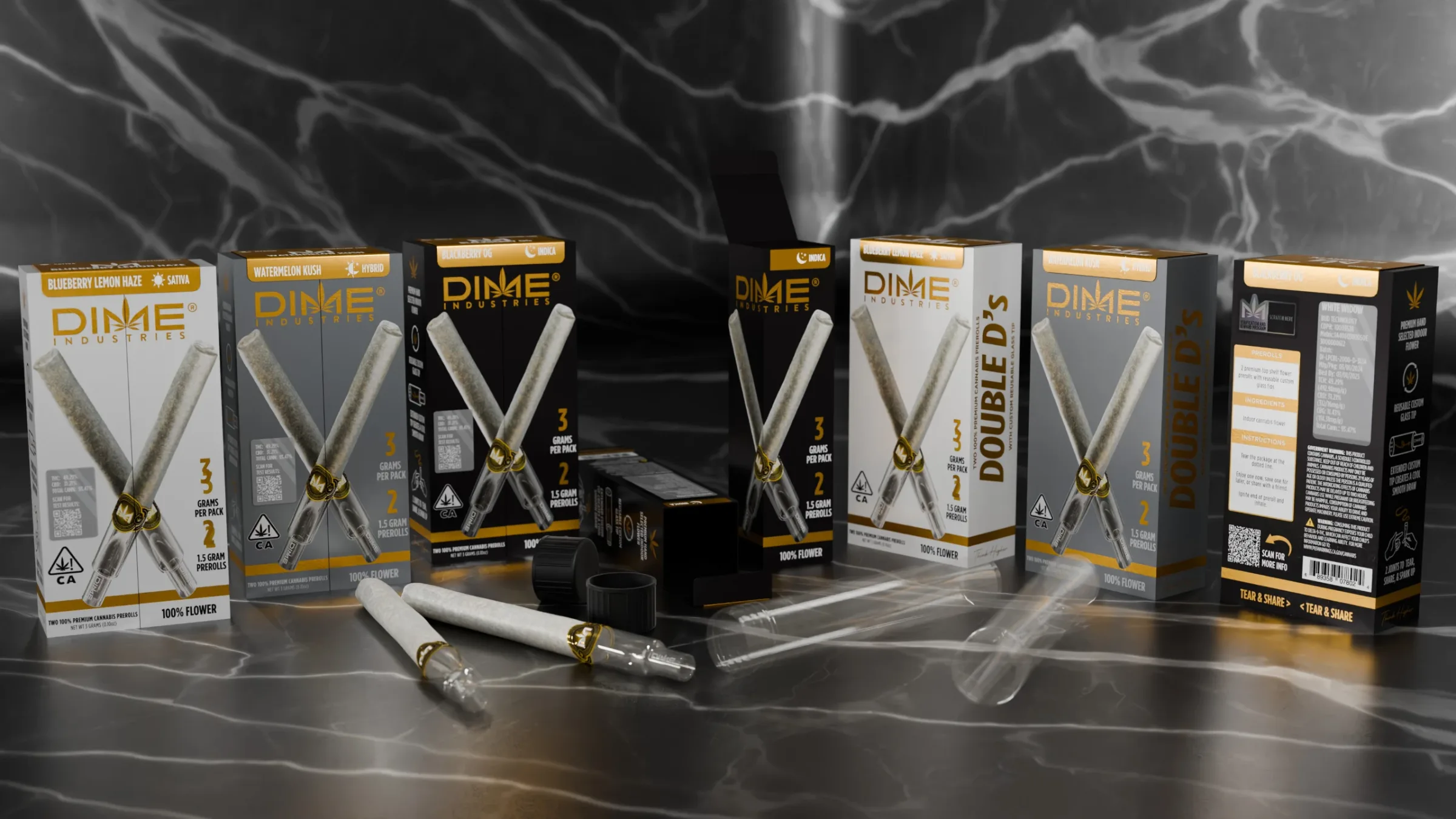
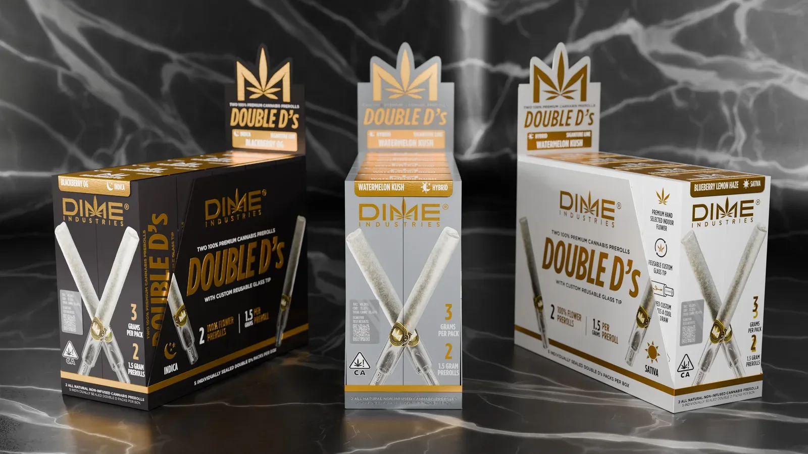
The crossed pre-rolls give both halves a shared focal point and show what’s inside. The gold frame and information layout stay consistent across white Sativa, gray Hybrid and black Indica packs.
The front gives the product image and pack count priority on the shelf. Strain information, product details and instructions sit on the side and reverse panels.
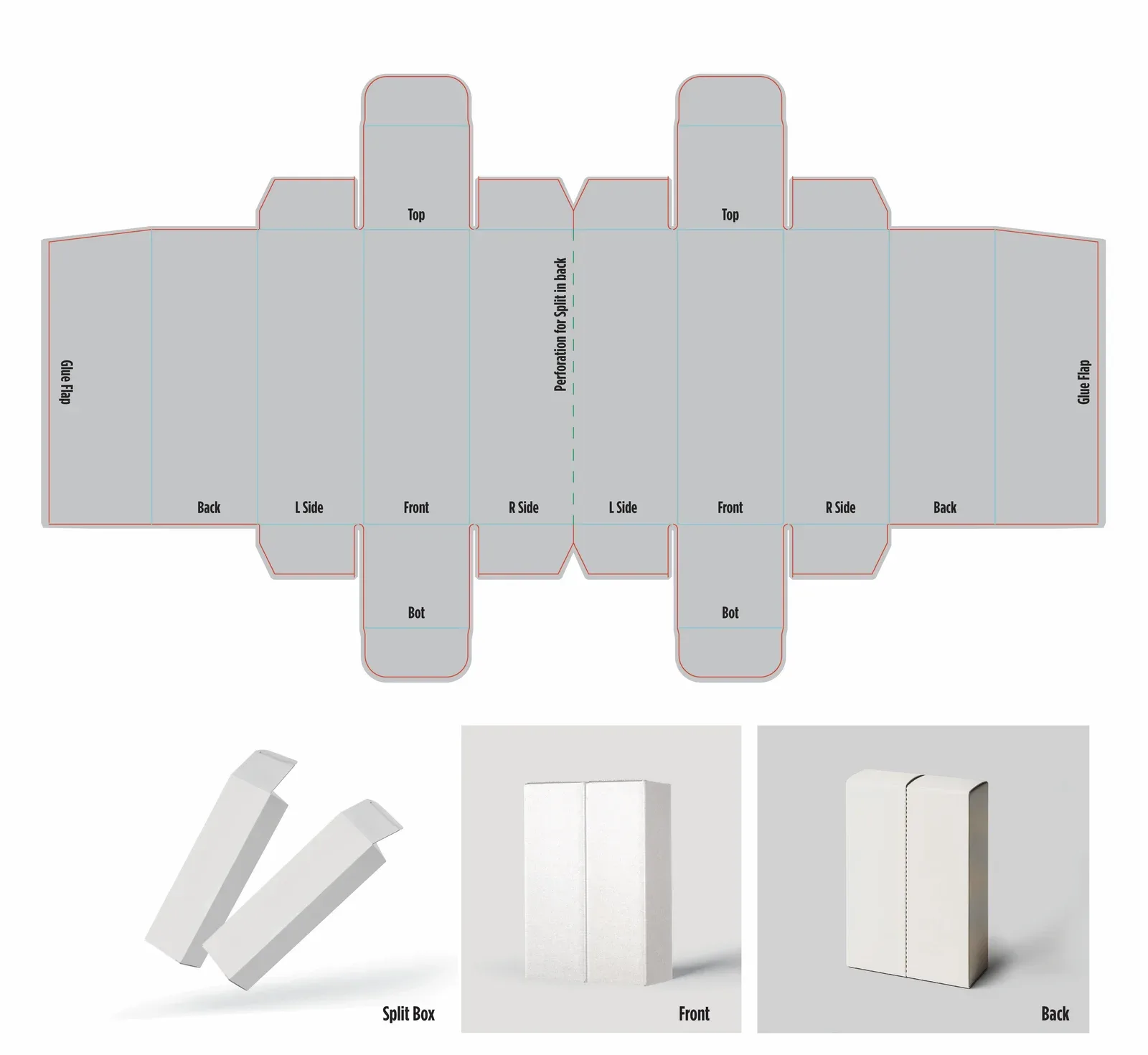
I drew the custom dieline around the center perforation and printed tests to check the folds, separation and alignment across the seam. Finish mockups showed how the gold detailing would read once the pack was assembled.
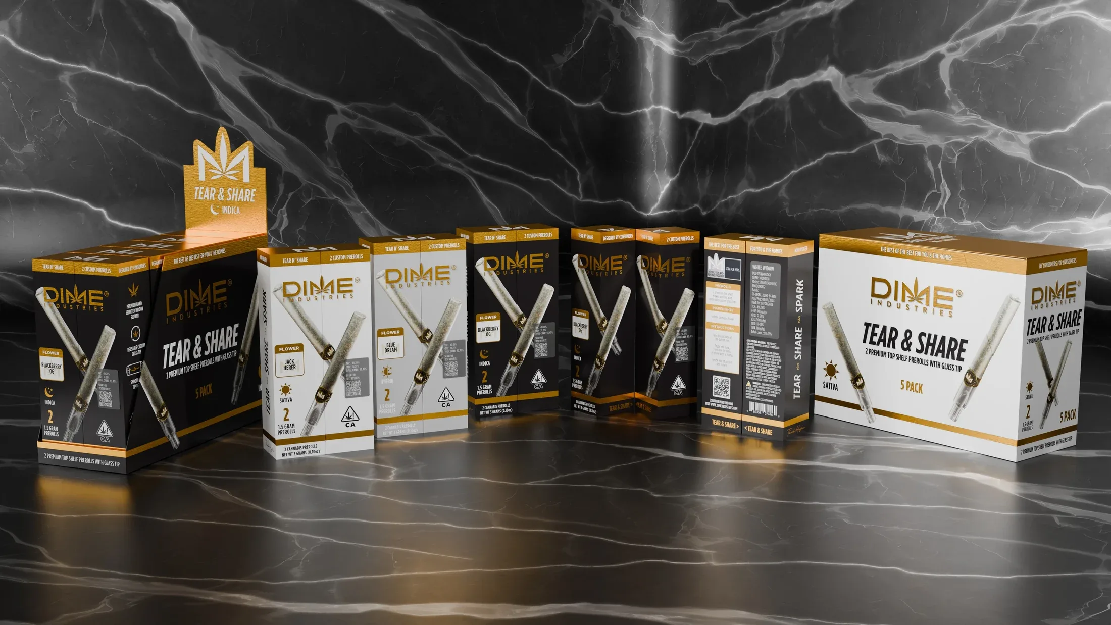
The early Tear & Share direction put the opening action in the name. The same treatment appears across the individual packs and retail displays, with separate front and reverse views.
The color and wordmark studies explored how much the two halves could differ and still read as one pack. One red concept repeats the name on both halves. A two-tone version gives each half its own color. The final design uses the same front layout across all three strain colors.
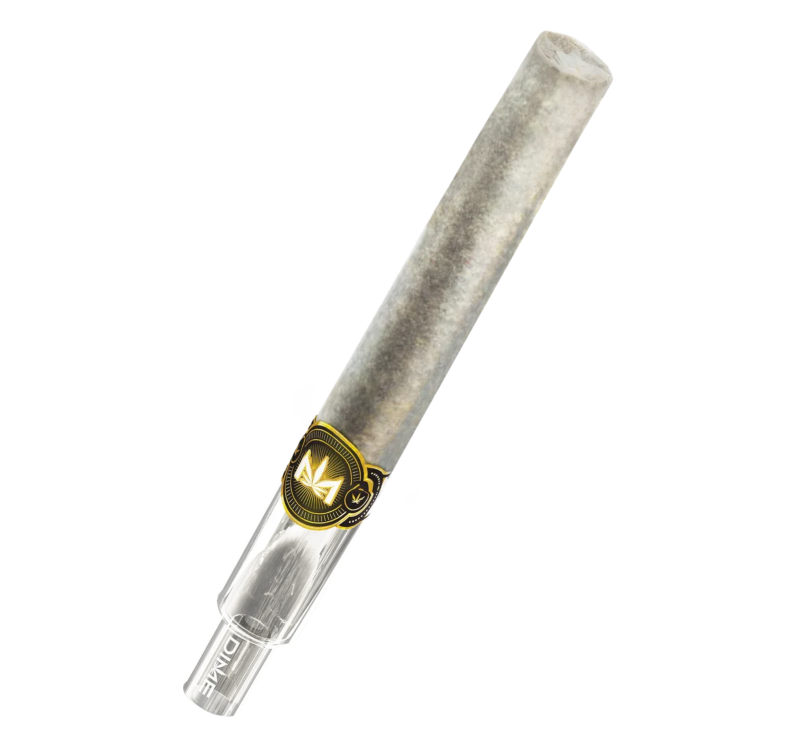
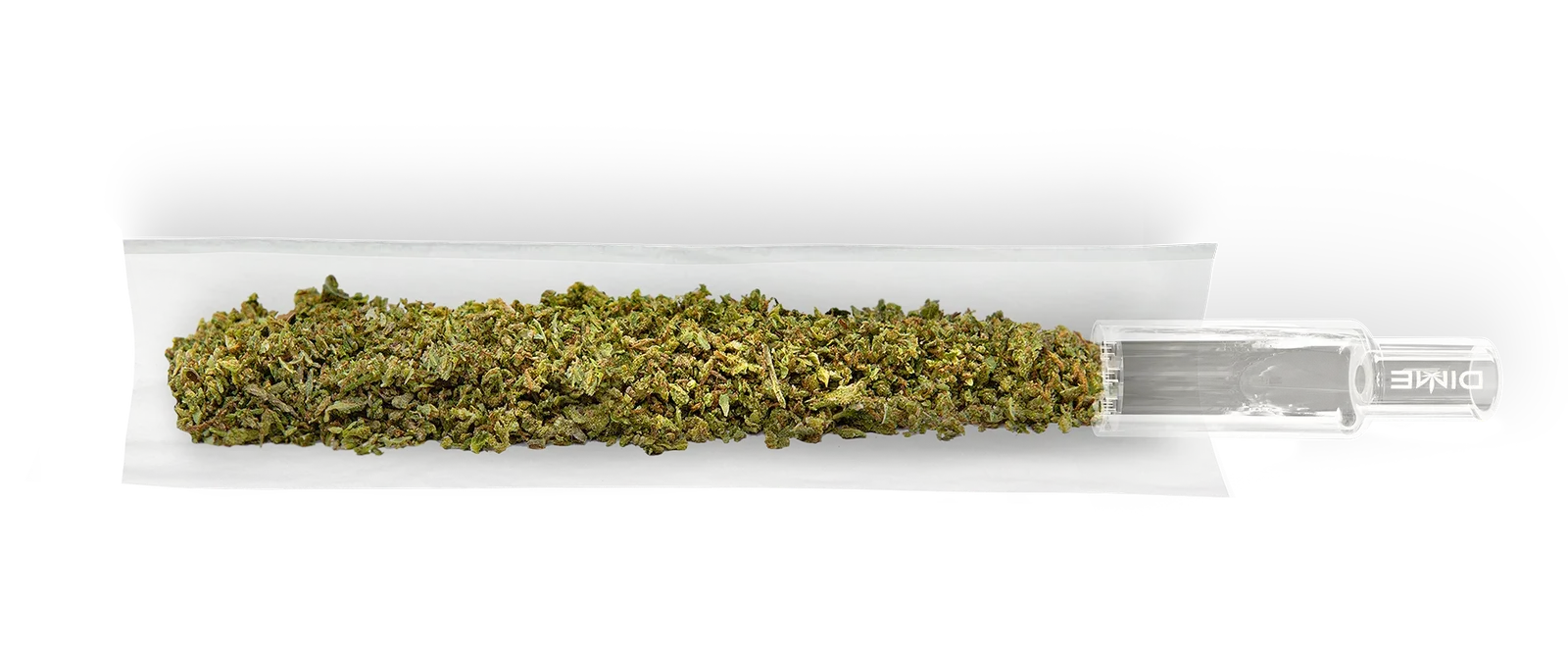
The rebuilt pre-roll render adds more natural paper texture and makes the glass tip easier to distinguish. A close-up shows the gold band and the transition from paper to glass. The cutaway shows how the flower sits inside the roll.
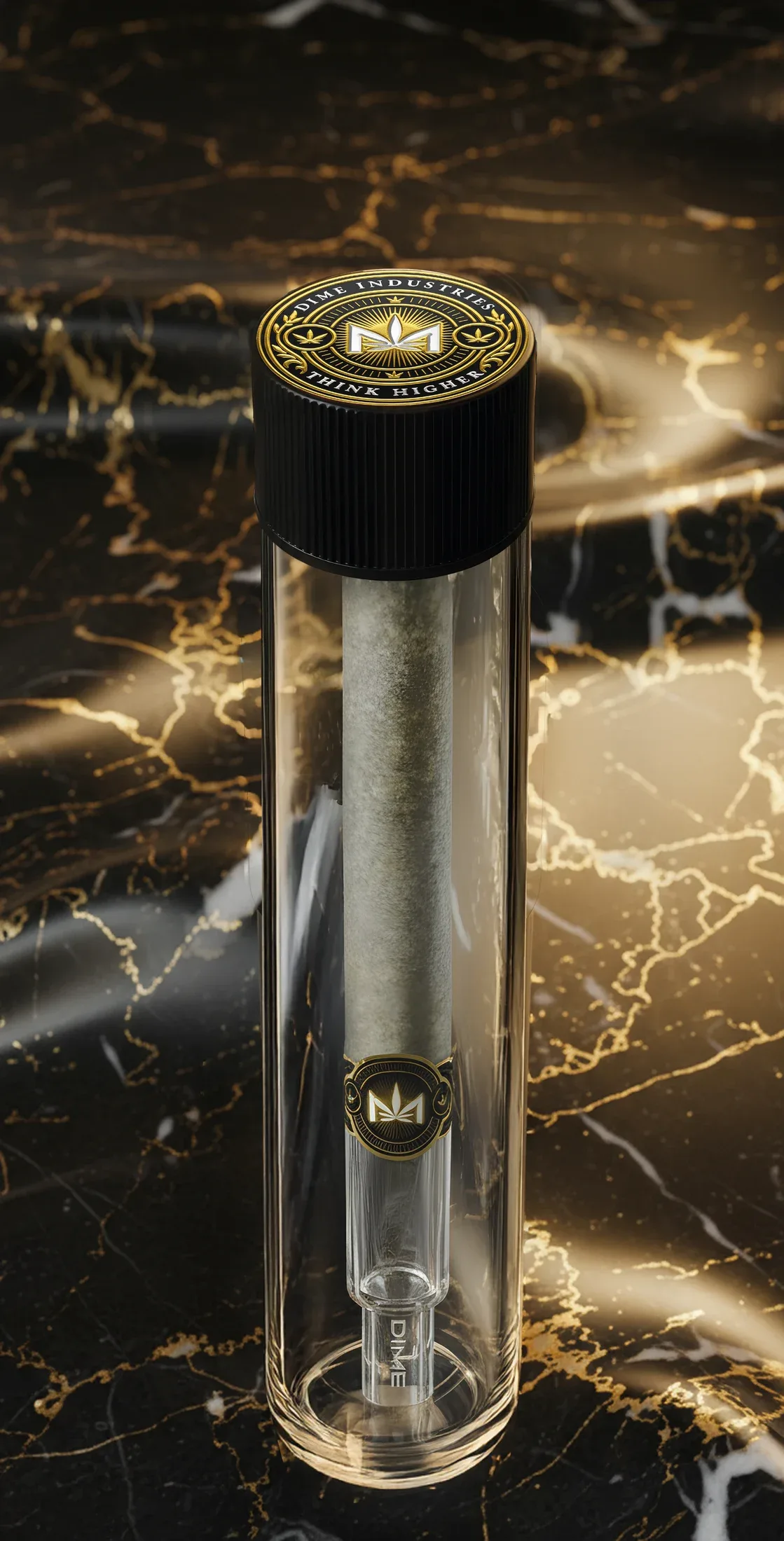
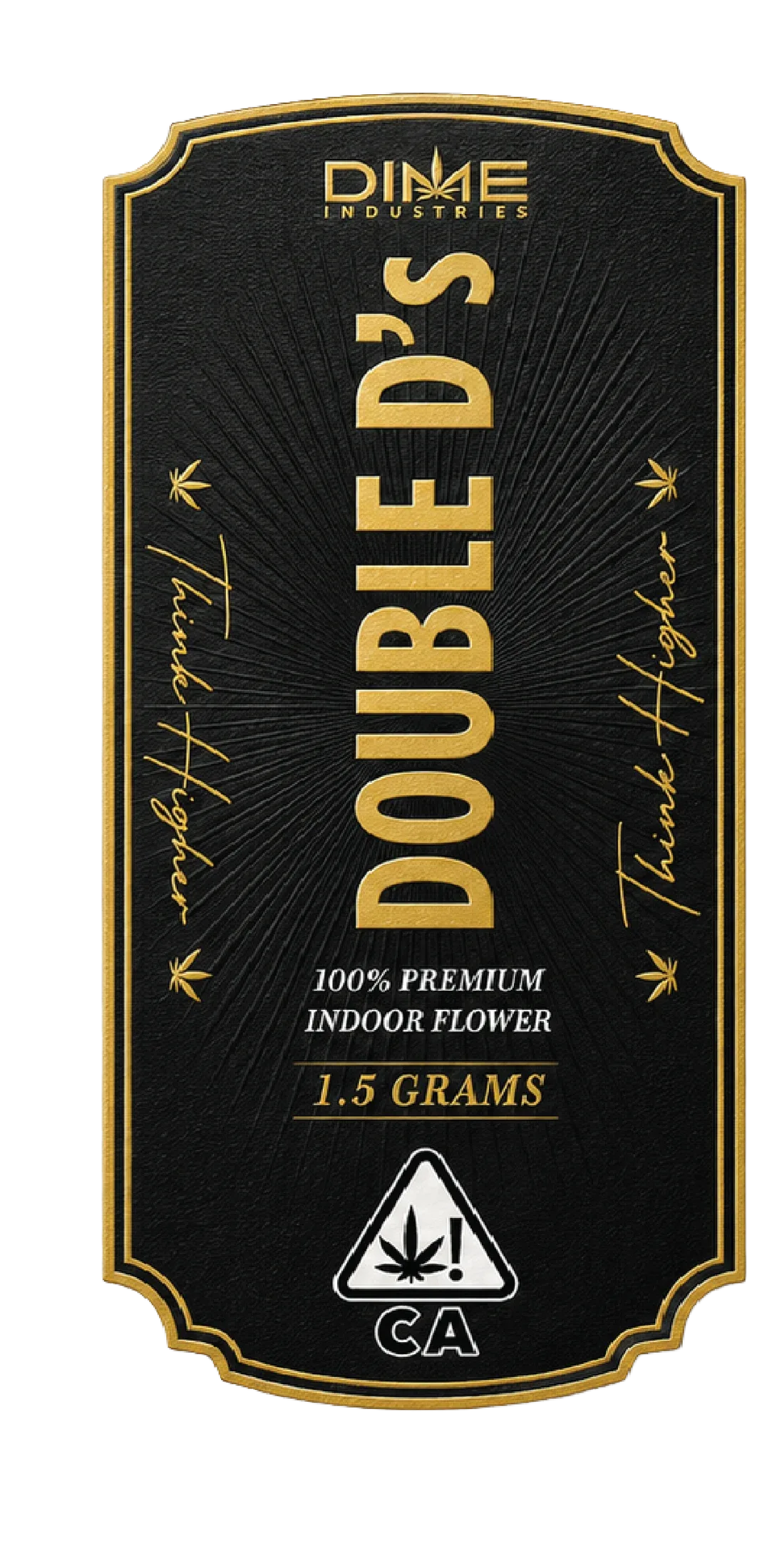
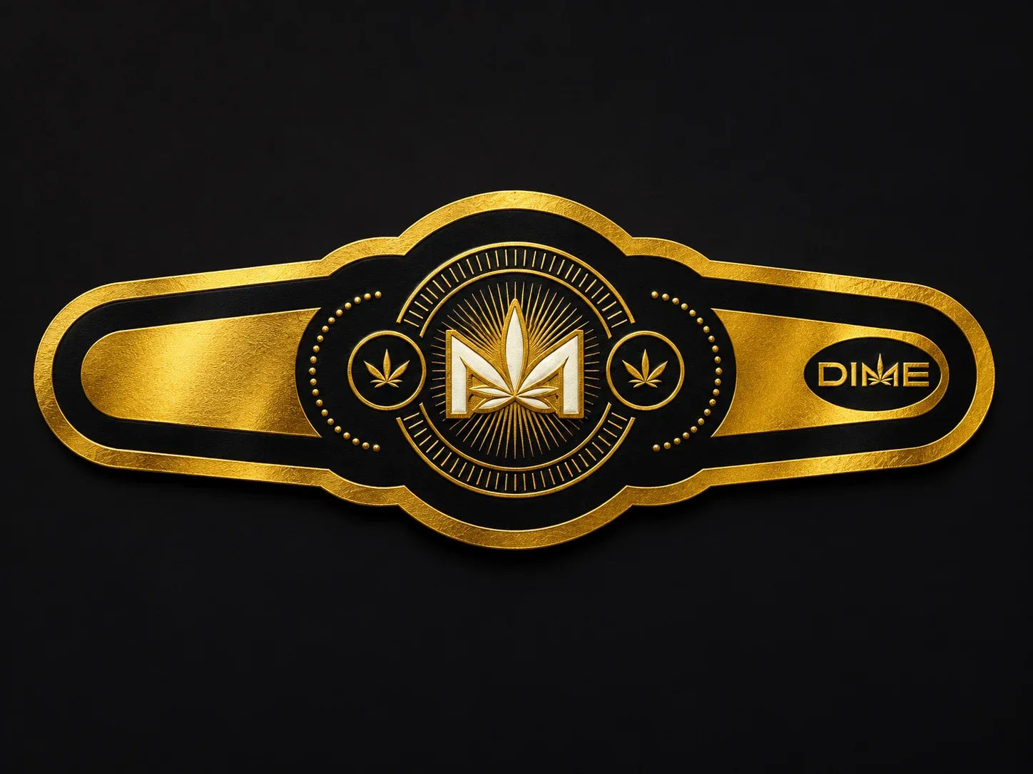
Each half holds one pre-roll in a clear tube. The wrap, cigar band and circular cap sticker tie the smaller pieces back to the pack. The wrap and cap sticker use embossing and gold foil.
The raised header keeps the product name and strain visible above the individual packs. Open and closed mockups show how the artwork reads as a master case and as a shelf display.
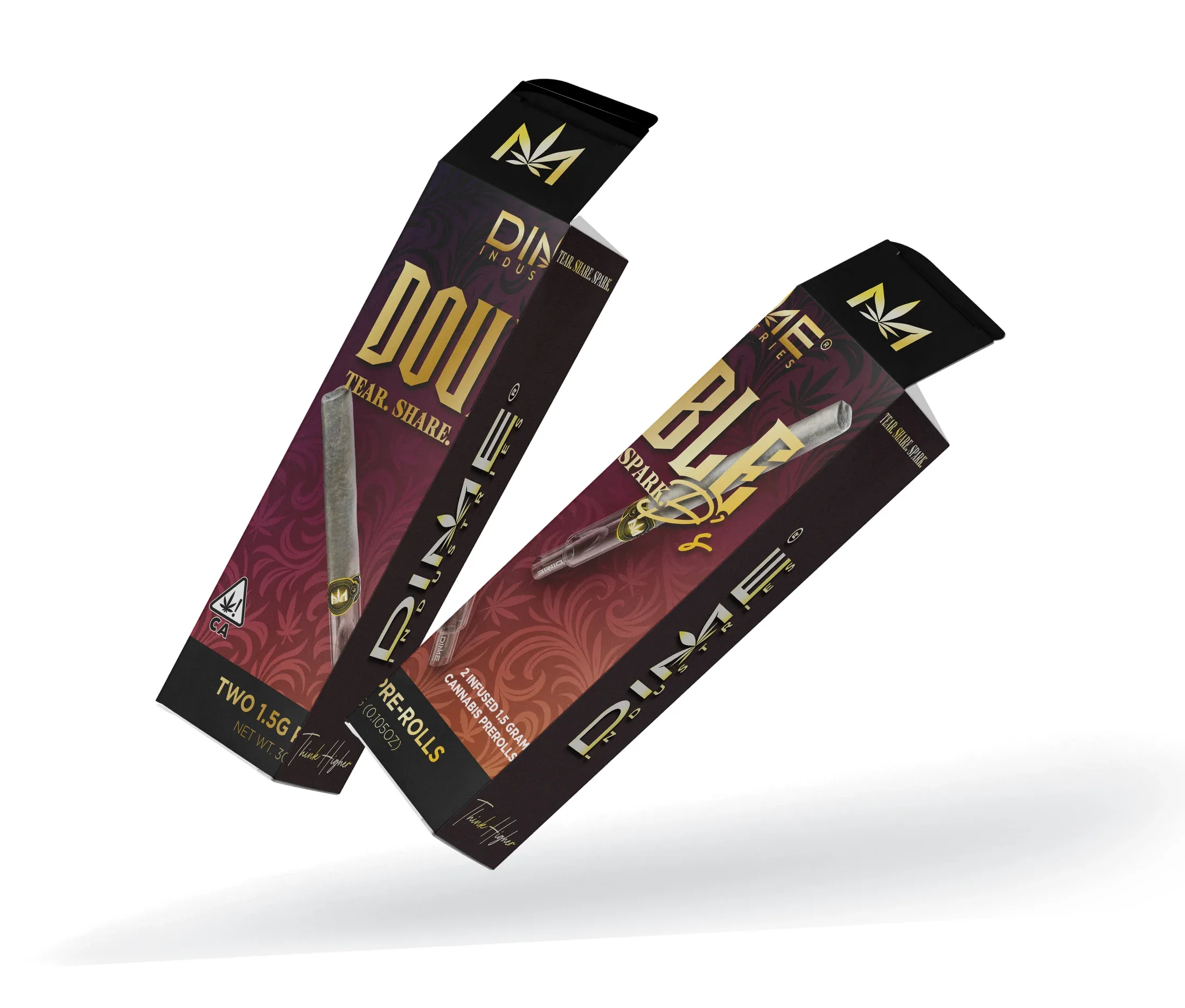
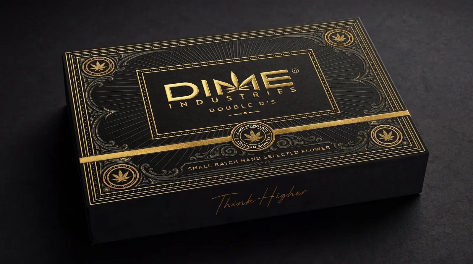
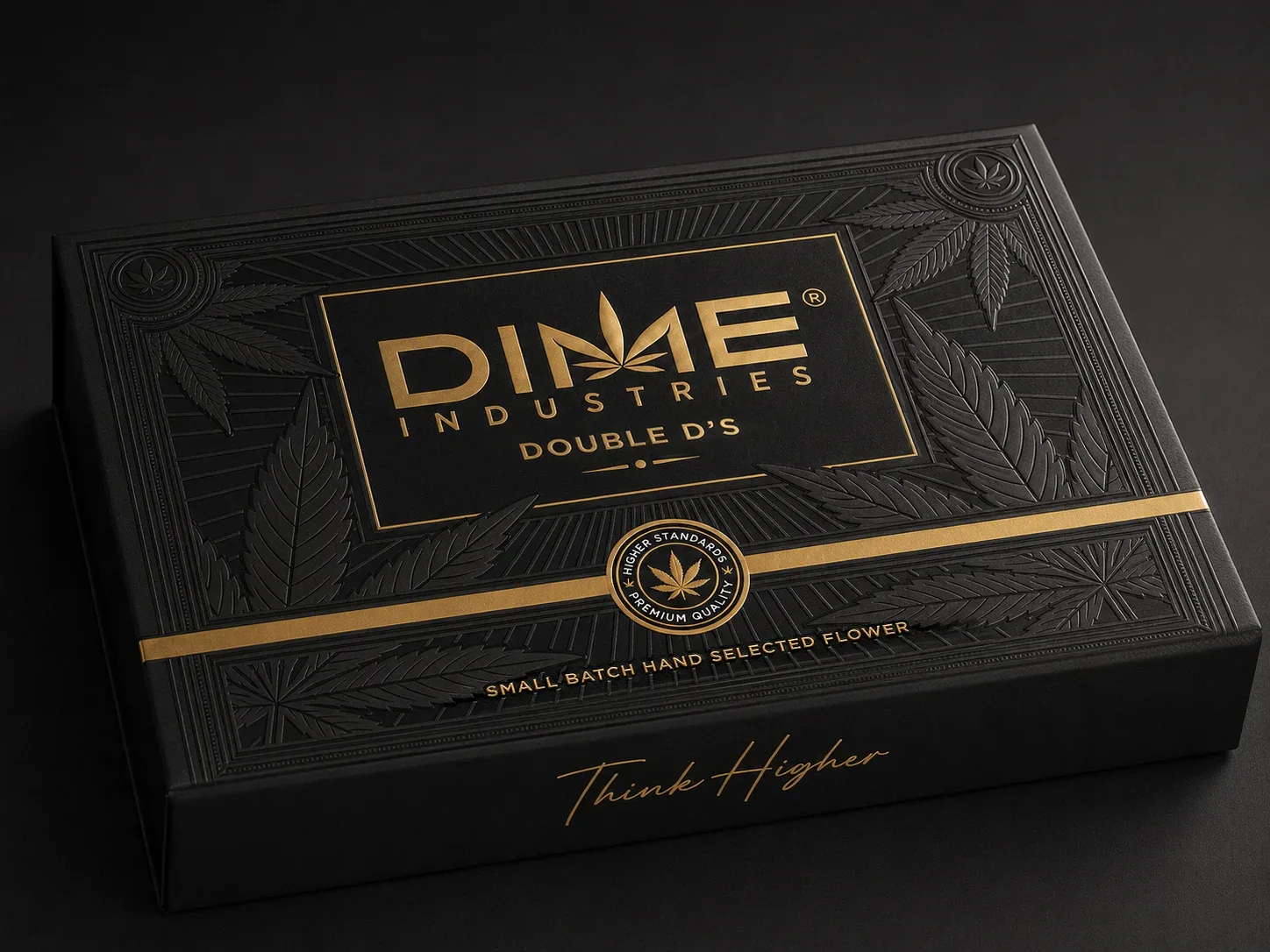
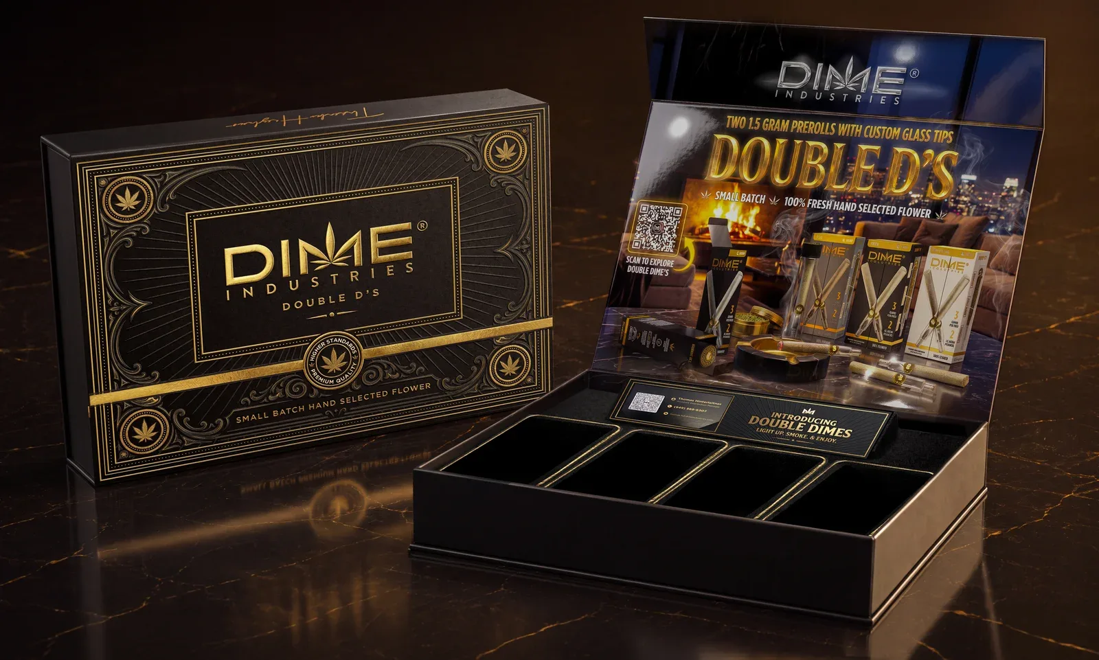
Gold linework frames the Dime mark on the closed lid. Inside, the launch artwork introduces Double D’s above a divided tray, and a printed insert gives retailers the product details.
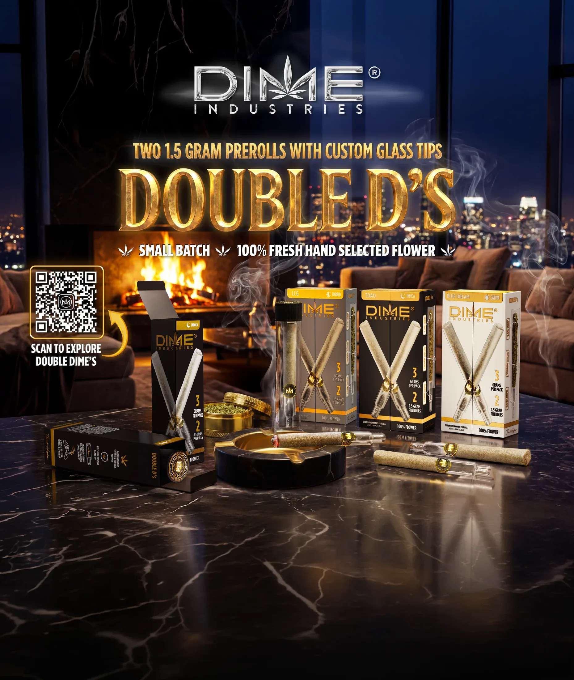
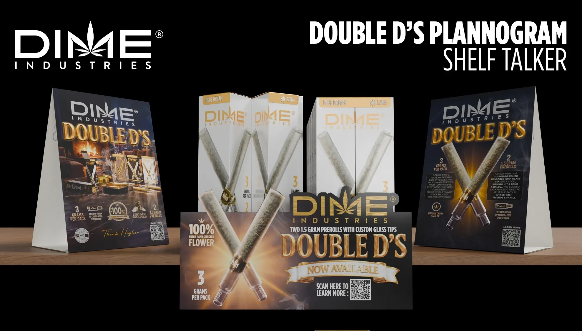
The launch scene shows the full range together. Postcards, flyers, table tents, shelf talkers and digital graphics use the same product imagery, with more room for the glass tip, pack count or product details where the format allows.
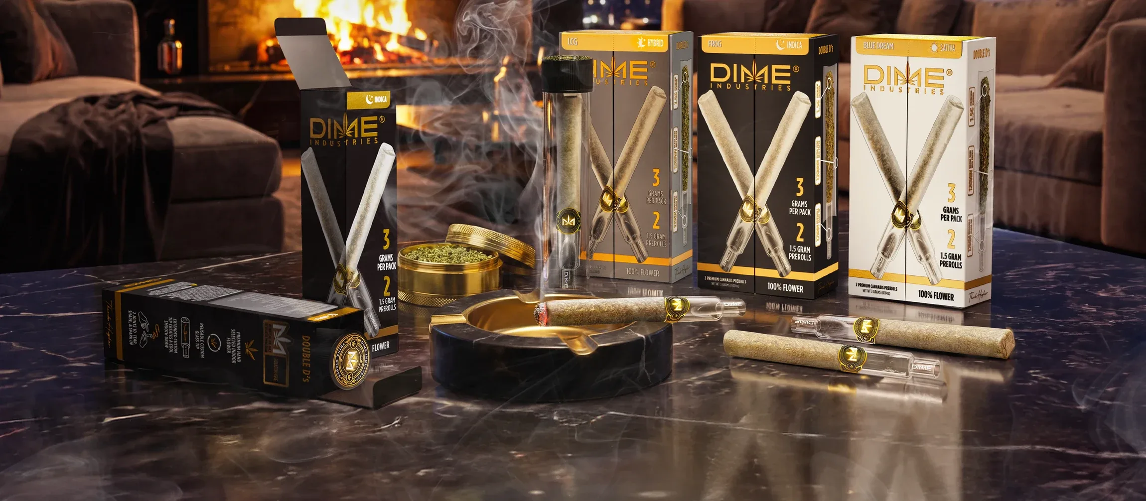
The launch film shows the packaging opening and brings the glass-tip pre-rolls and their details into view.