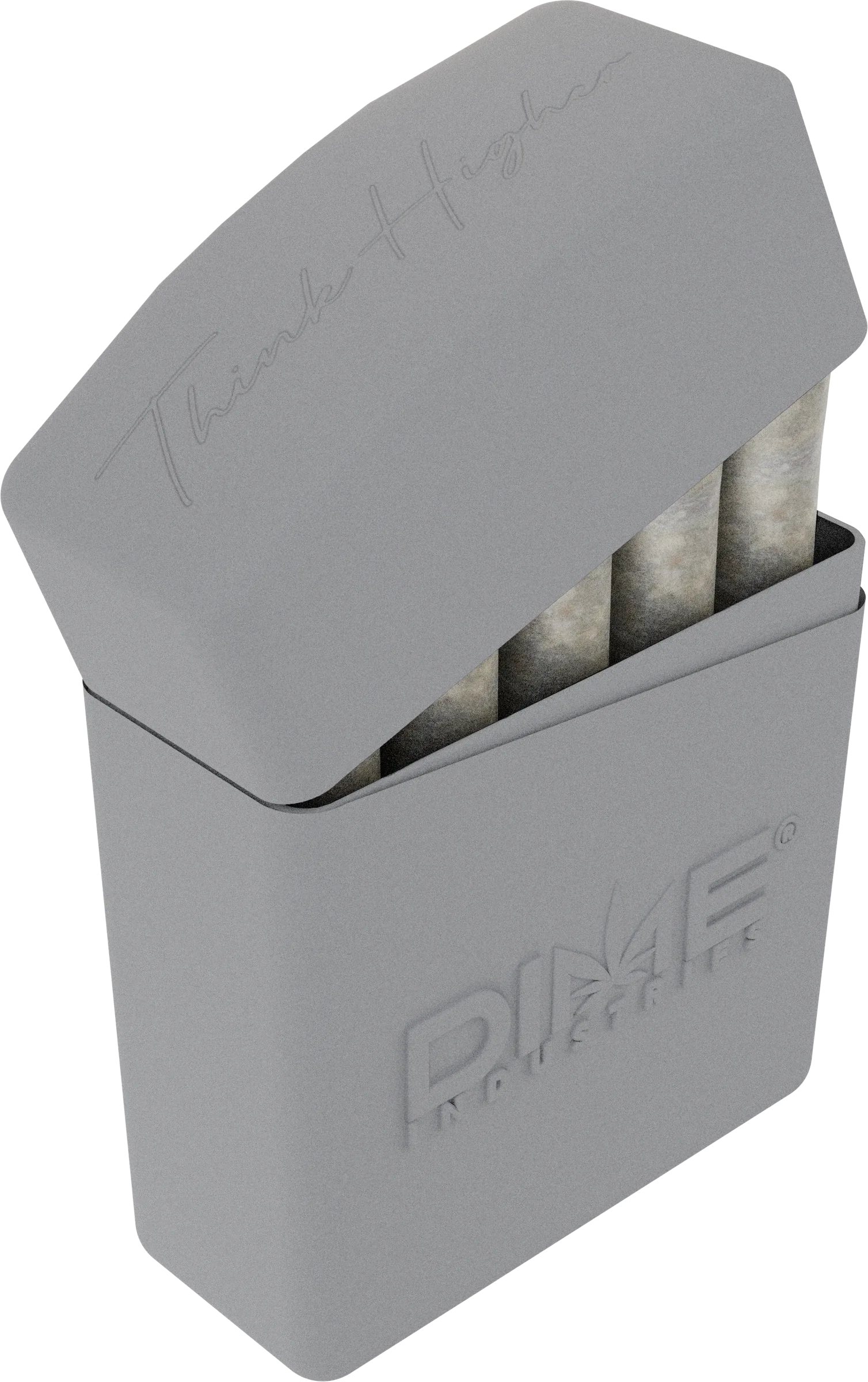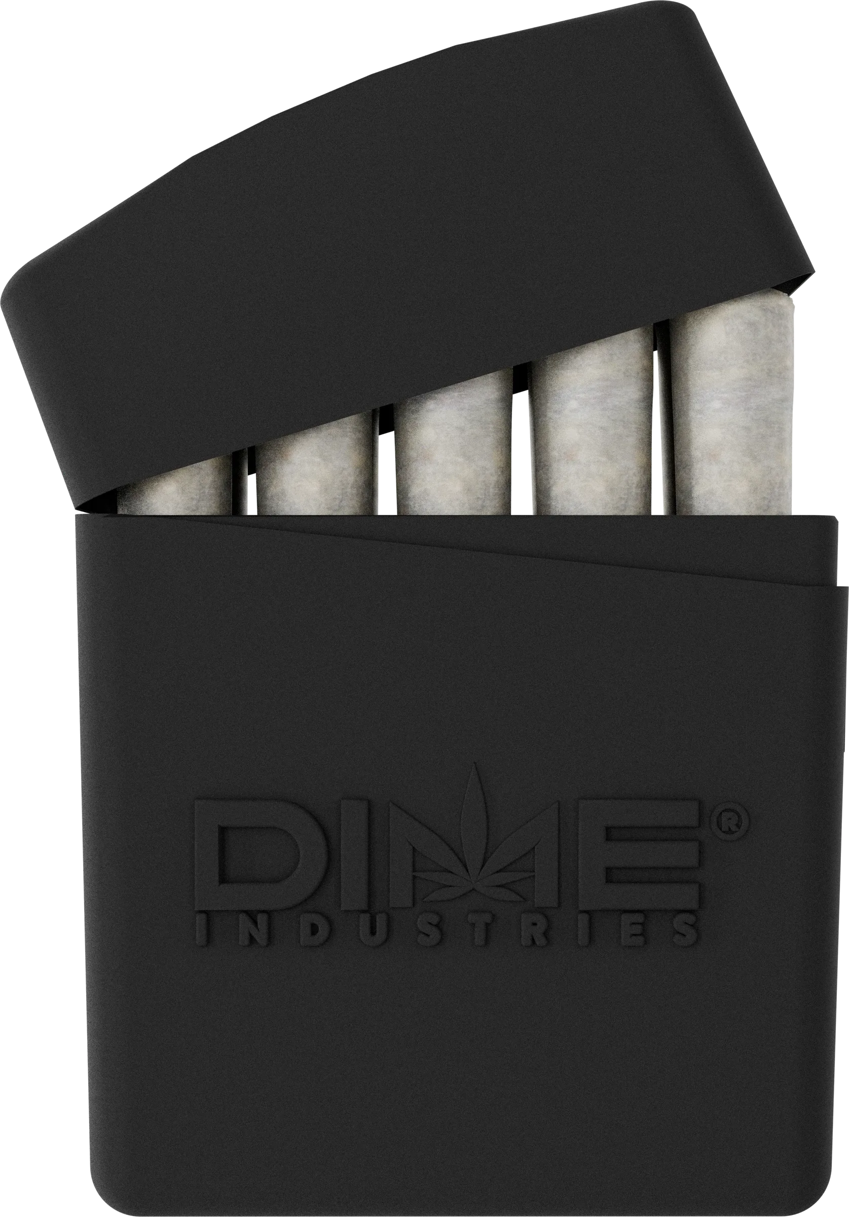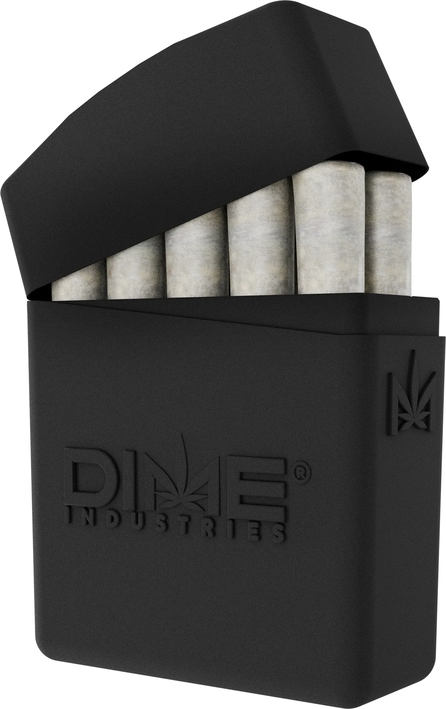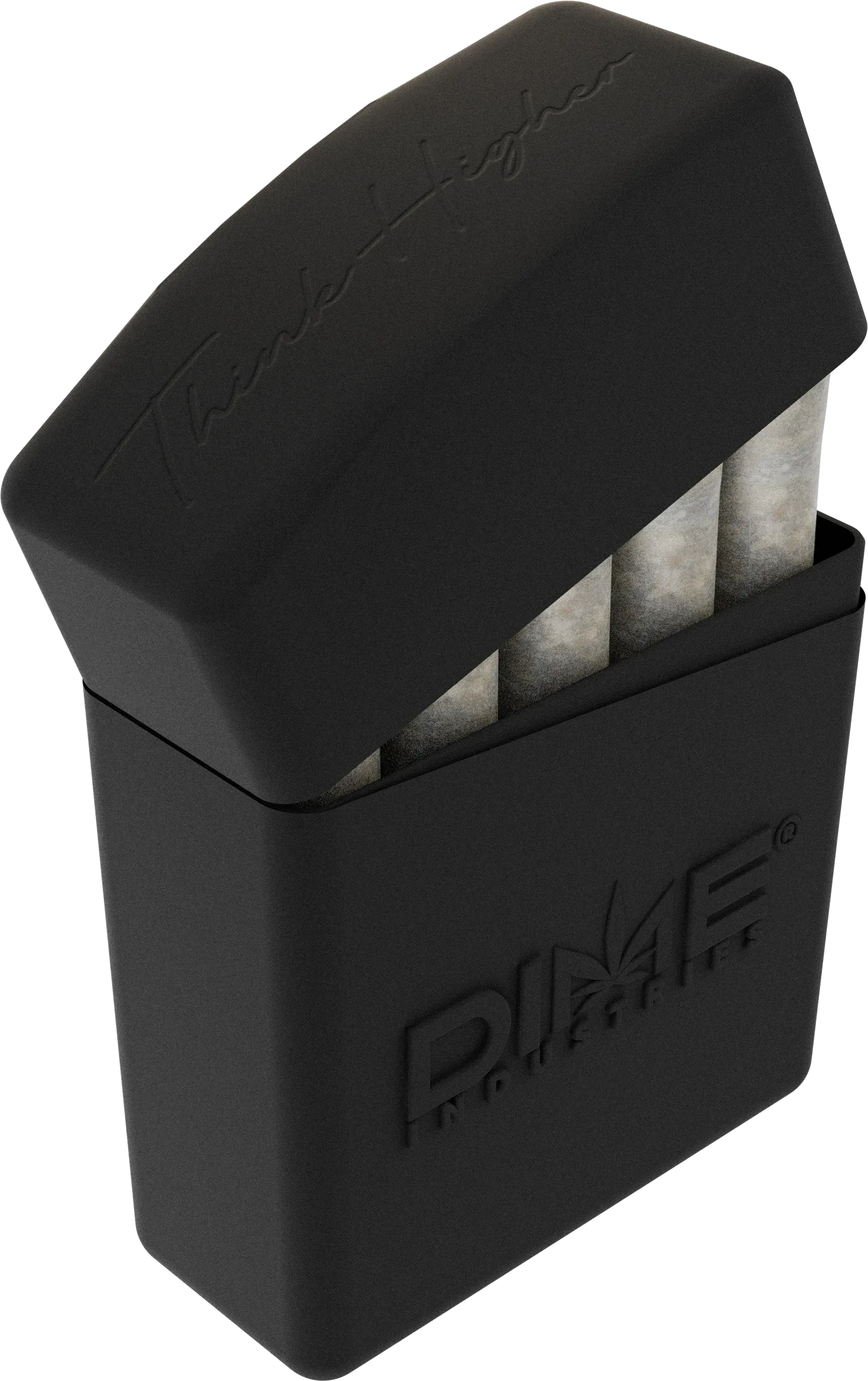
Packaging design and product visualization
A packaging refresh for Dime’s ten-pack of infused pre-rolls, from the retail pack and product renders to the buyer’s kit and launch materials.
Watch product showcaseDime wanted a shared design direction for three pre-roll products. DimePack’s existing packaging closely followed the vape line, so the refresh needed its own identity, clearer product imagery and materials for launch.
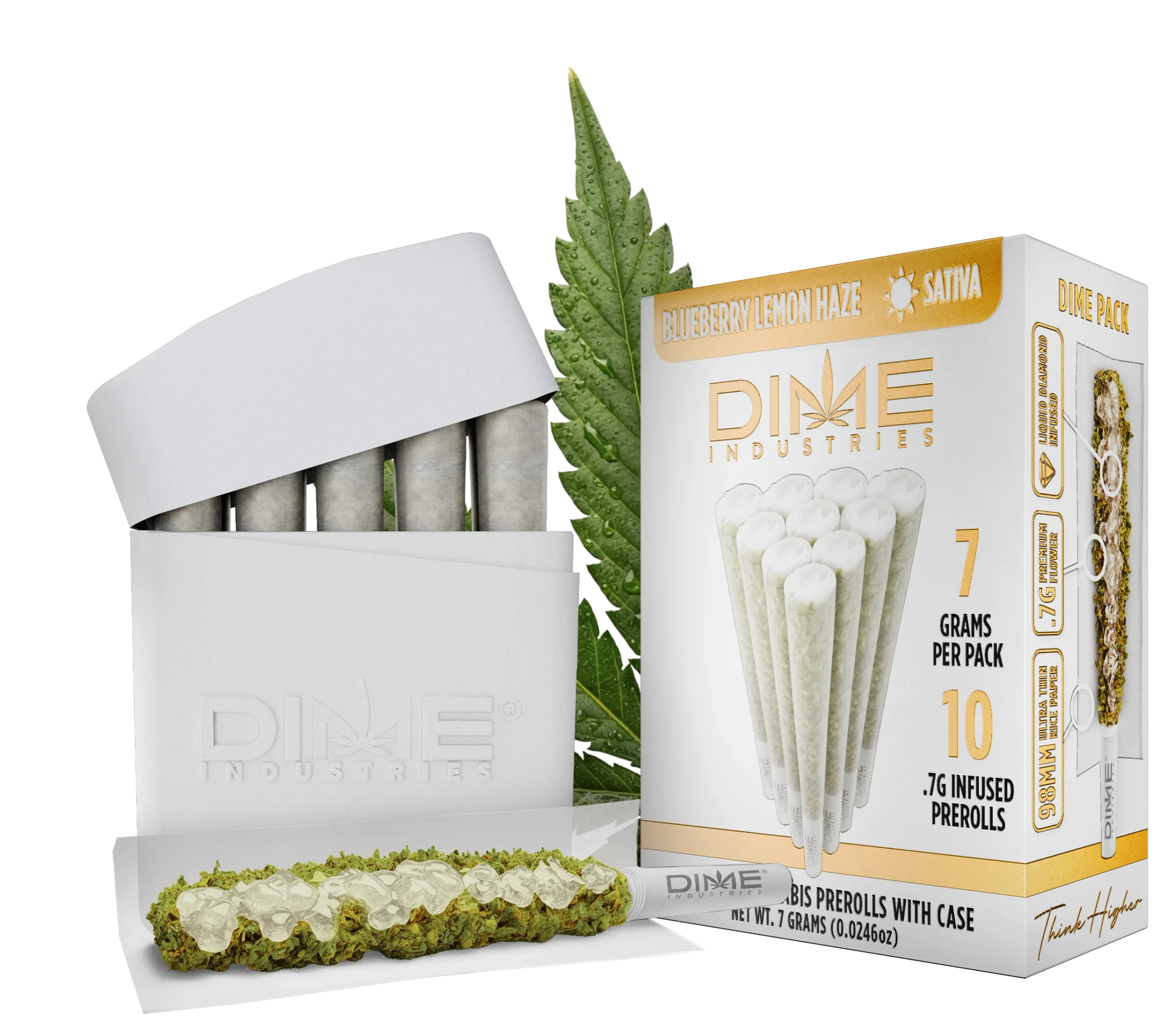
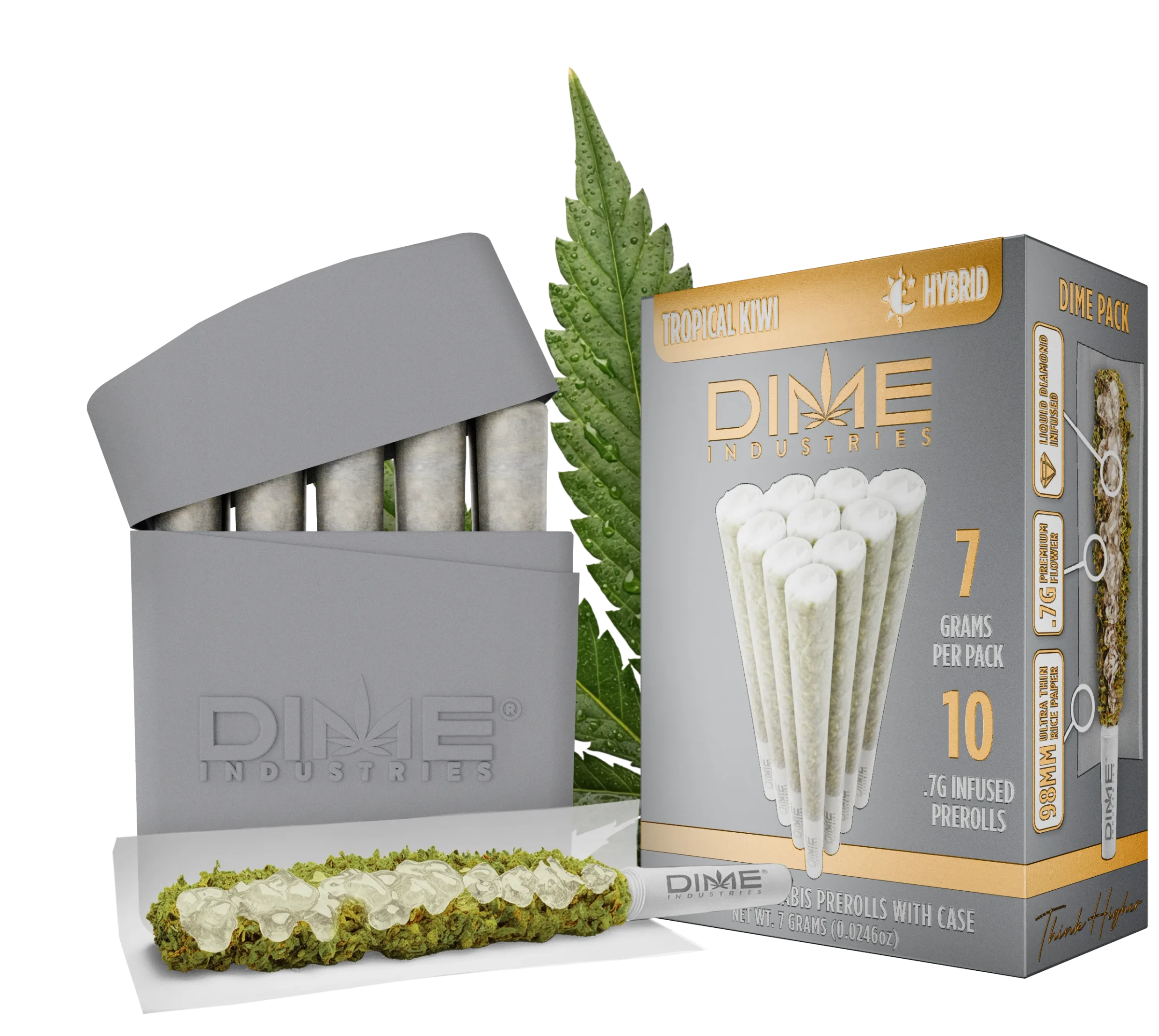
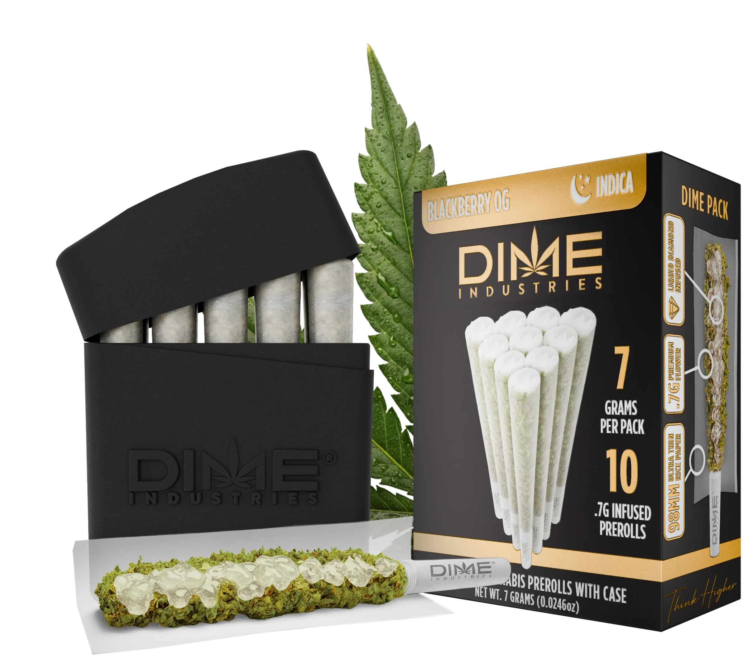
I developed the packaging artwork and colorways, rebuilt the pre-roll imagery and prepared the files for print. The same visual system carried into the master cases, sample tube, buyer’s kit and campaign.
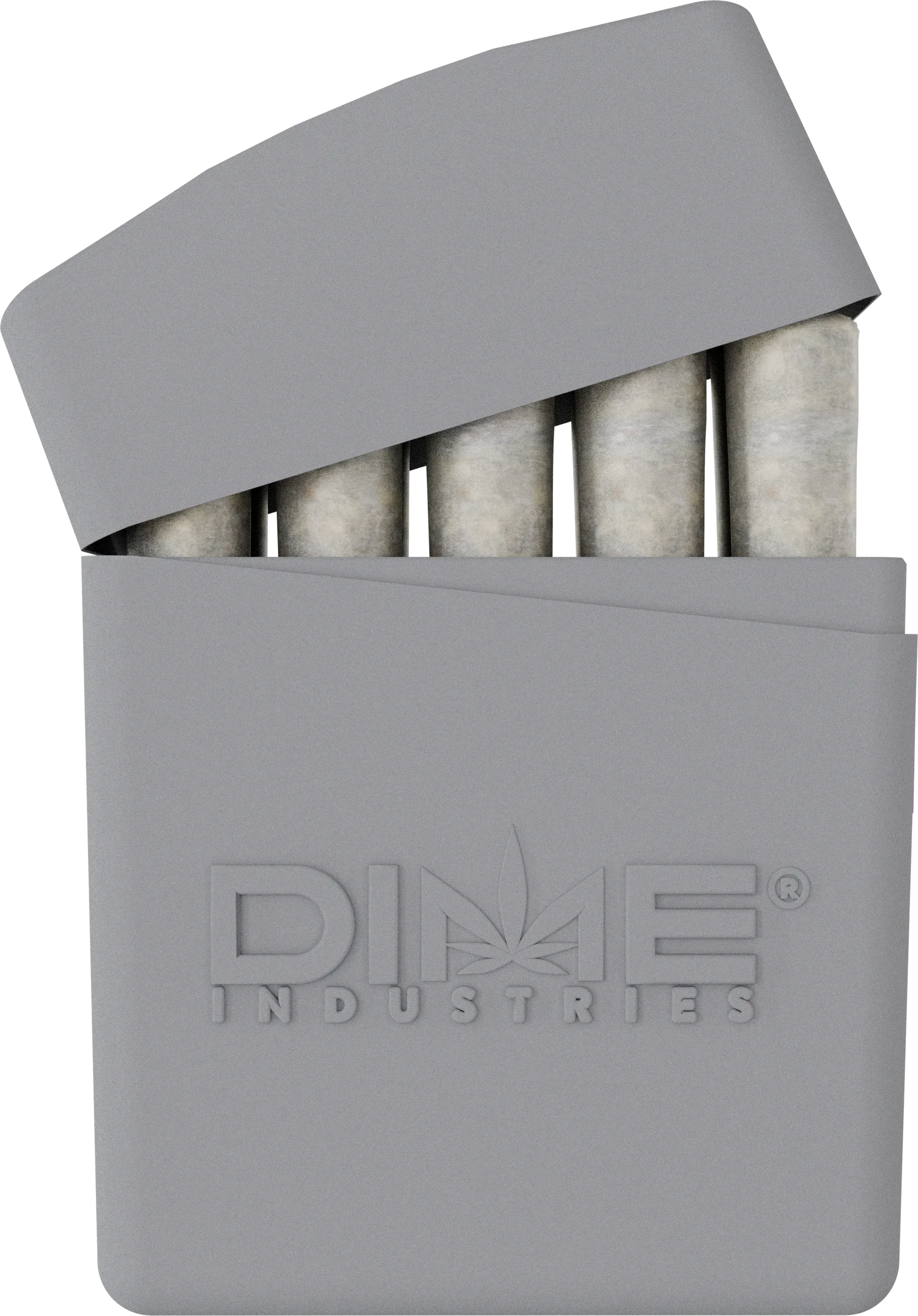
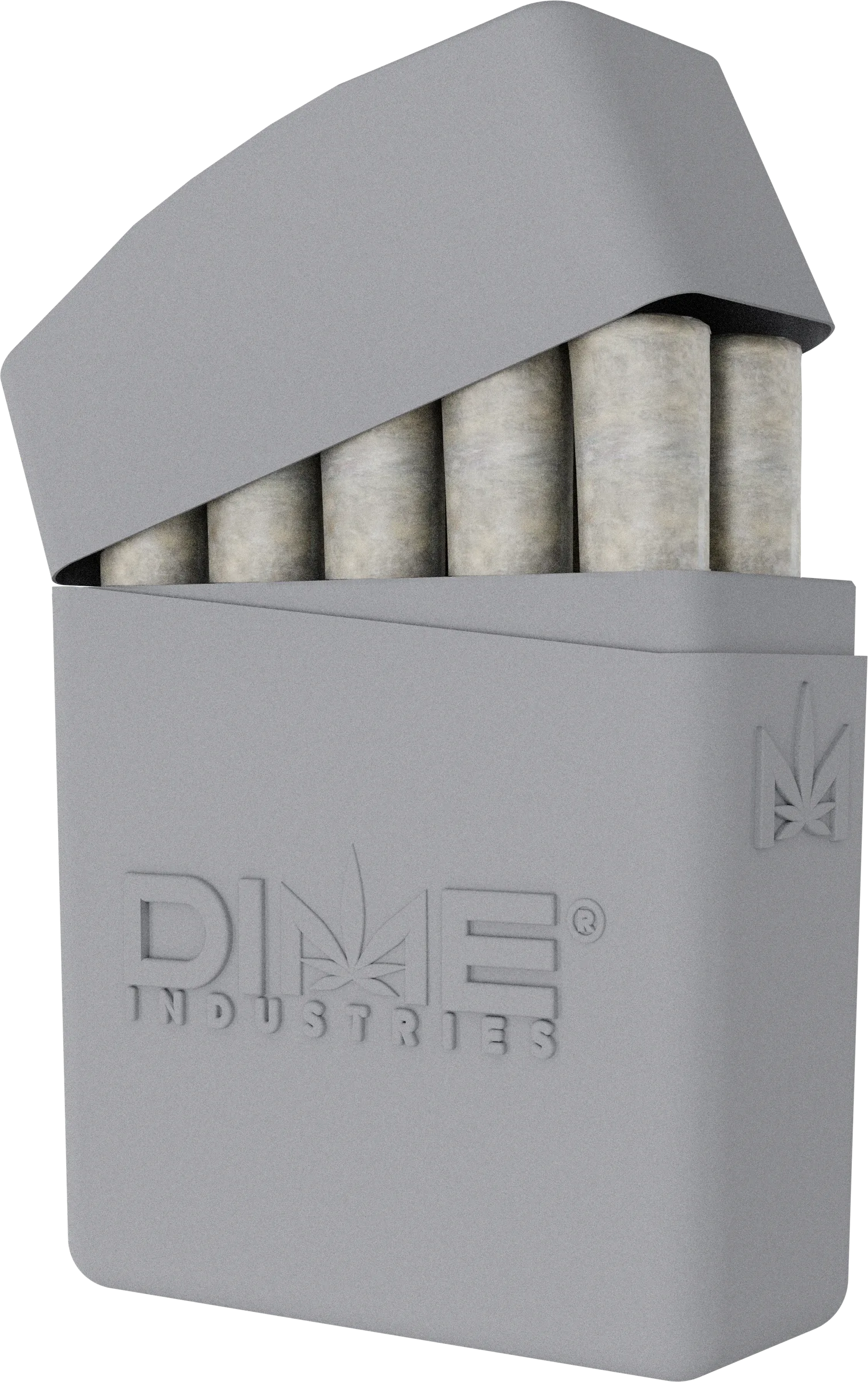
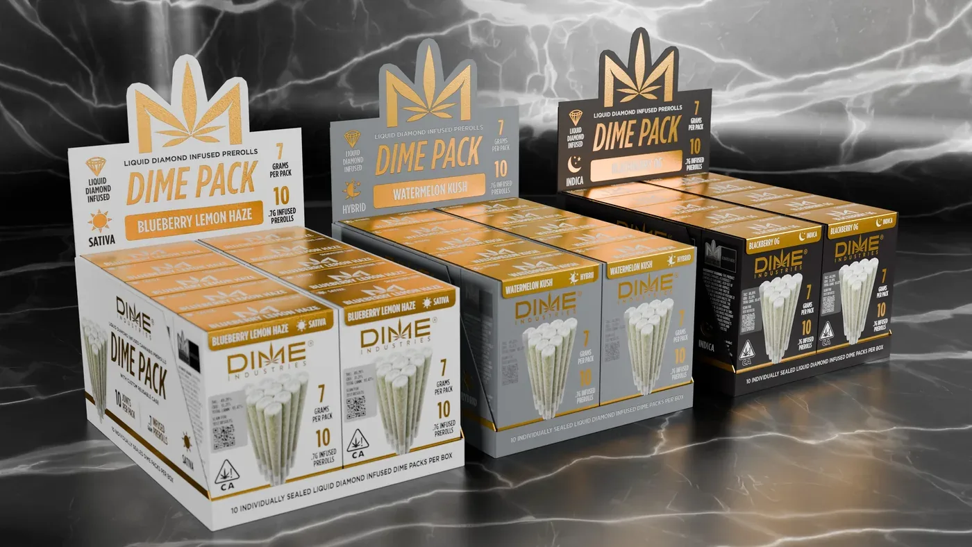
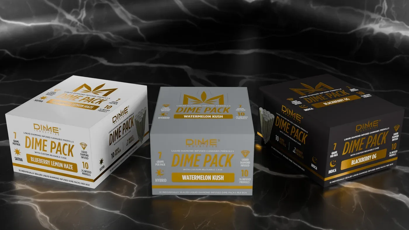
White, gray and black distinguish Sativa, Hybrid and Indica at a glance. Shared gold details and a consistent information layout keep the three variants recognizable as one range.
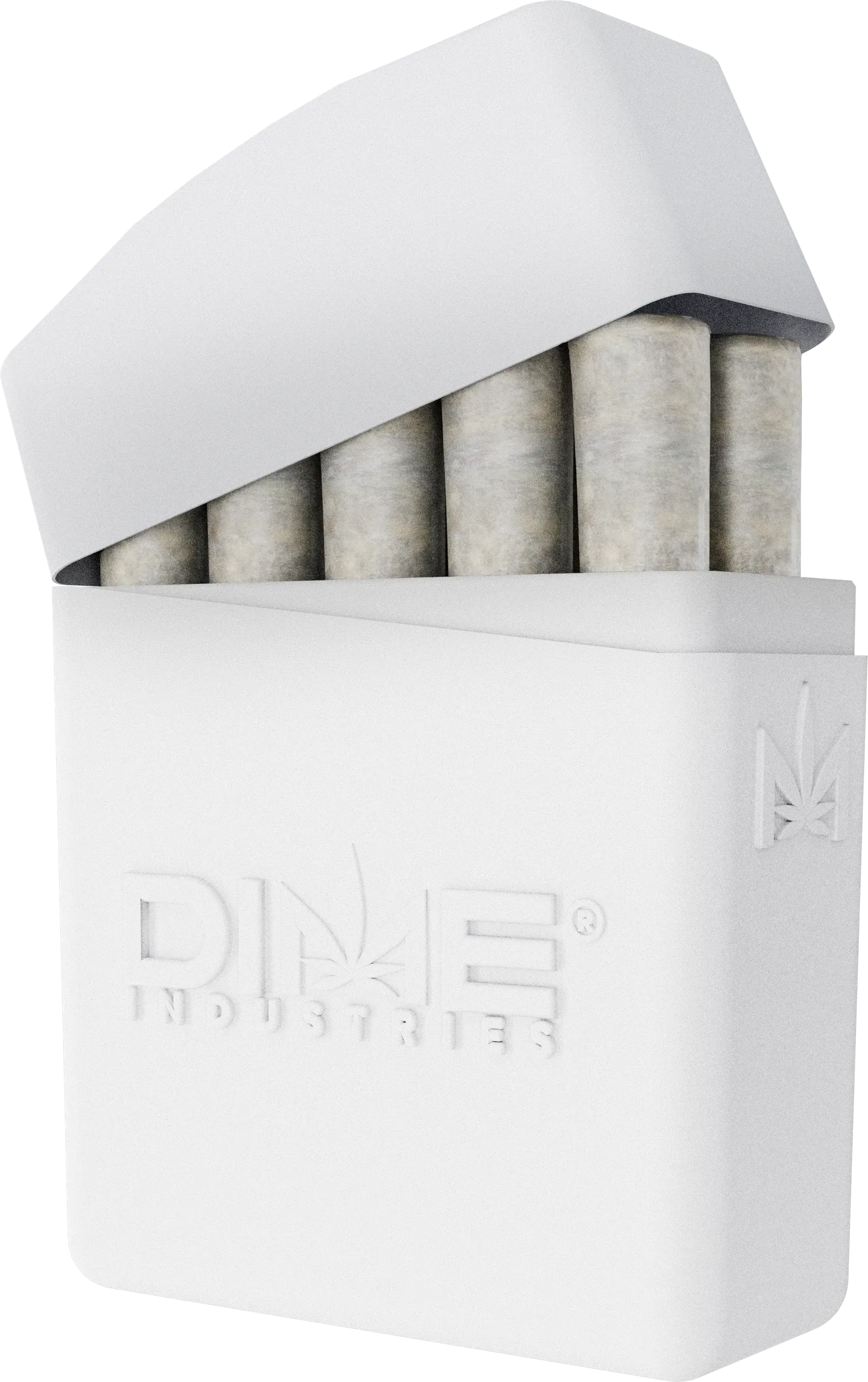
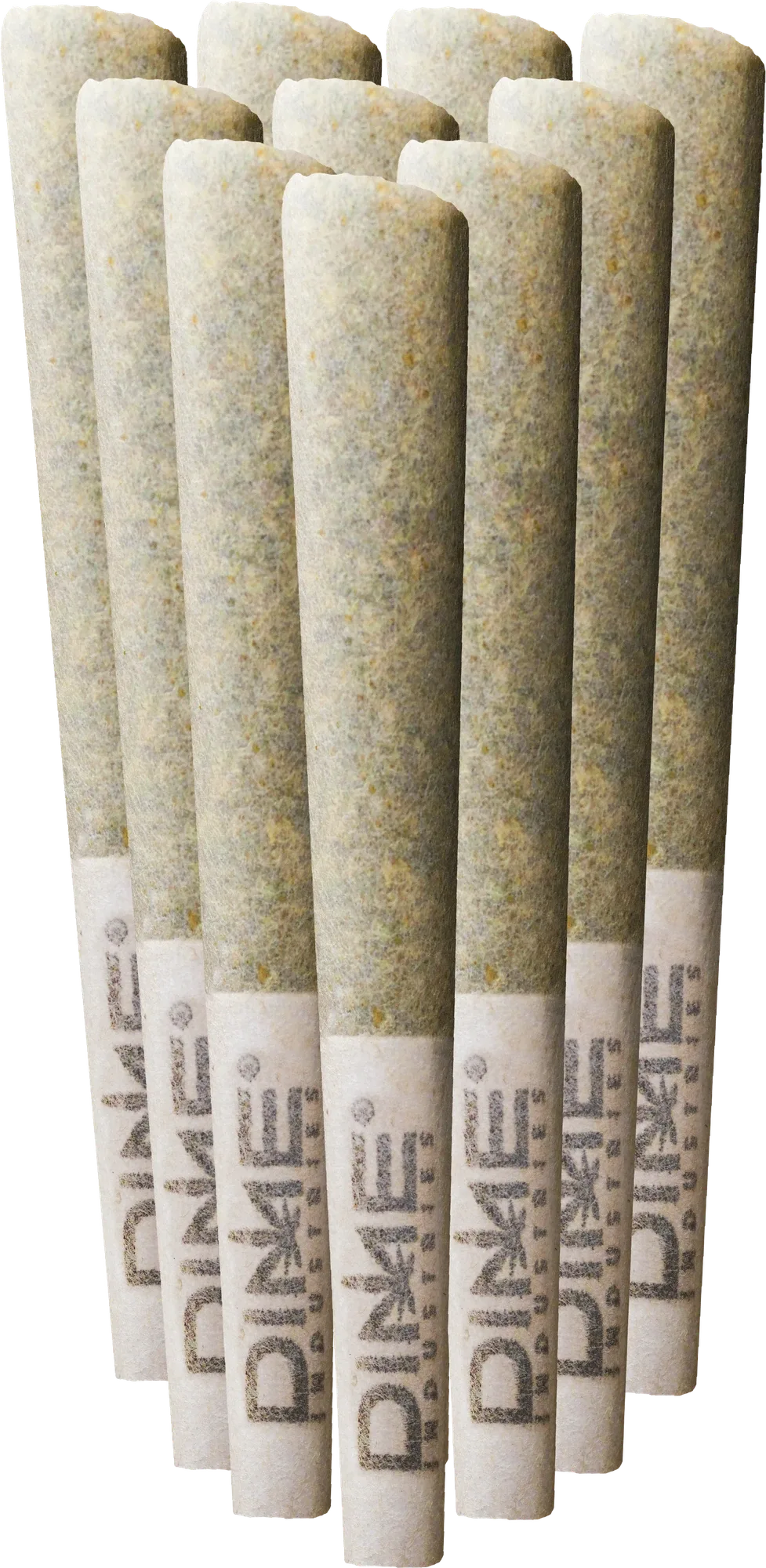
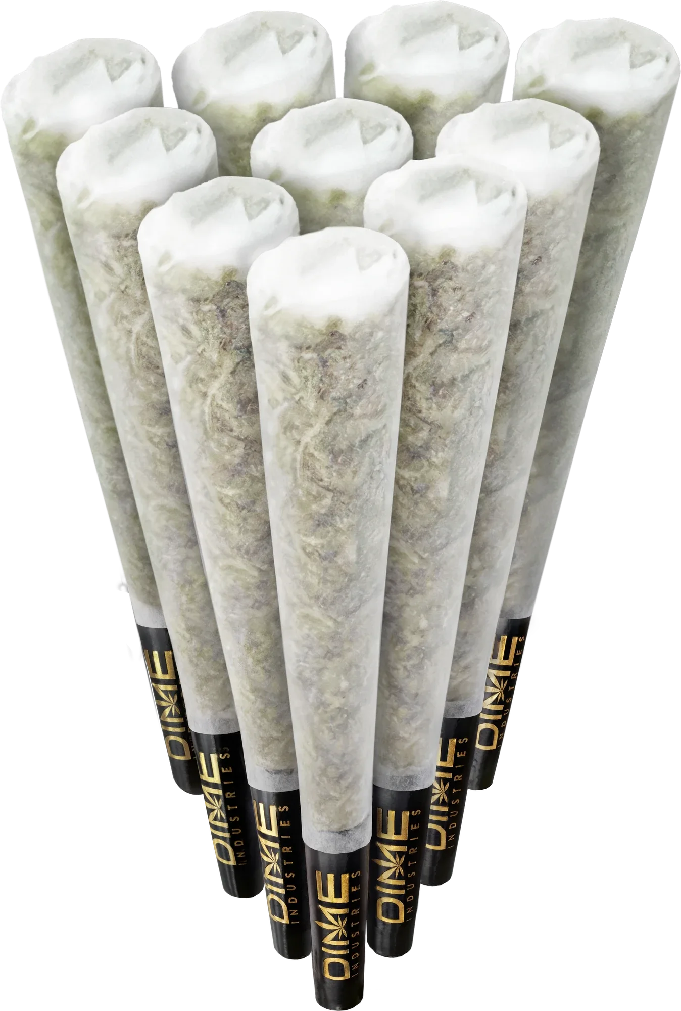
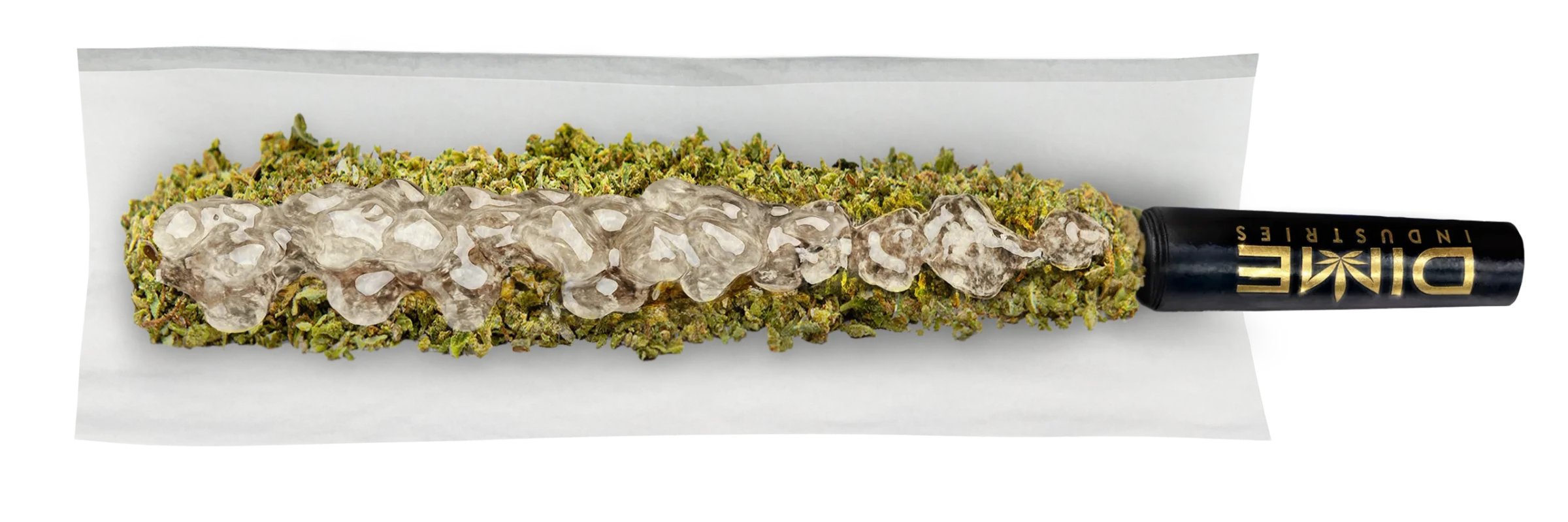
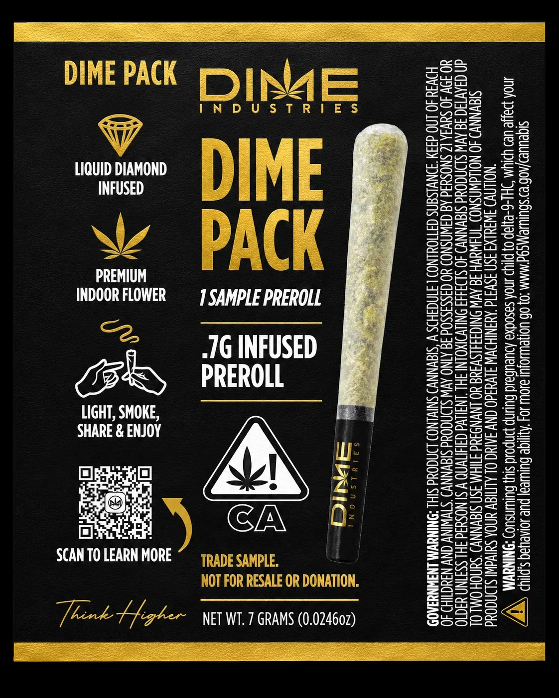
The front groups ten pre-rolls to show the pack format. The side panel uses an open pre-roll render to show what’s inside, and the reverse carries the product information.
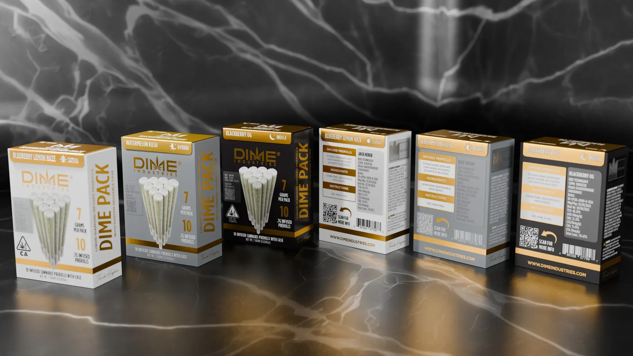
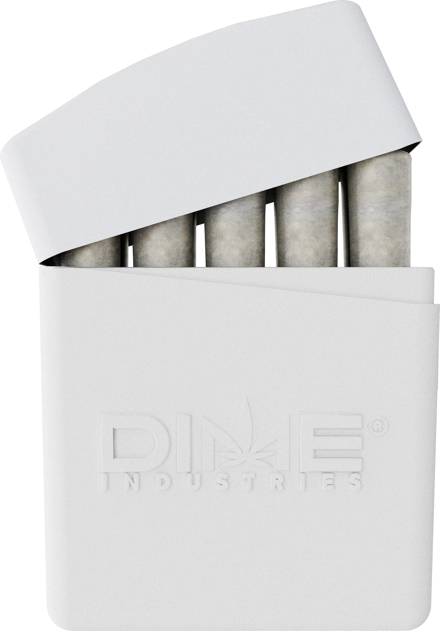
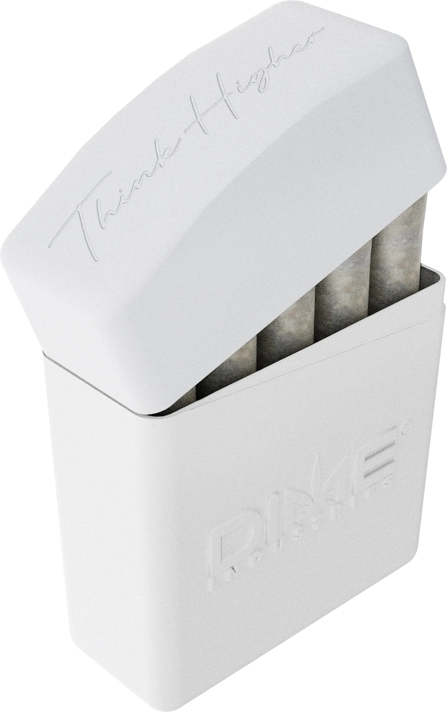
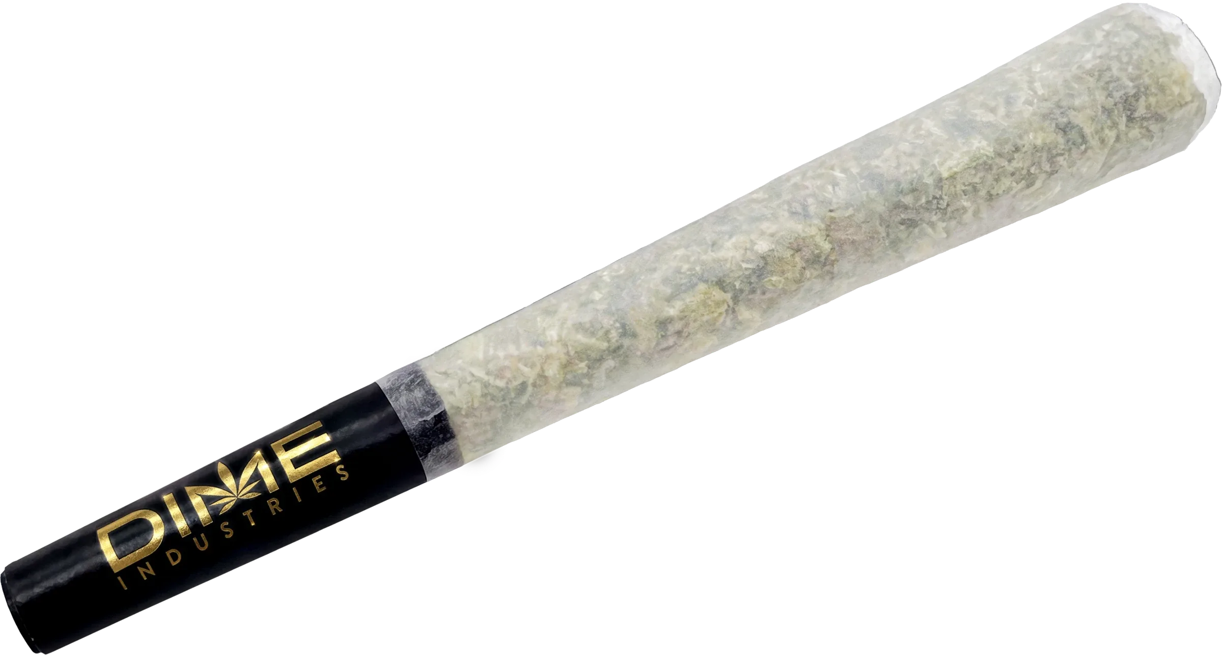
The rebuilt renders give the paper a more natural texture and show the folded ends and contents in more detail. The grouped view was composed for the front of the pack, with individual and open views for close-ups.
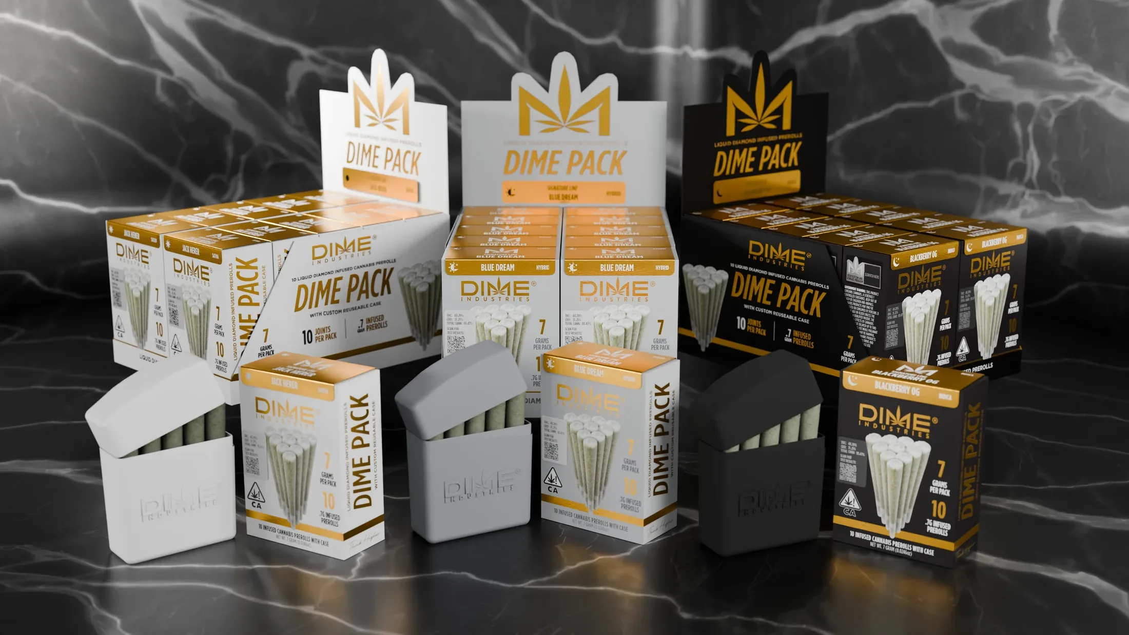
The master case doubles as a retail display. The open view shows how the individual packs sit together, with the product name and strain information carried onto the larger display artwork.
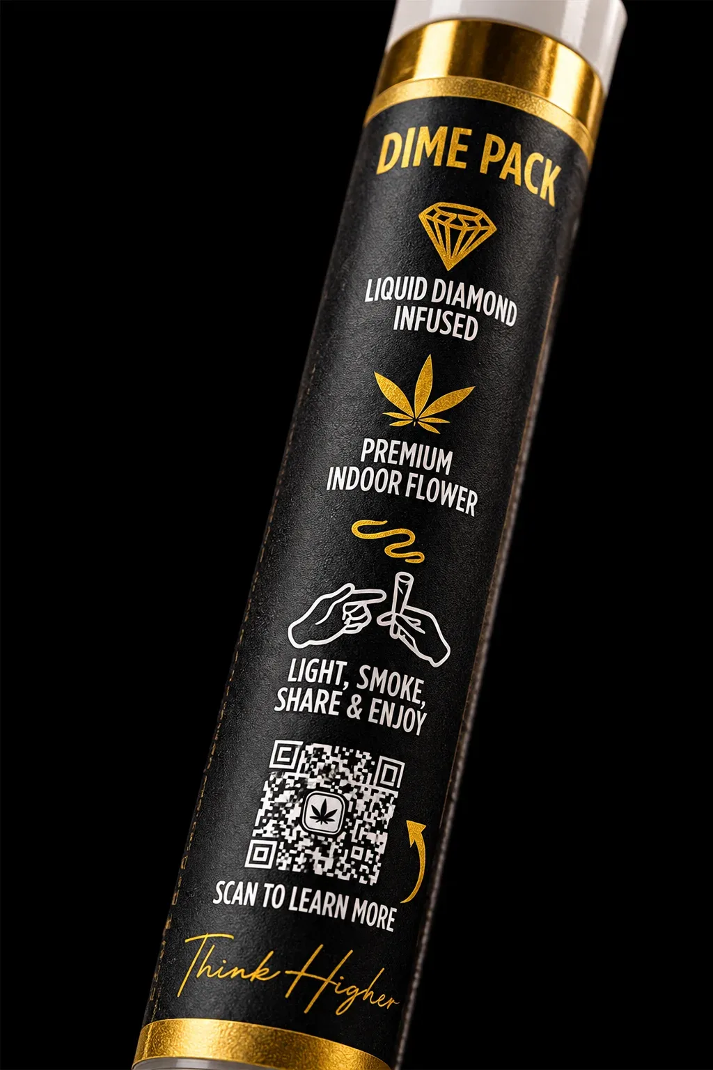
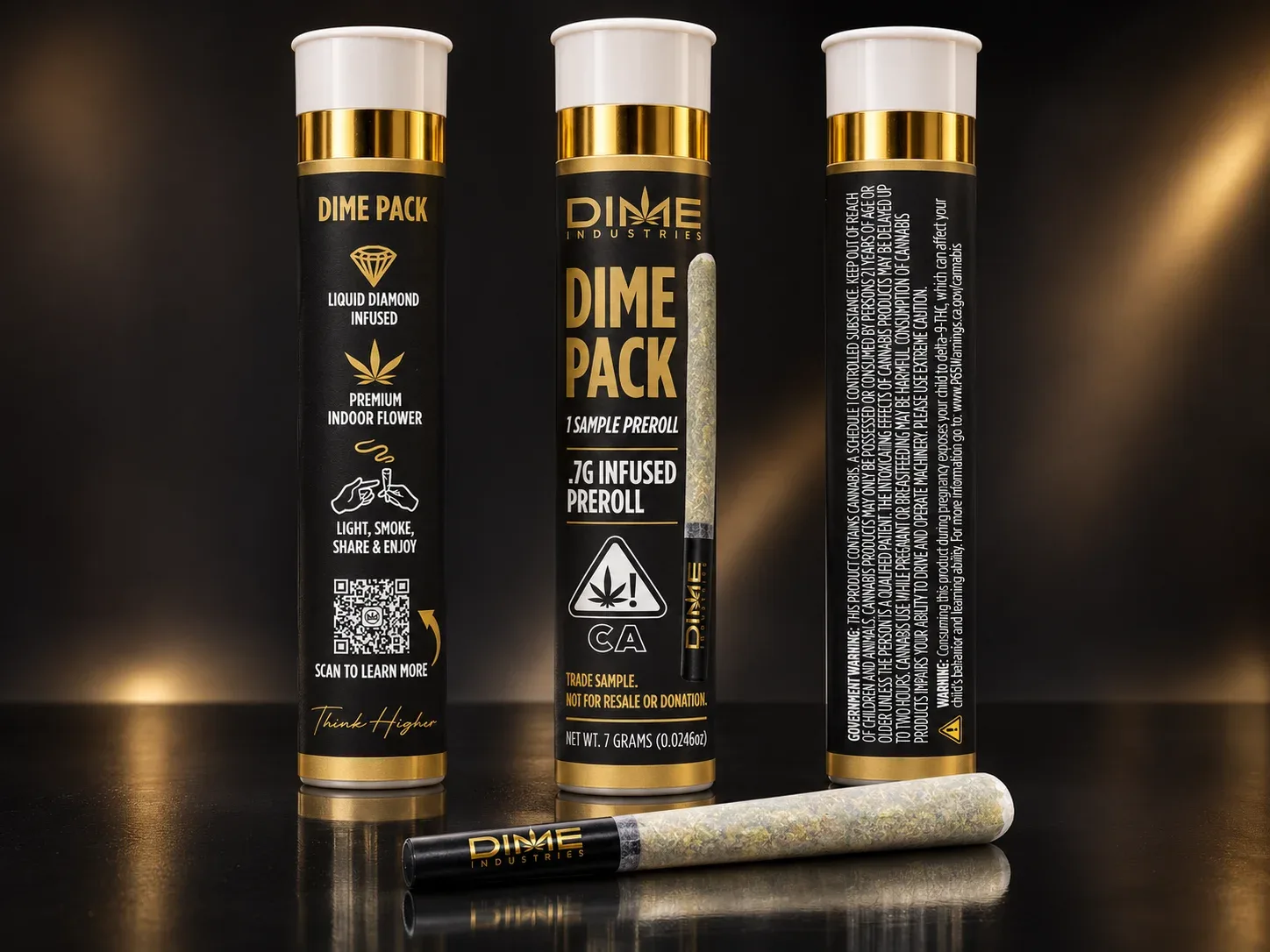
The single-joint sample tube uses the same black-and-gold palette and pre-roll imagery as the larger pack. The lettering and product details are arranged to read around the narrower, curved surface.
The buyer’s kit introduces DimePack to retailers. The lid carries the pack’s gold details into an embossed foil treatment. Inside, a custom product insert and dedicated card holder keep the samples and sales information together. I prepared the separate embossing and foil layers and made finish mockups for the manufacturer.
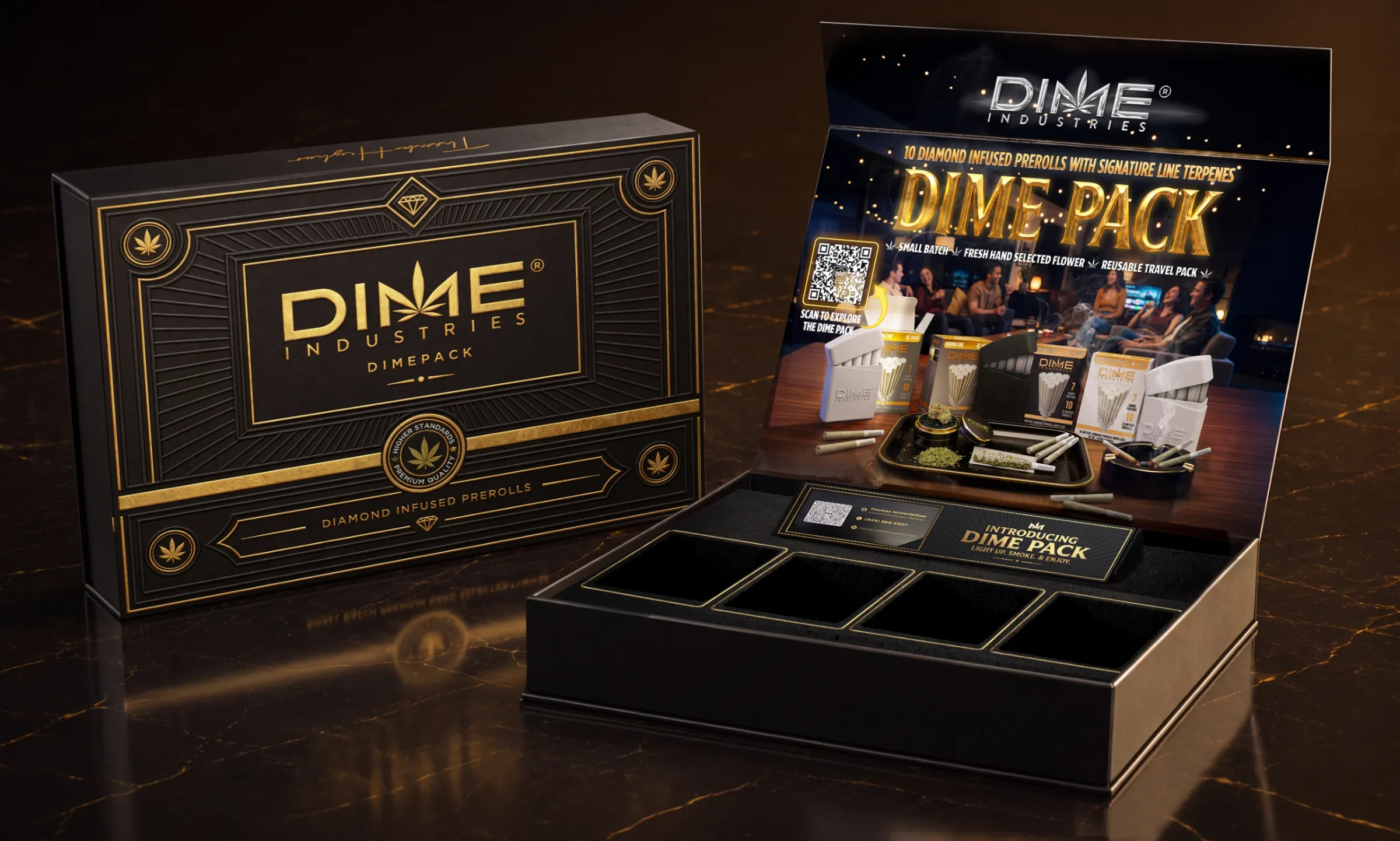
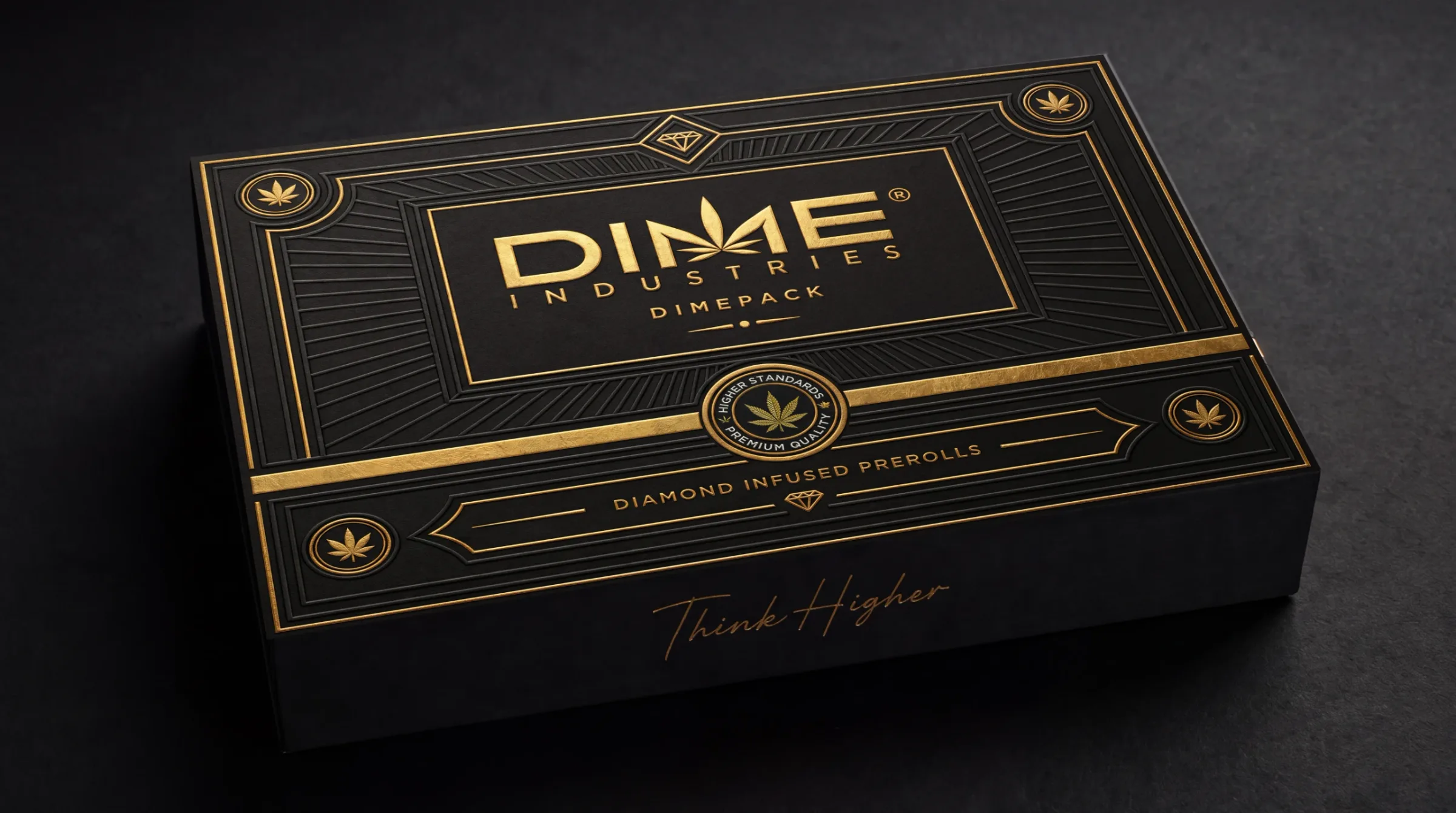
Embossing and gold foil distinguish the DimePack kit within the wider pre-roll range.
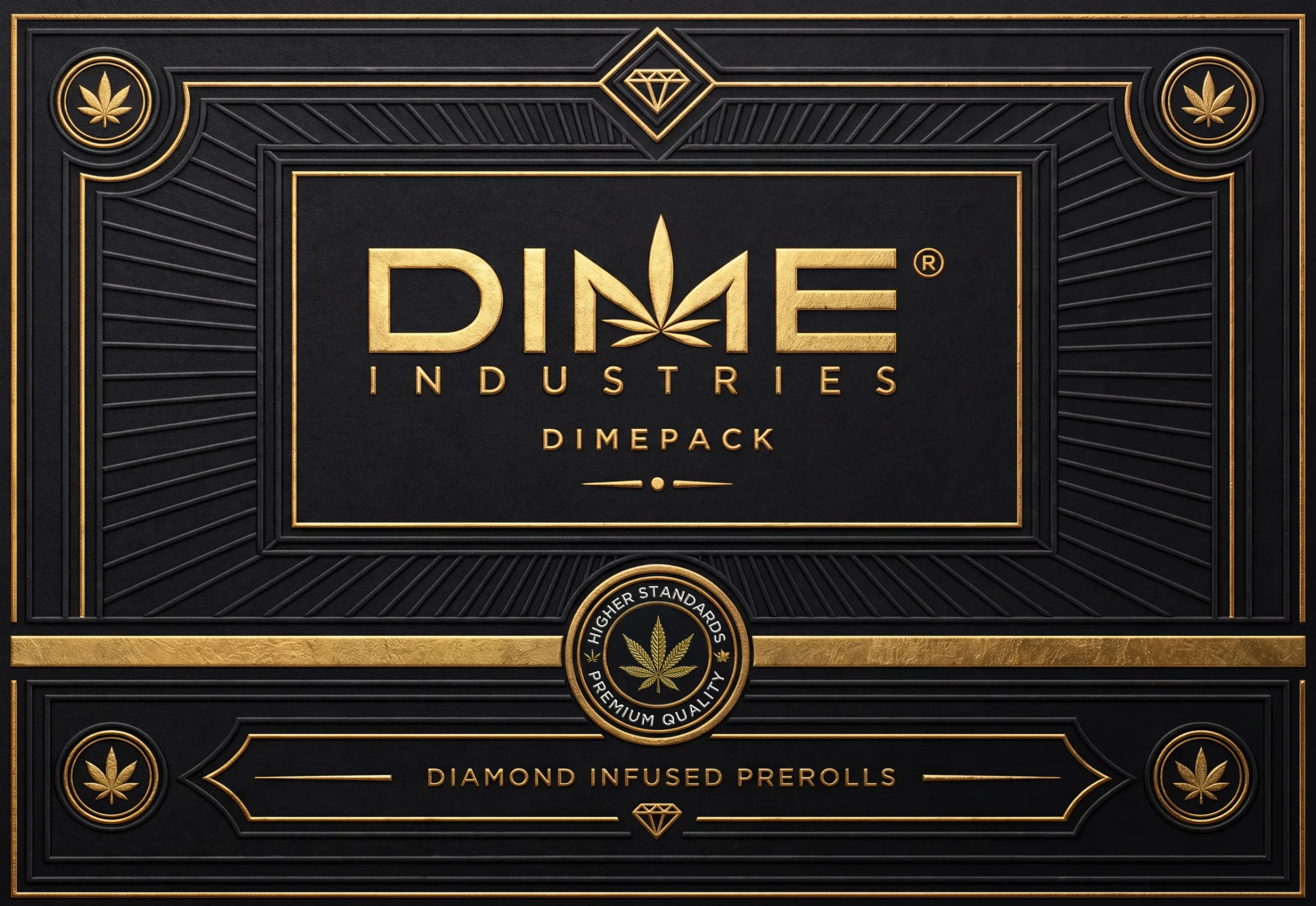
A flat view shows the placement of the finishes for the print manufacturer.
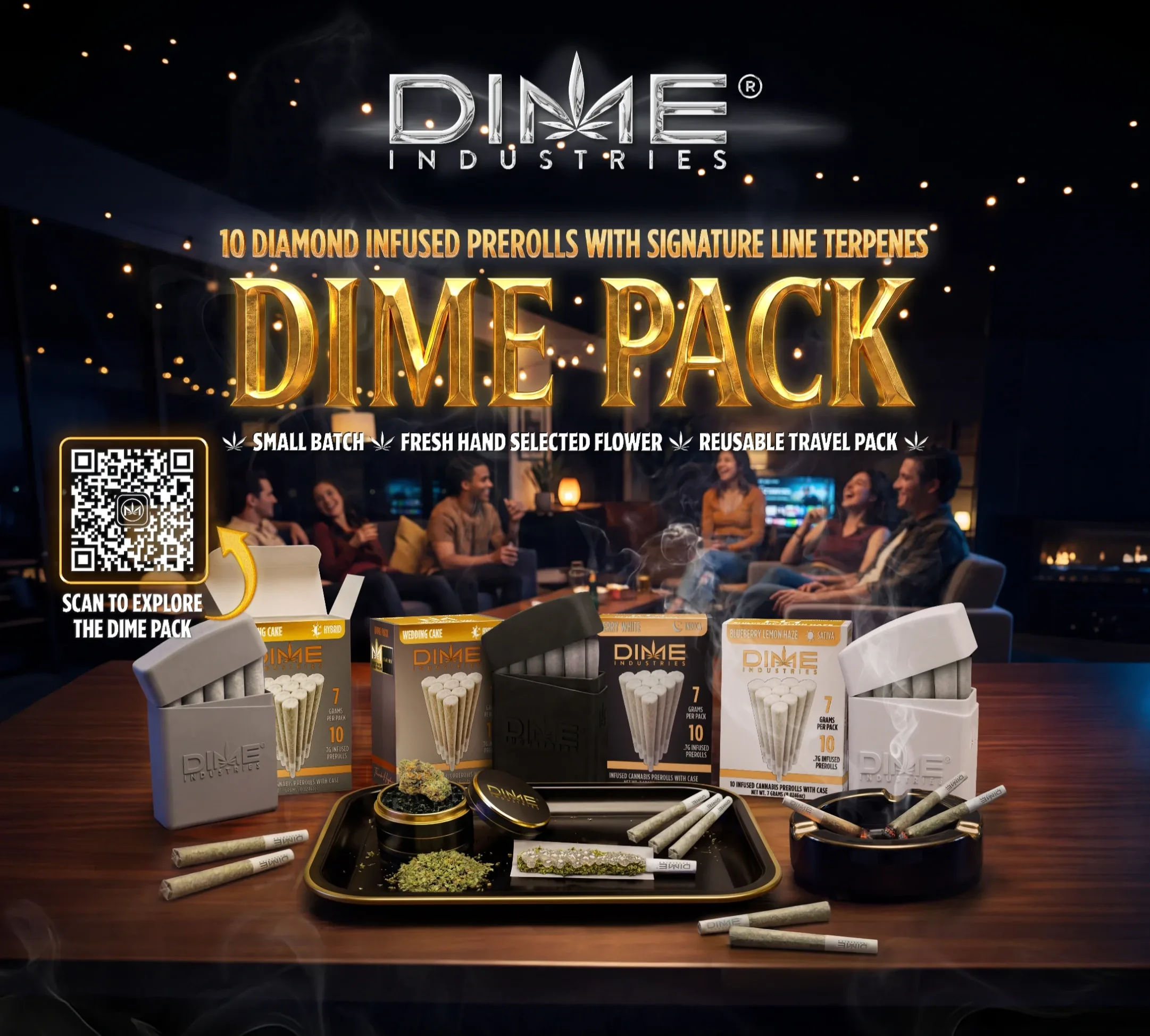
The launch scene was recomposed for the lid with updated pre-roll renders and a QR code linking to product and flavor information.
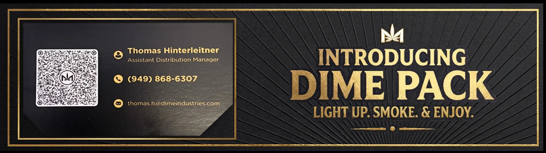
The angled foam gives the sales team a place to leave a business card above the product. Gold foil and embossing carry through to the insert artwork.
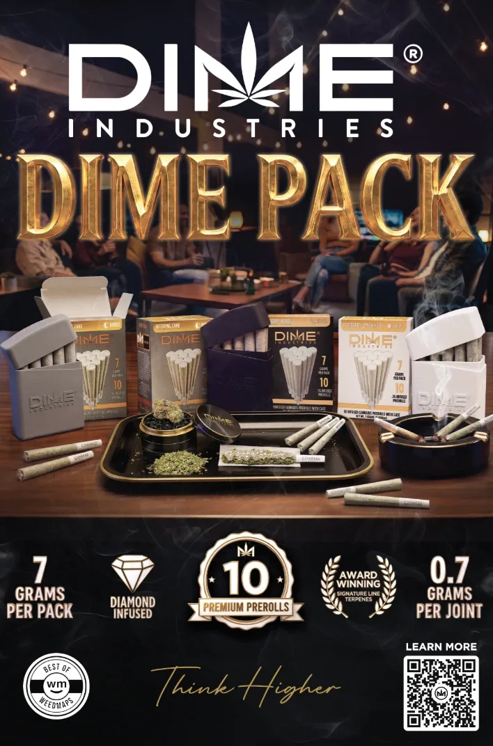
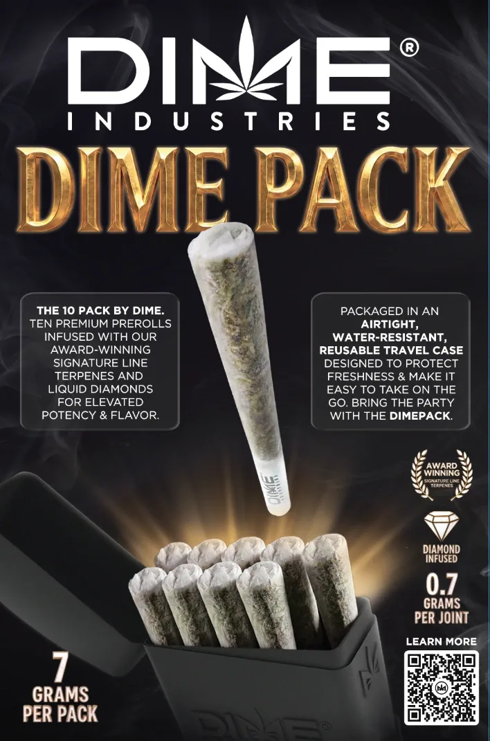
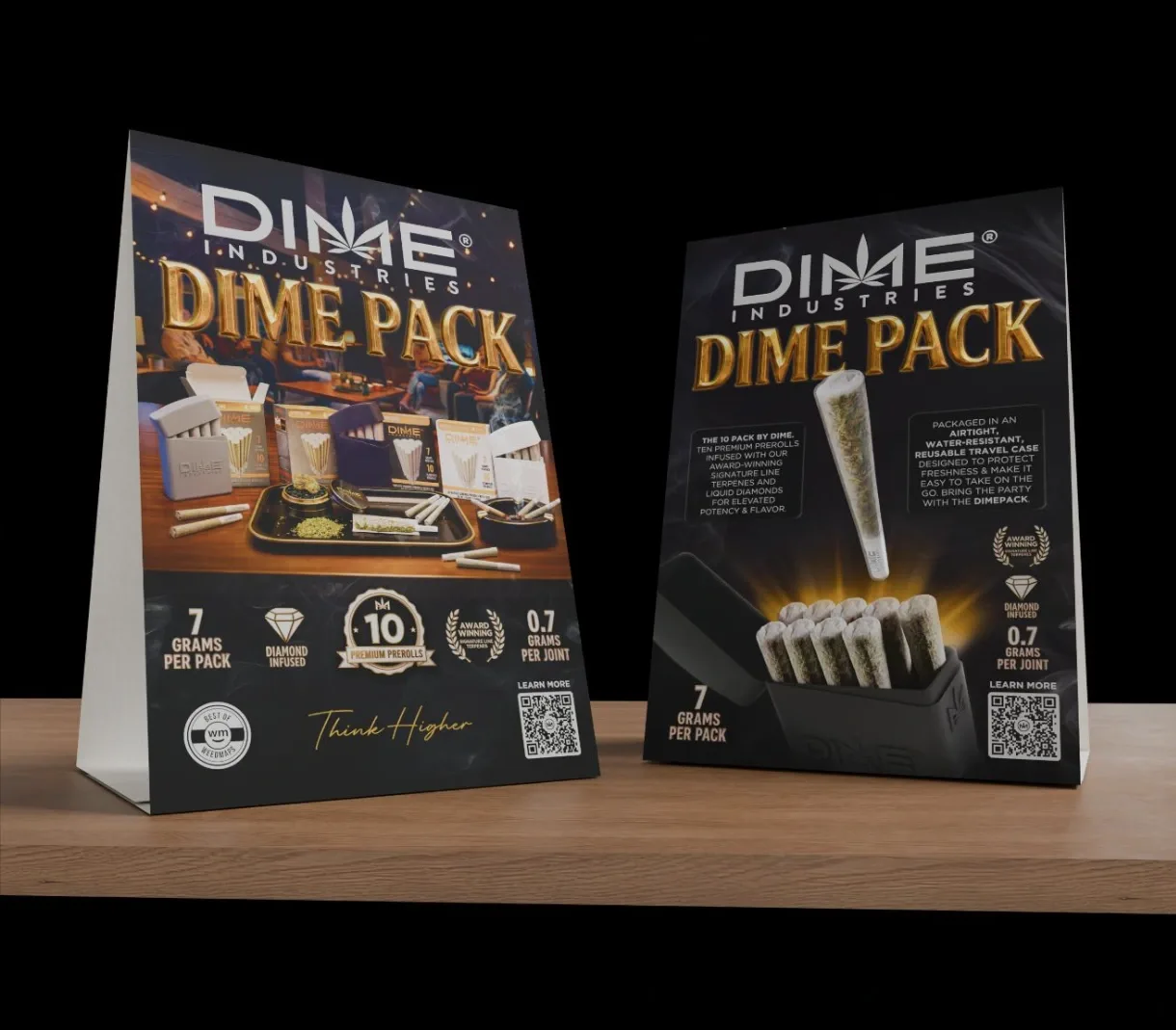
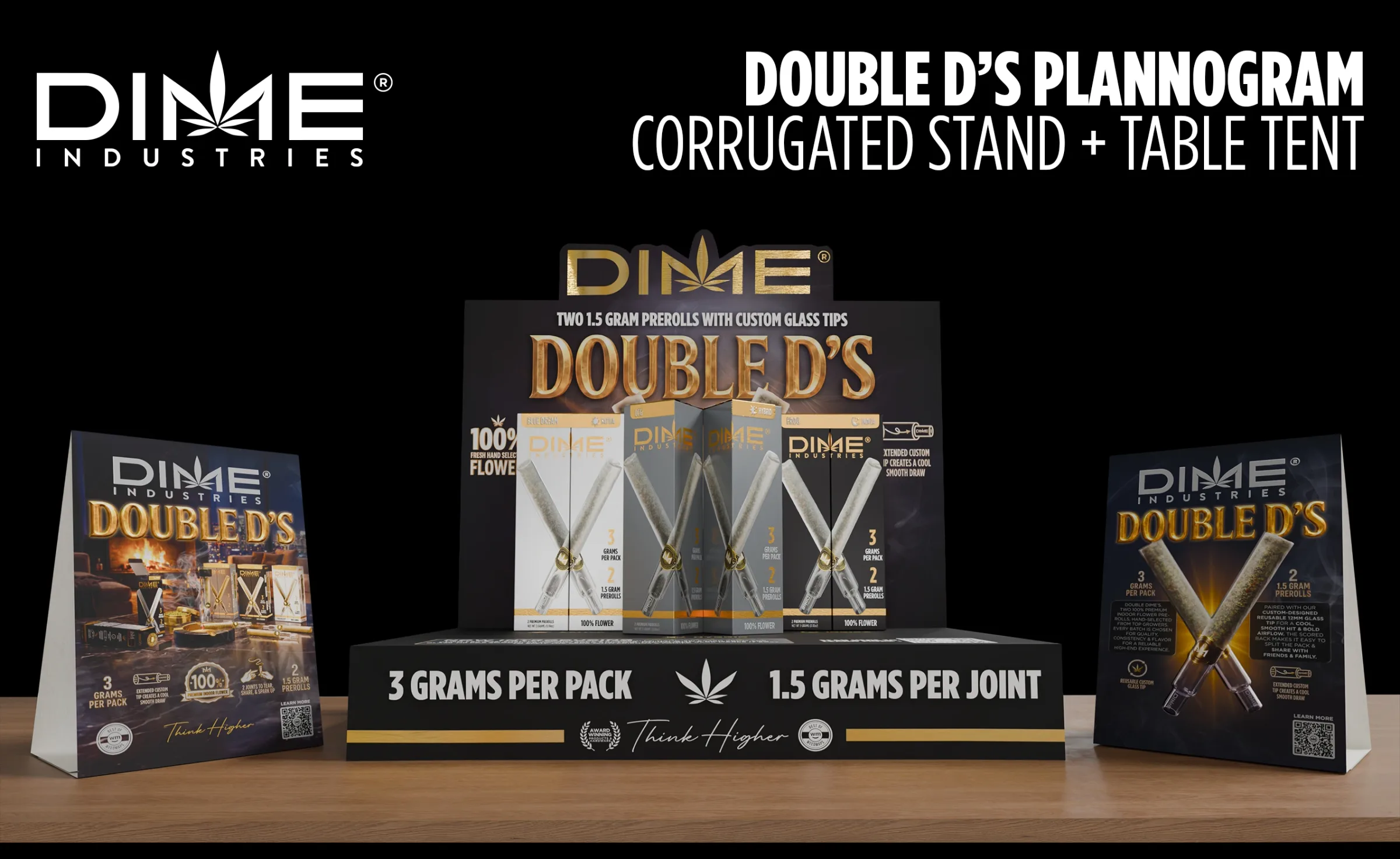
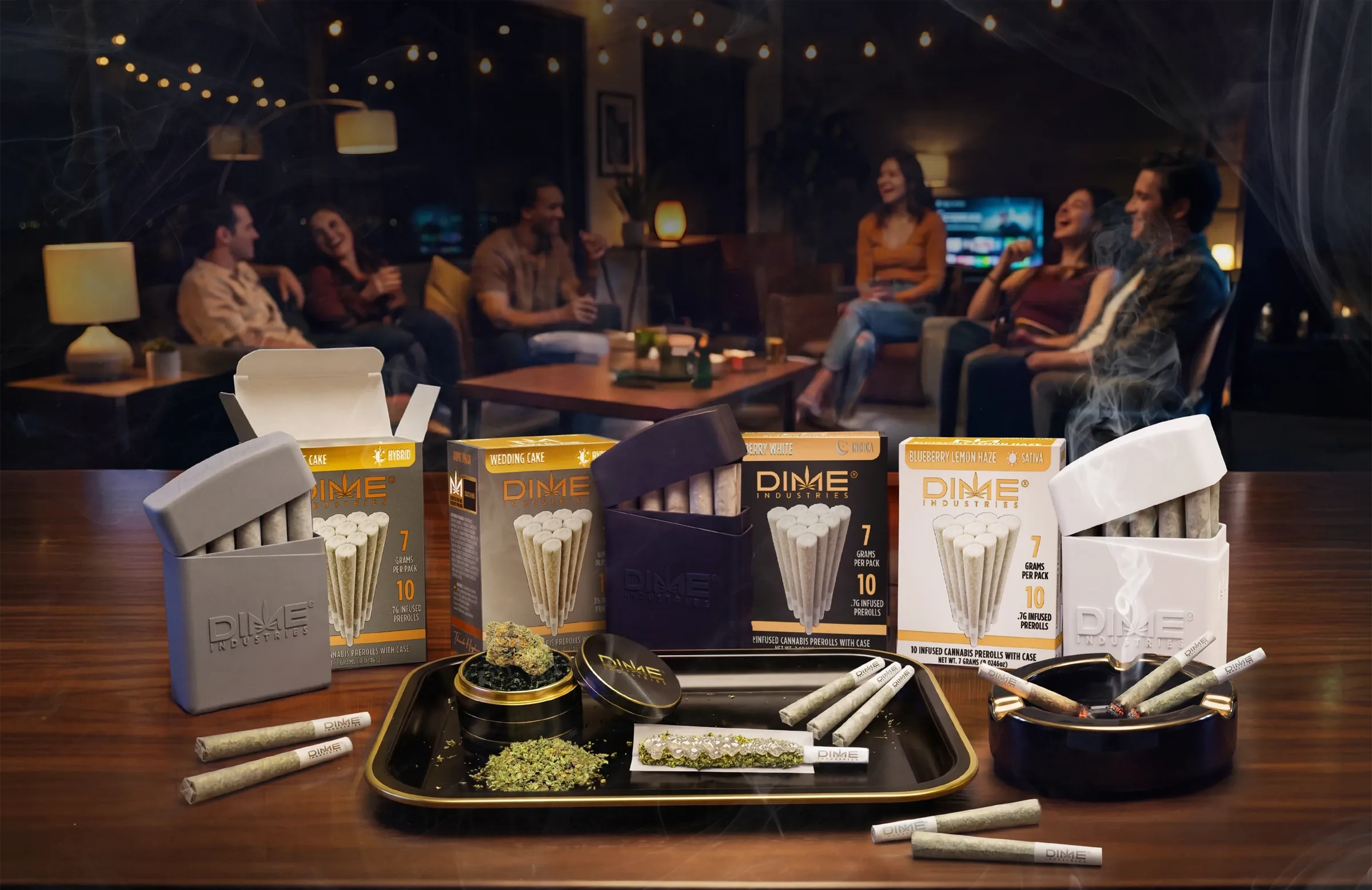
The campaign scene puts the packaging, reusable cases and pre-rolls in context. Postcards, flyers, table tents and digital graphics use those same renders at different scales, with space for the information each format needs.
The film brings the product imagery into motion. I contributed art direction, scenes and product assets. My coworker handled most of the video production.