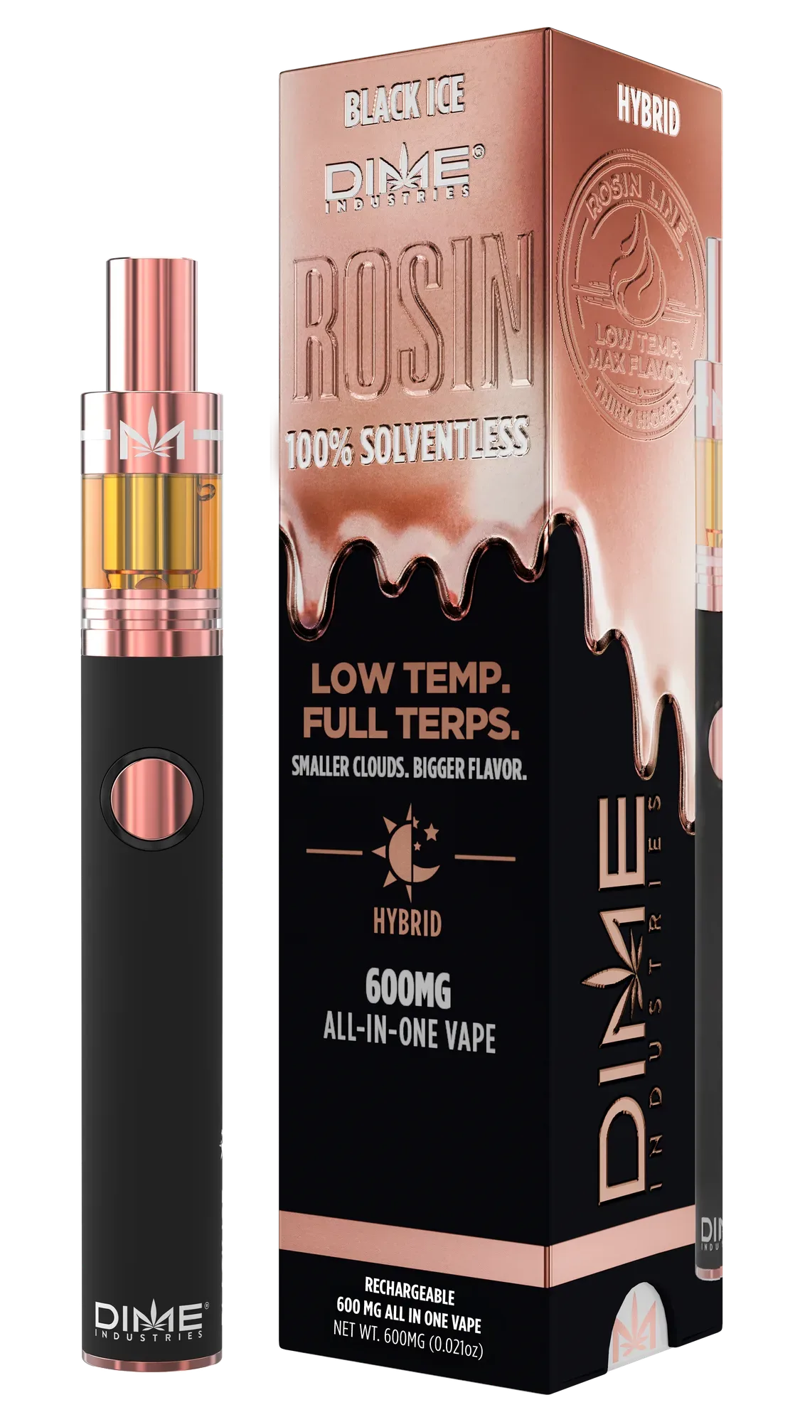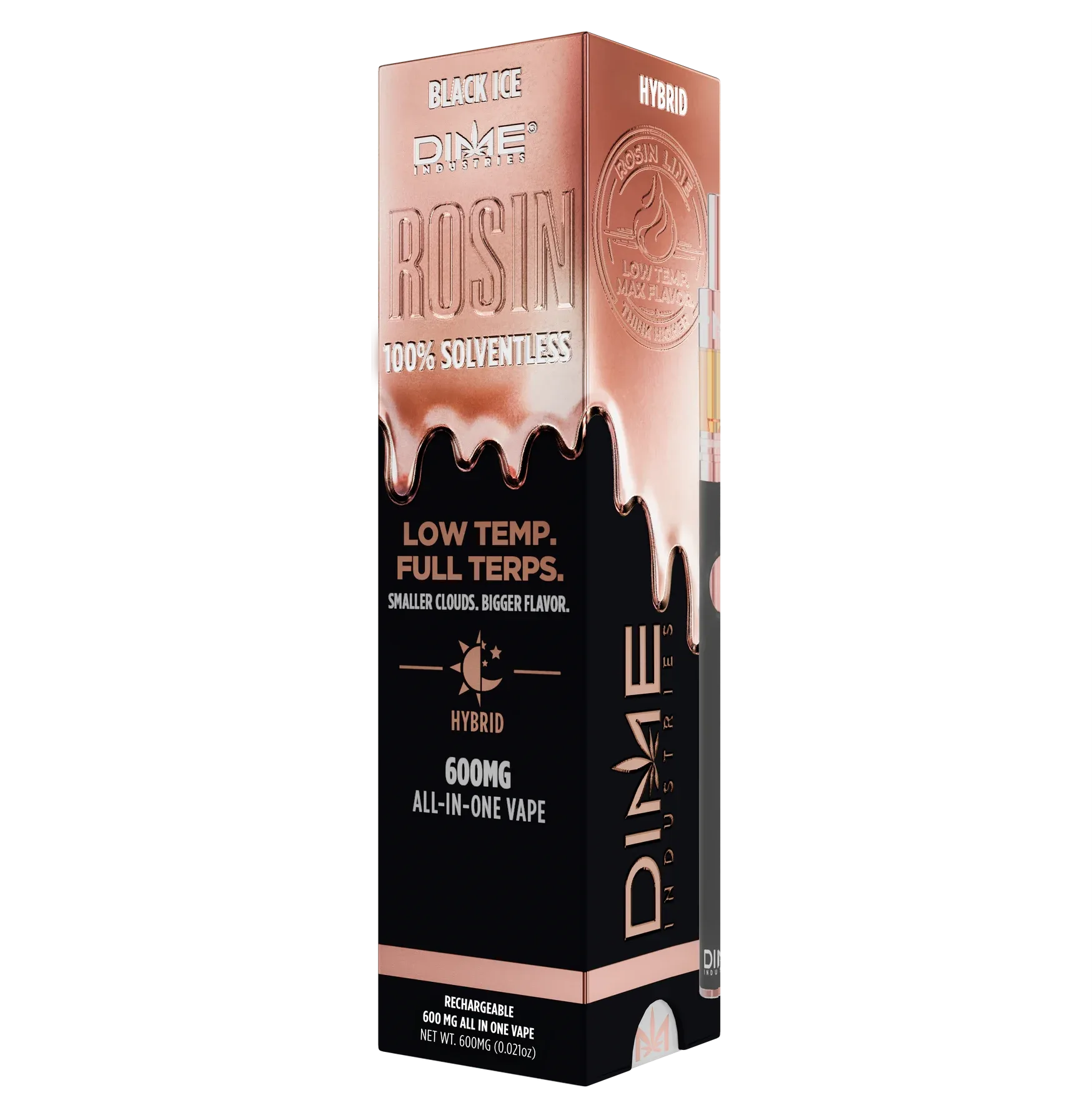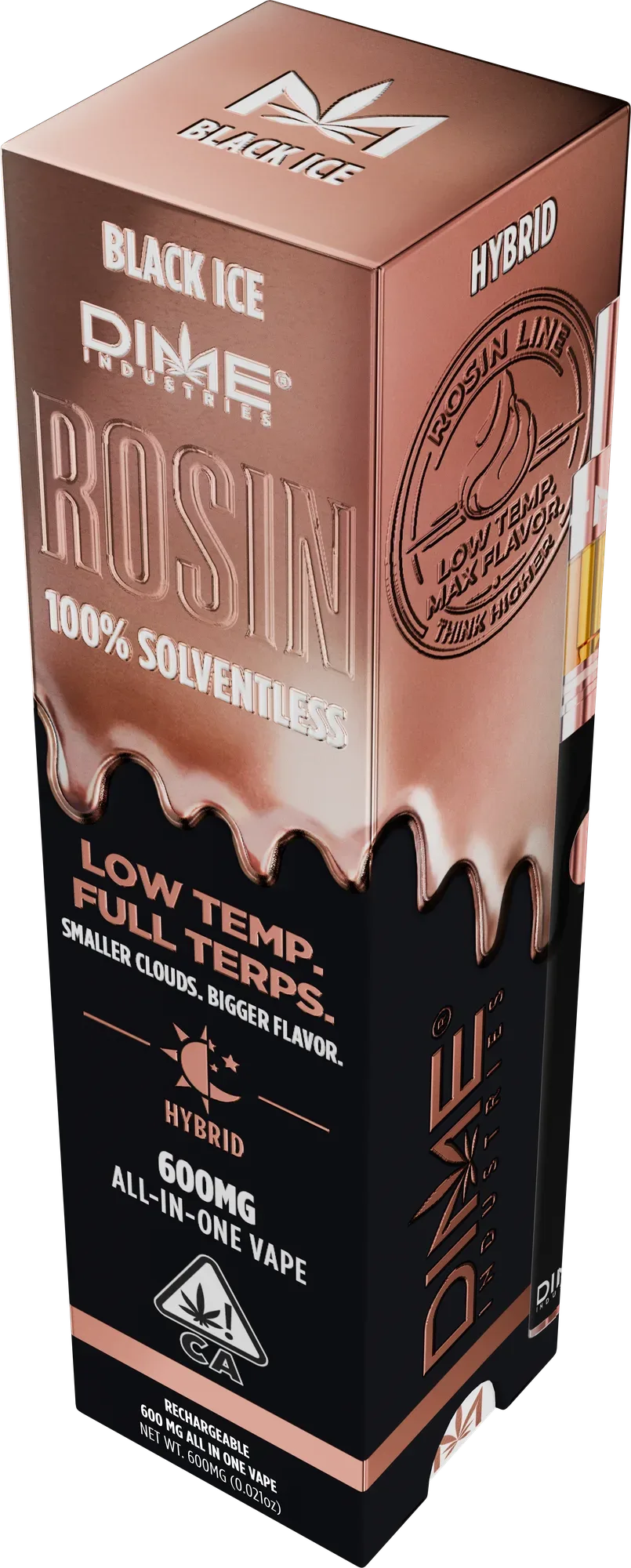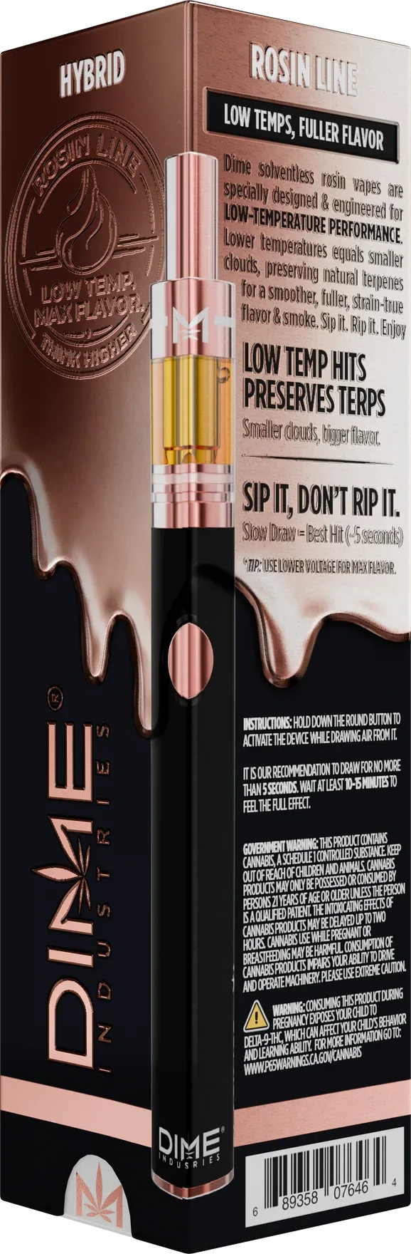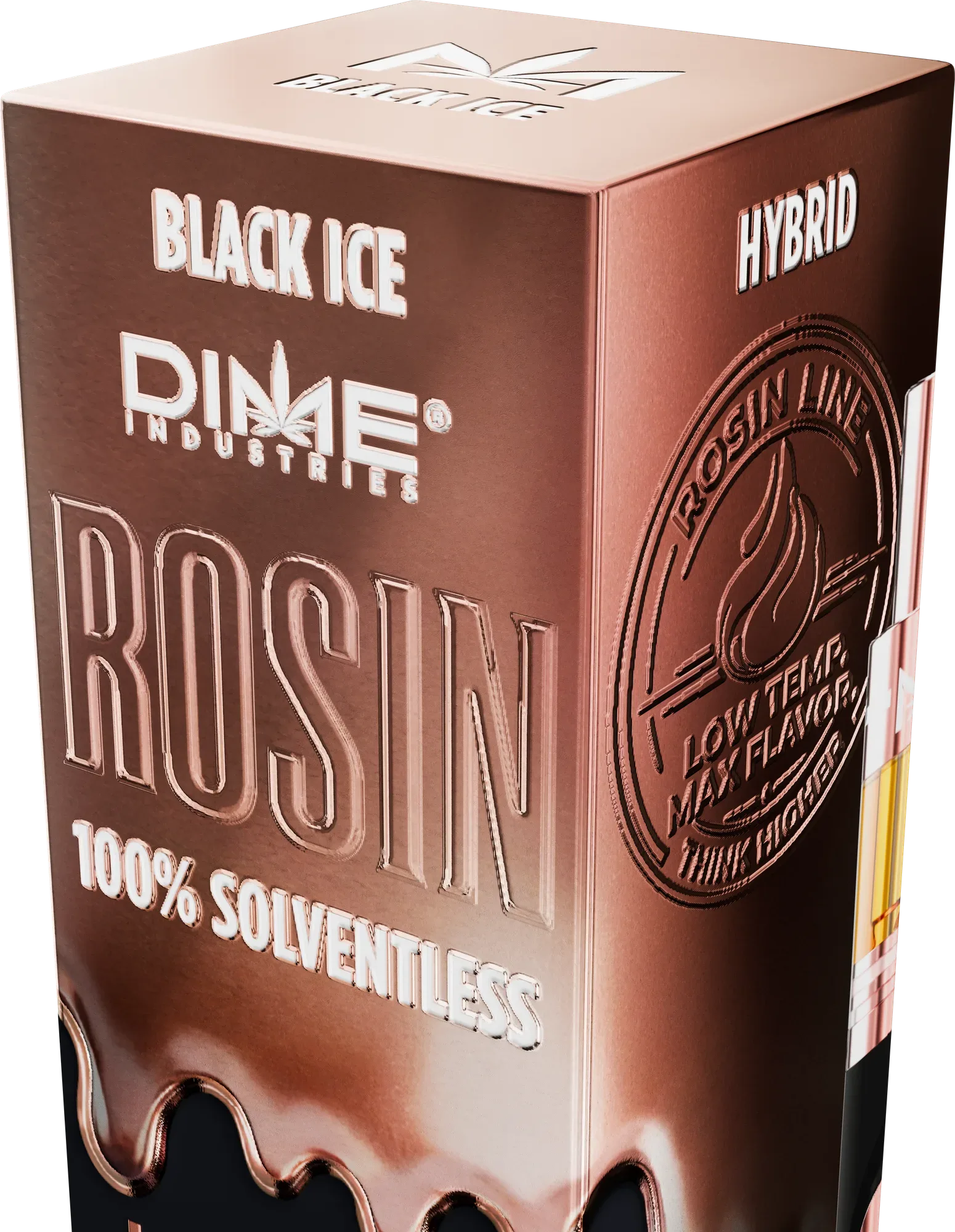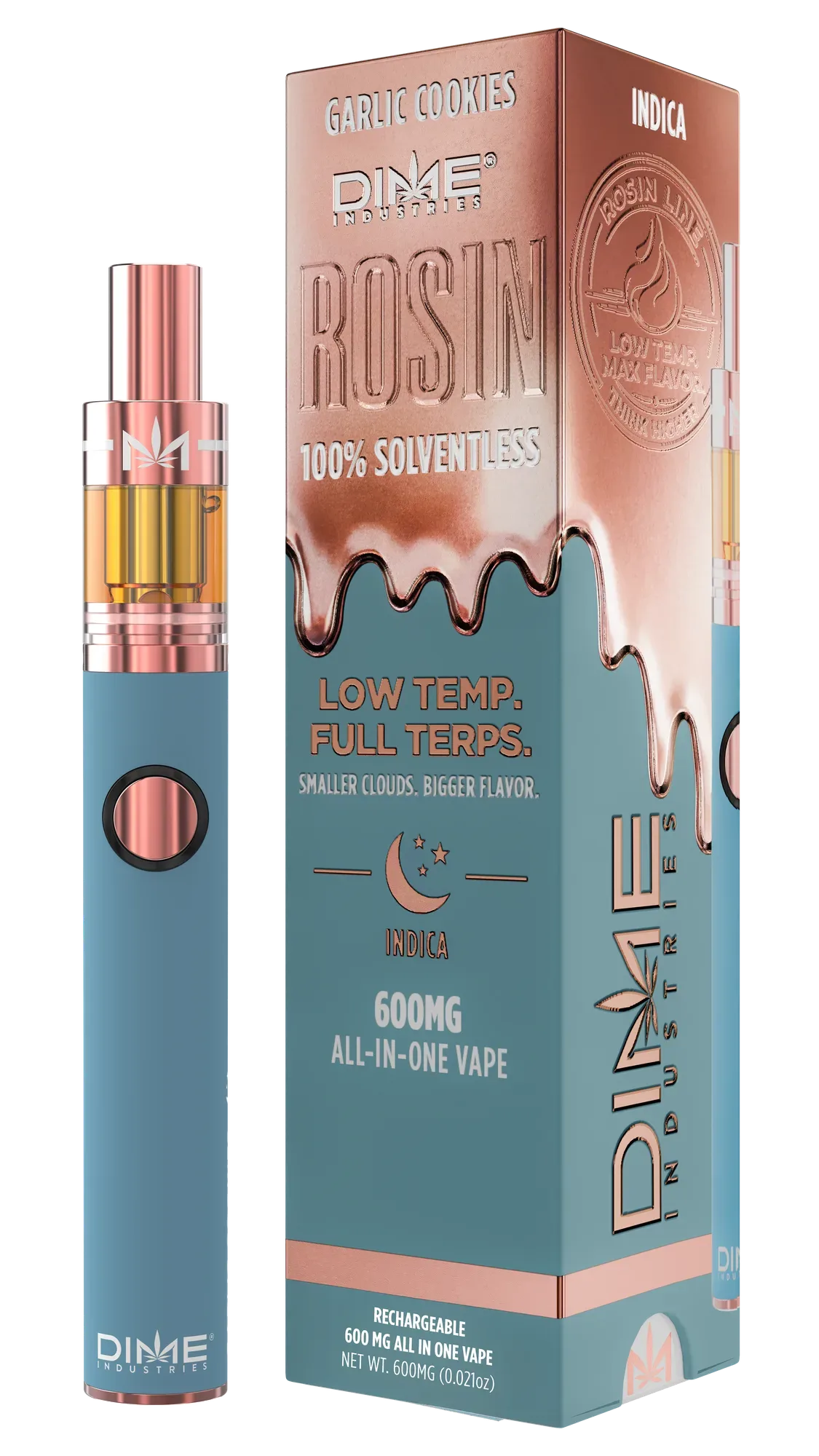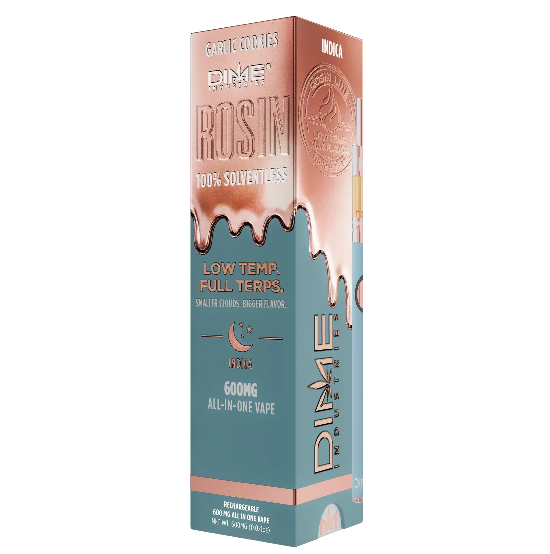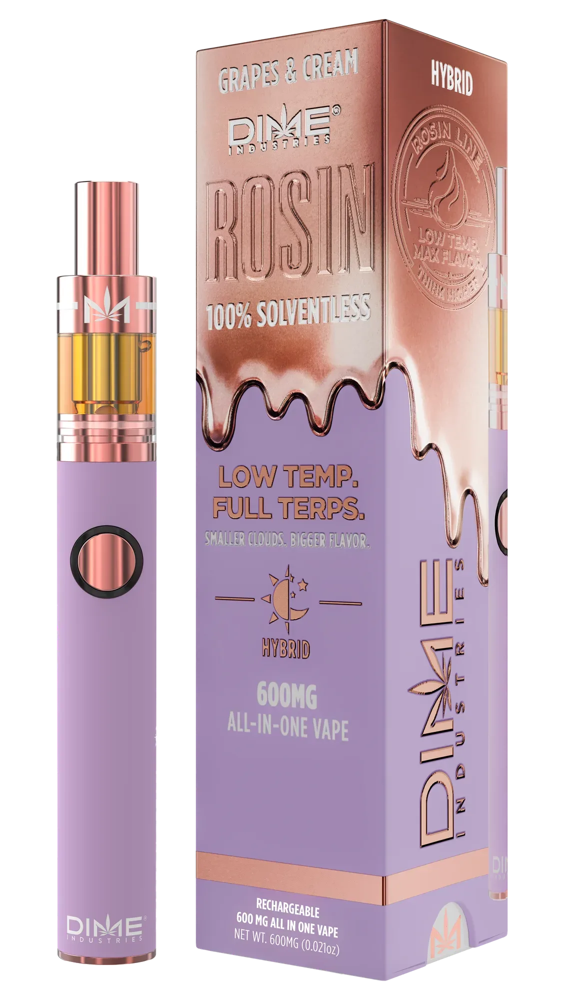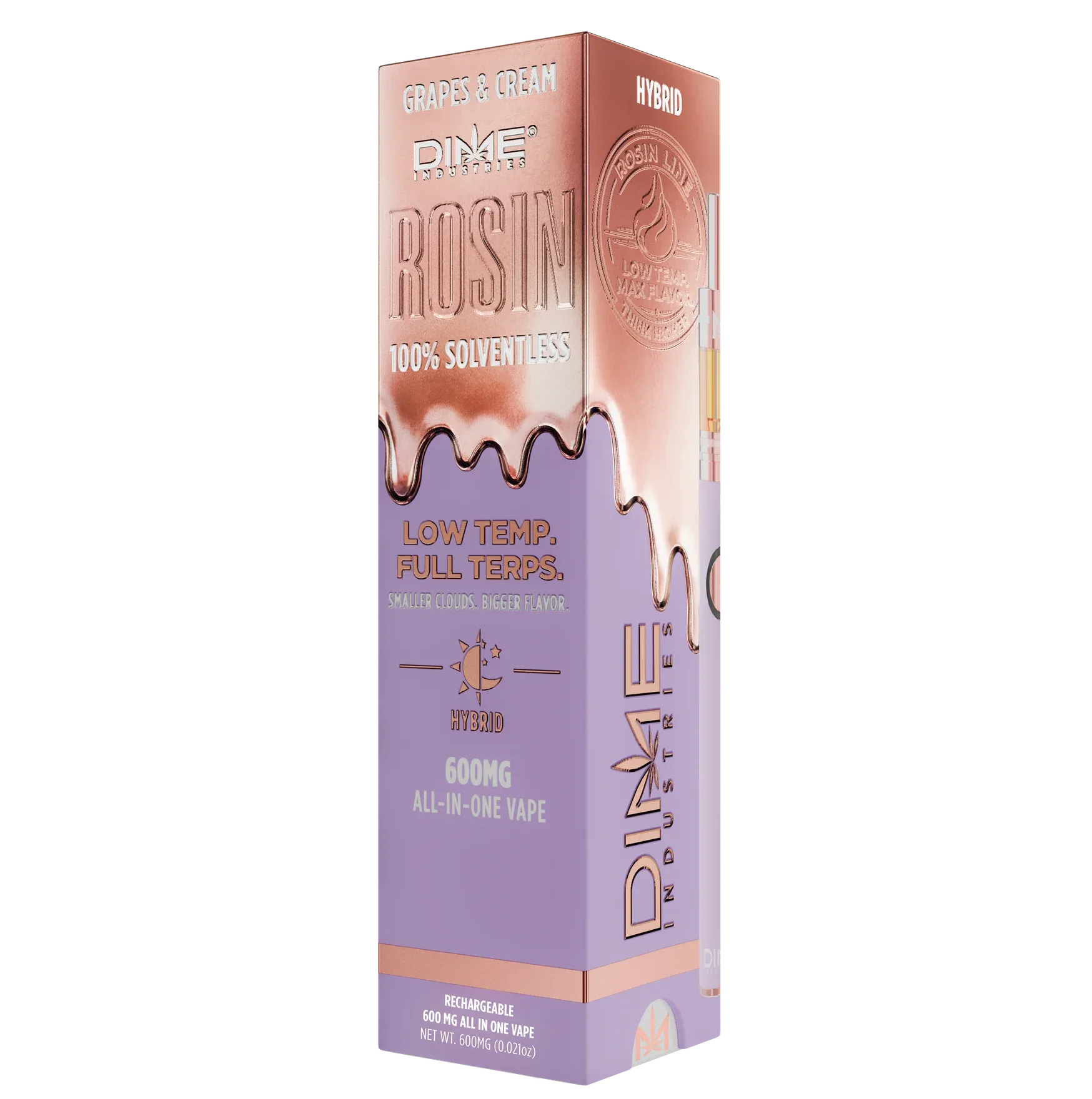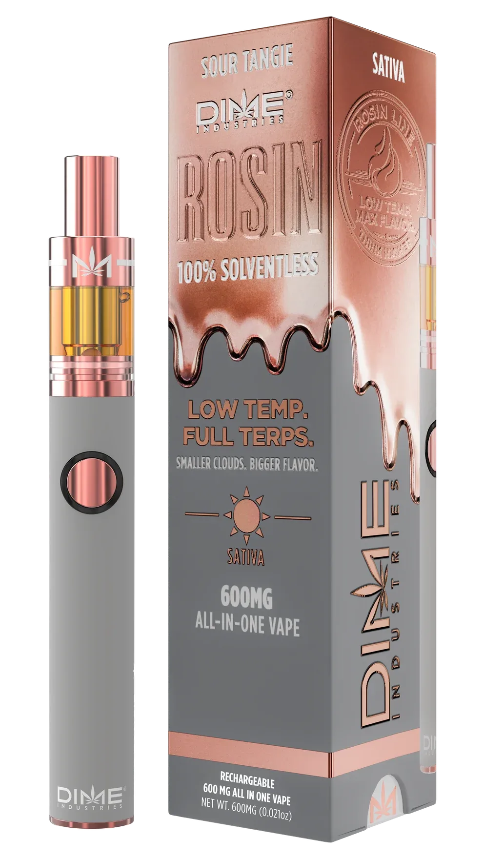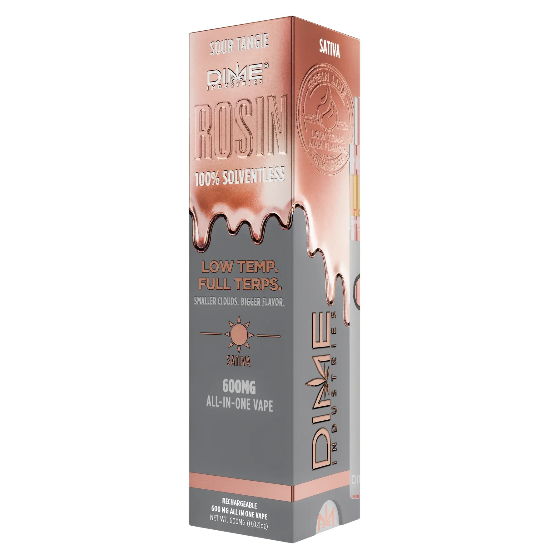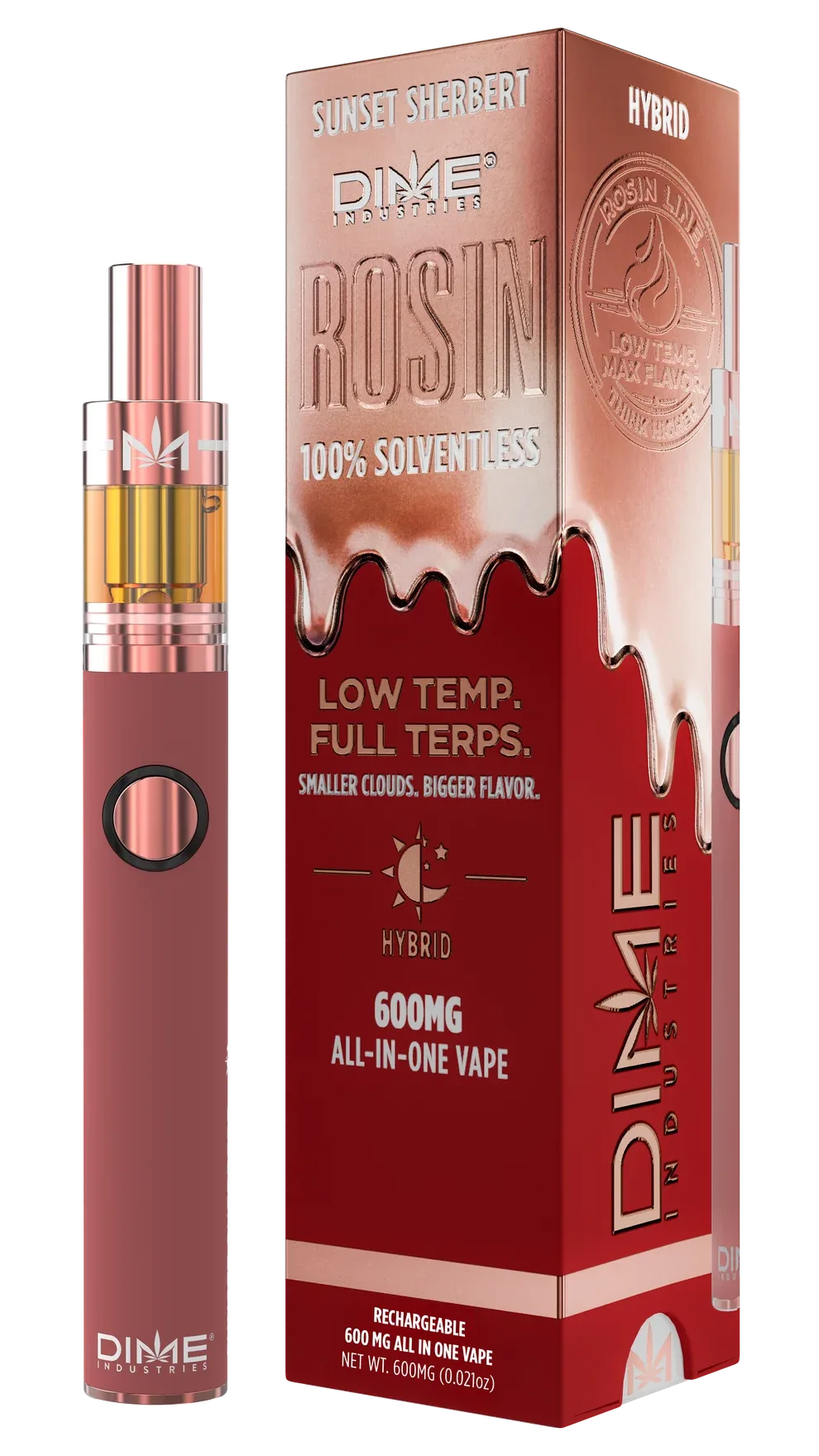
A packaging refresh for Dime’s six-flavor vape range, built around copper drip artwork and a distinct color for each flavor.
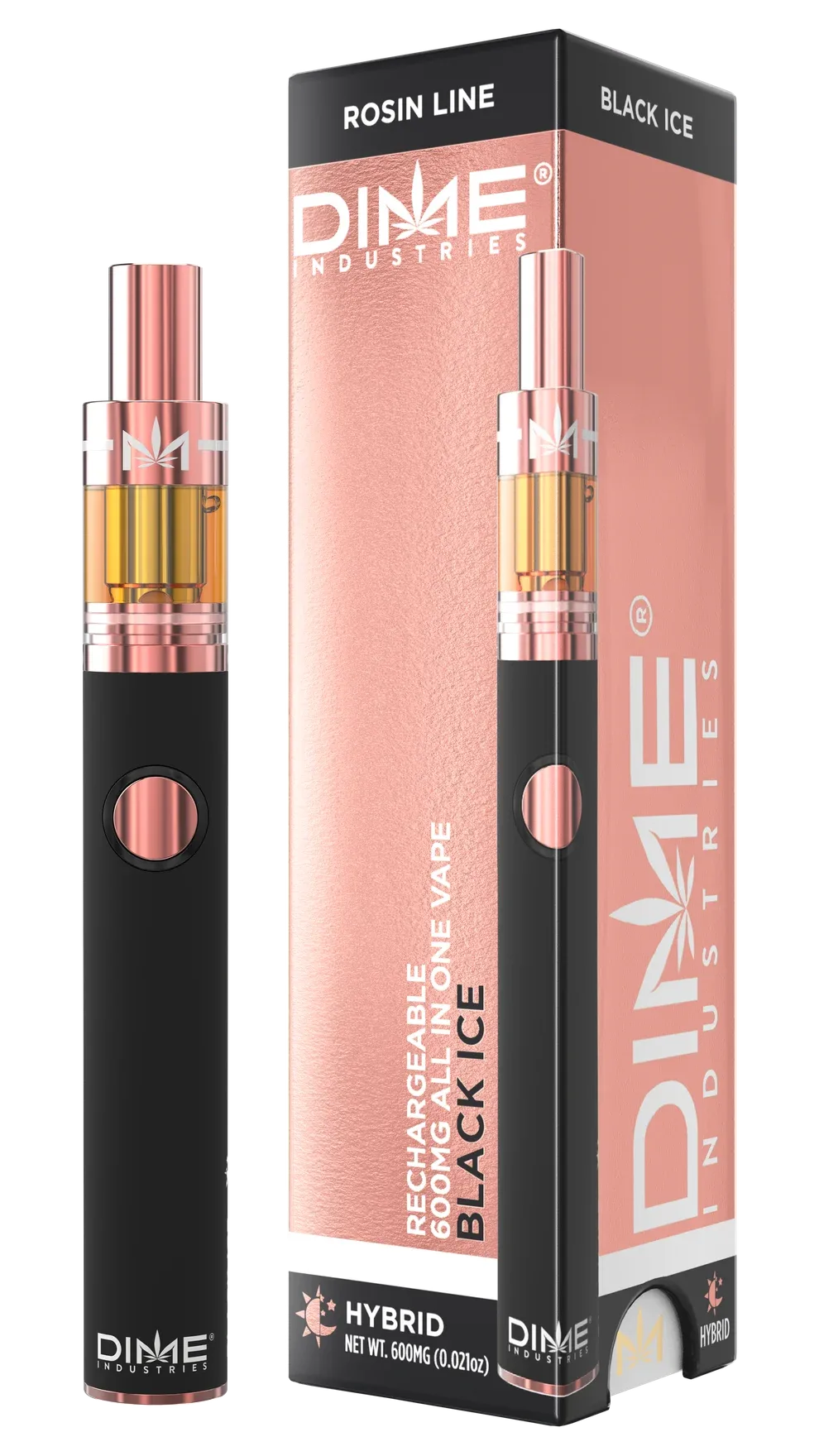
Dime’s earlier packaging used a rose-colored panel and vertical Dime branding. The refresh needed to give the Rosin Line a recognizable identity of its own and make six flavors easier to distinguish.
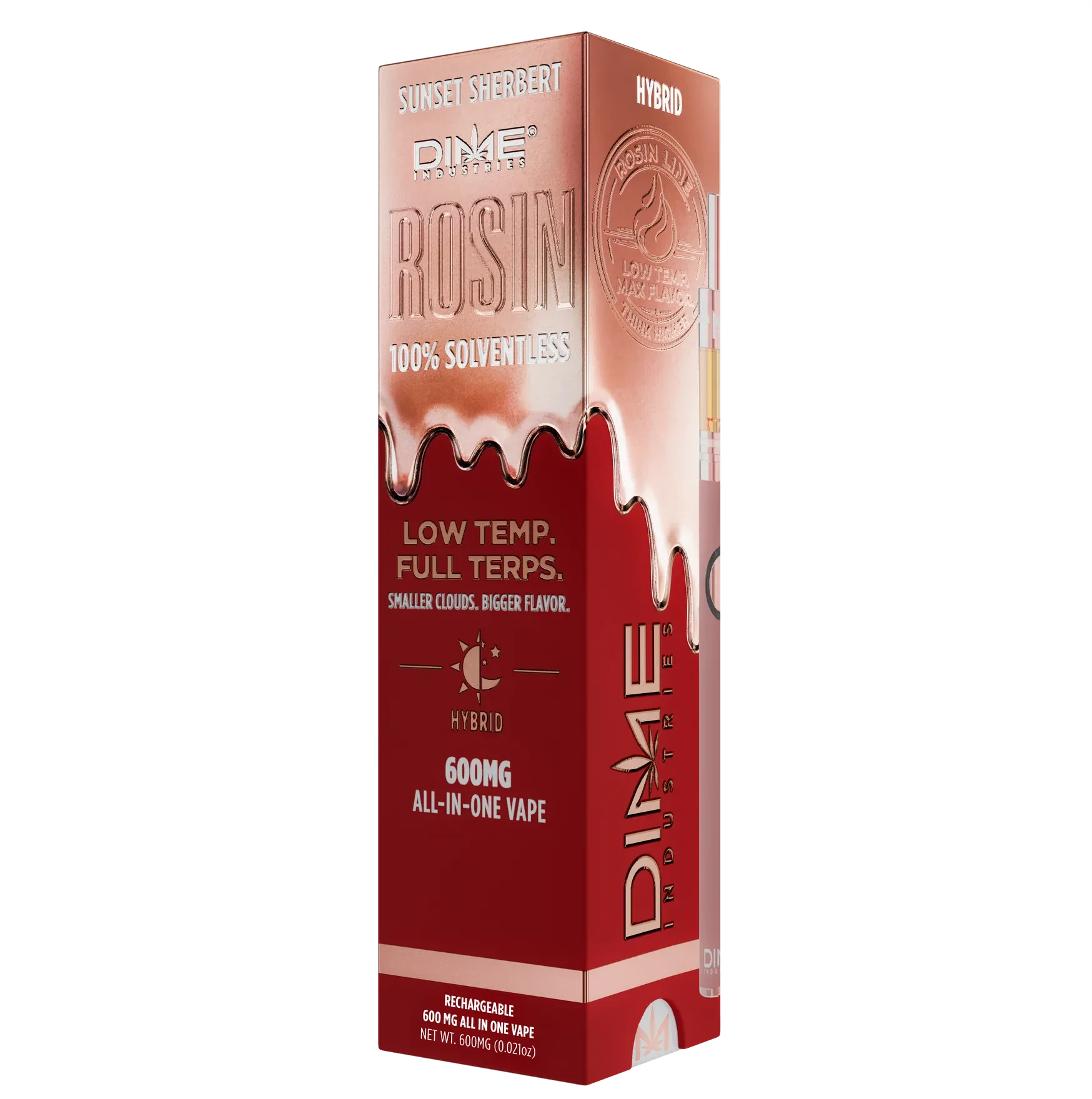
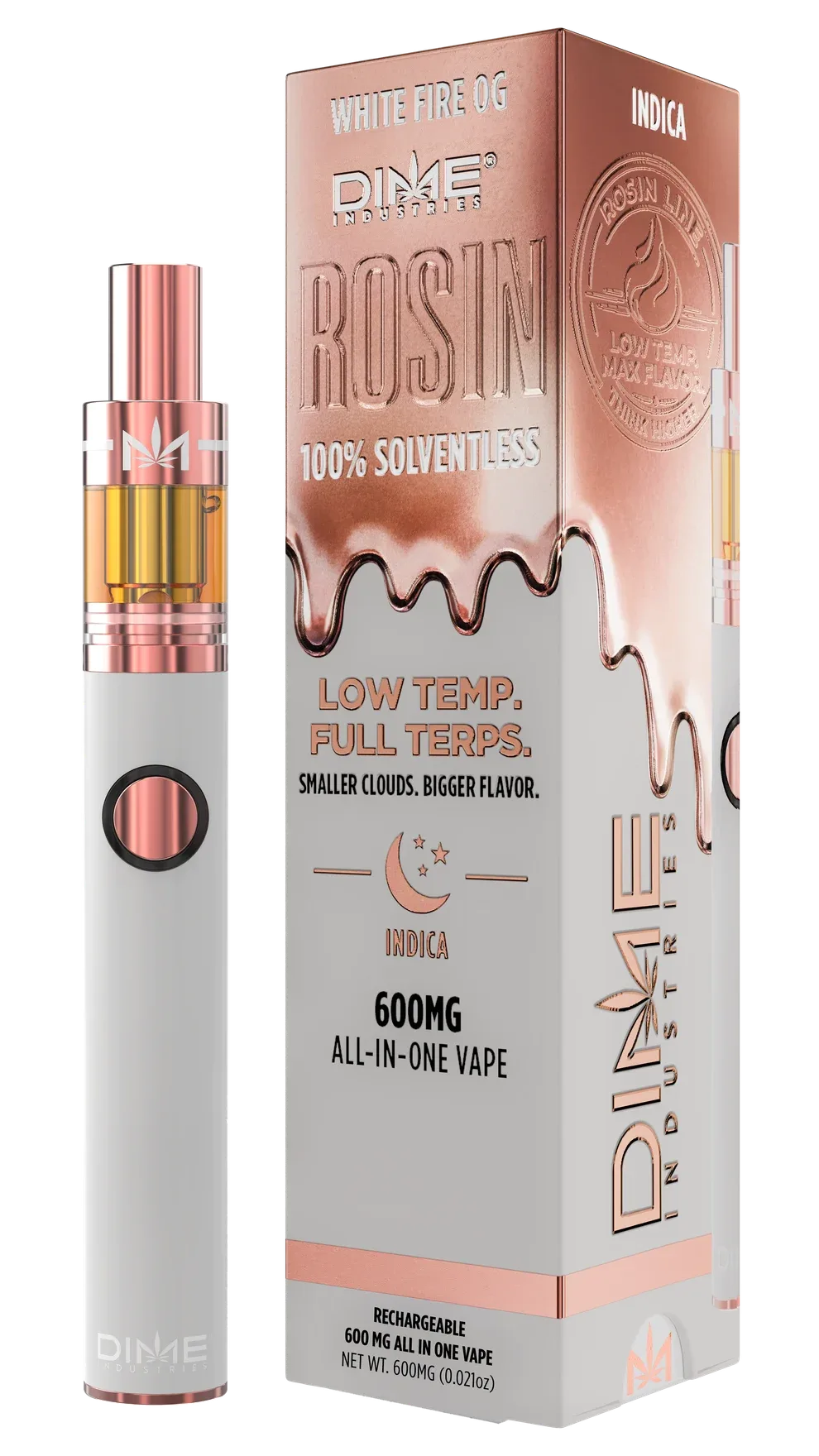
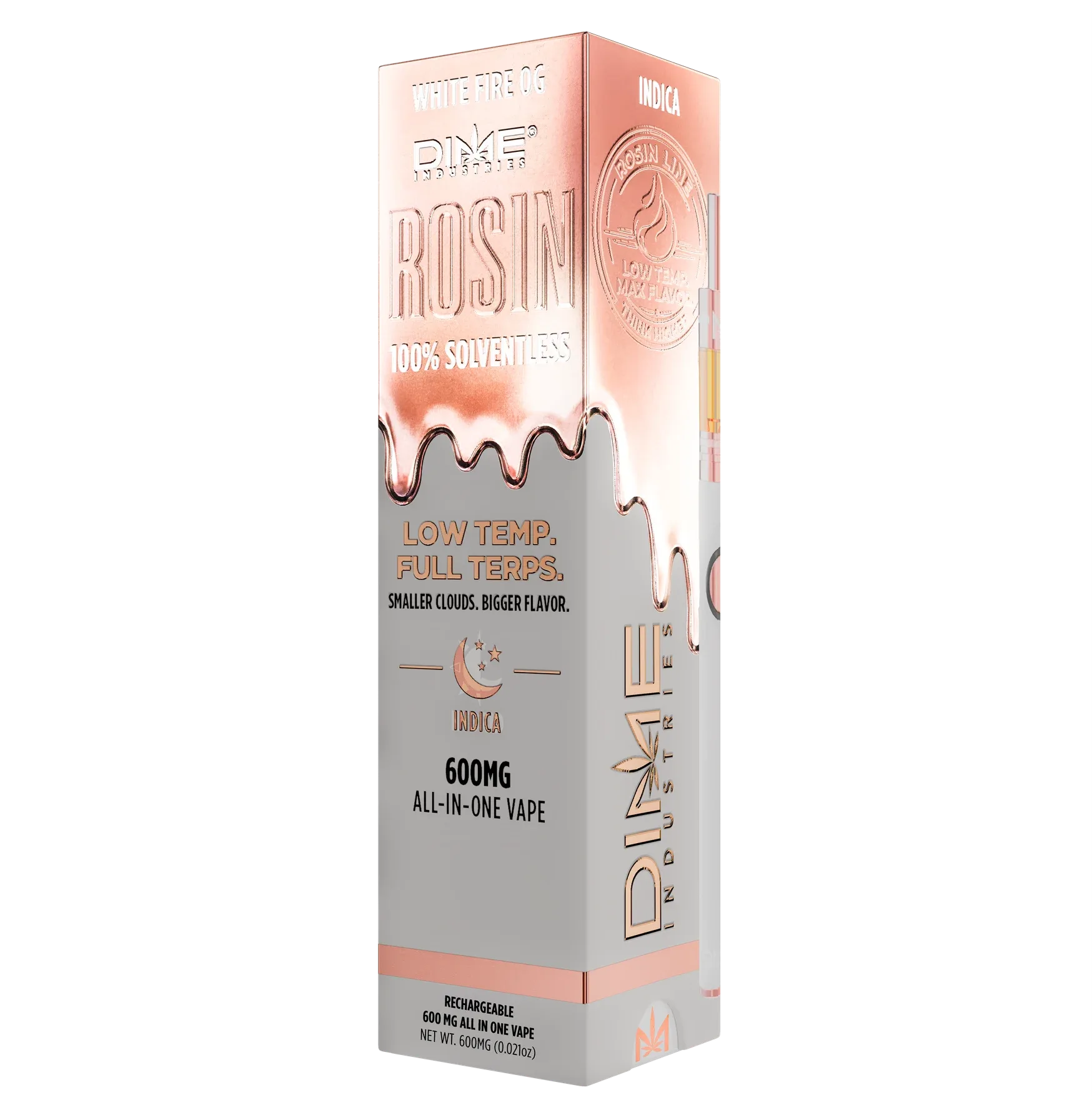
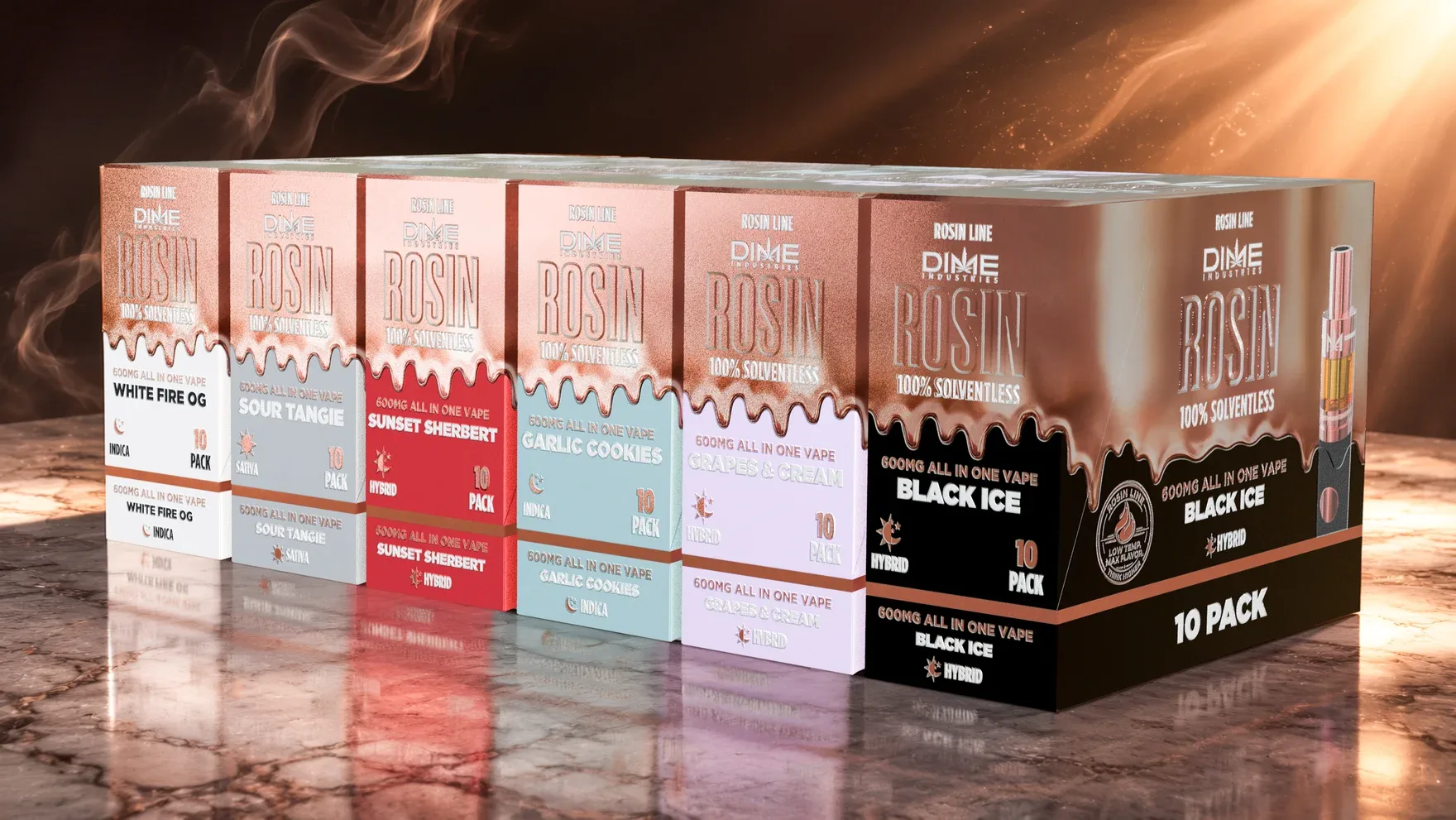
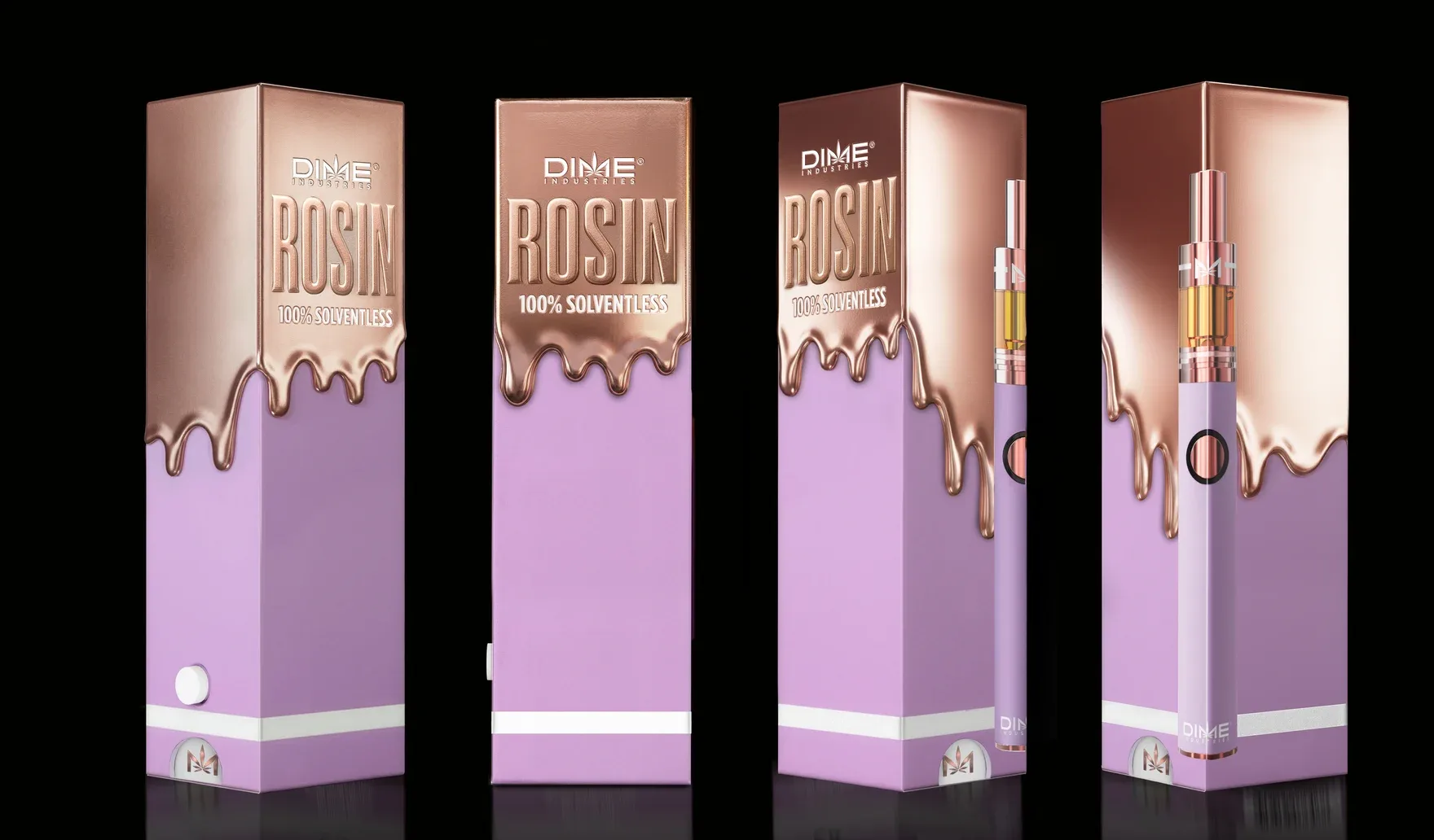
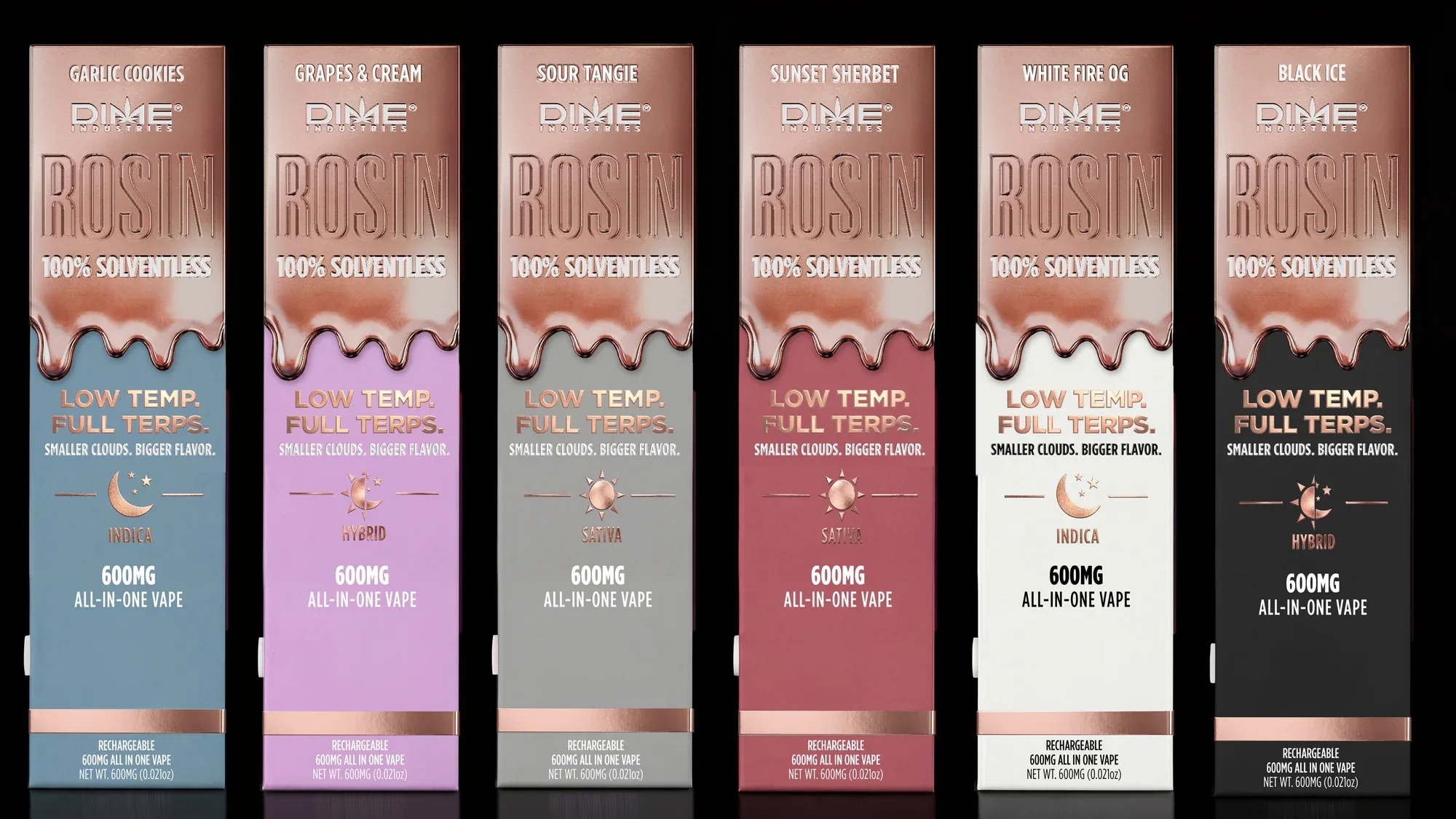
I brought the Rosin name forward and ran a copper-colored drip across the top of the packaging. Color below the drip identifies each flavor. I extended that structure across the individual boxes, master displays and imagery for web and print.
The front keeps the Rosin name, drip and product information in consistent positions. Each flavor gets a distinct lower color field carried through to its device.
The closed master box uses the same copper-and-color division as the individual pack. In the open display, the die-cut header brings the Dime mark and flavor name above the row of packs.
Black Ice shows the change in hierarchy most clearly. The original front led with the Dime mark. The updated front gives the Rosin name its own space and uses the drip to separate it from the flavor and product details.
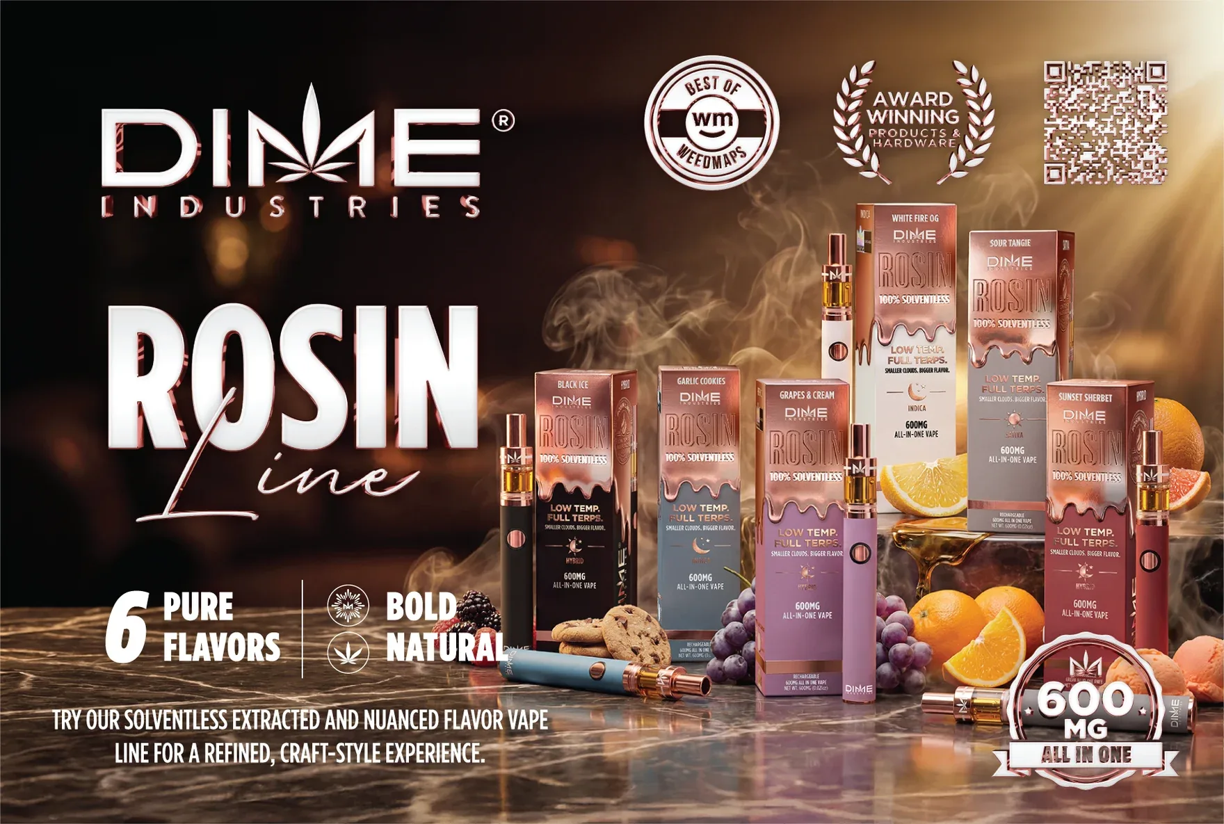
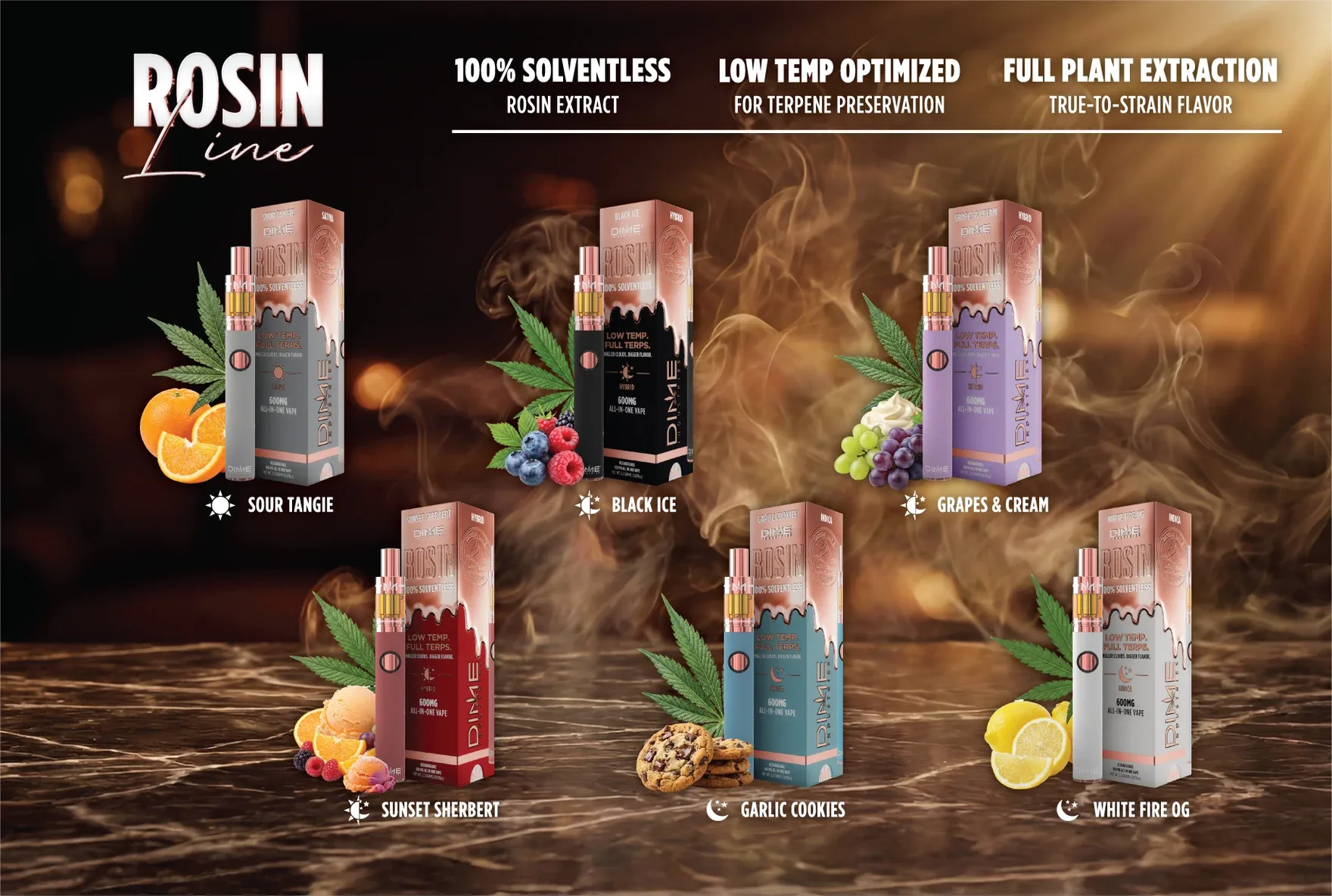
The postcard front introduces the range with the campaign image. The reverse brings all six device-and-packaging pairs together so the flavor differences are easy to compare.