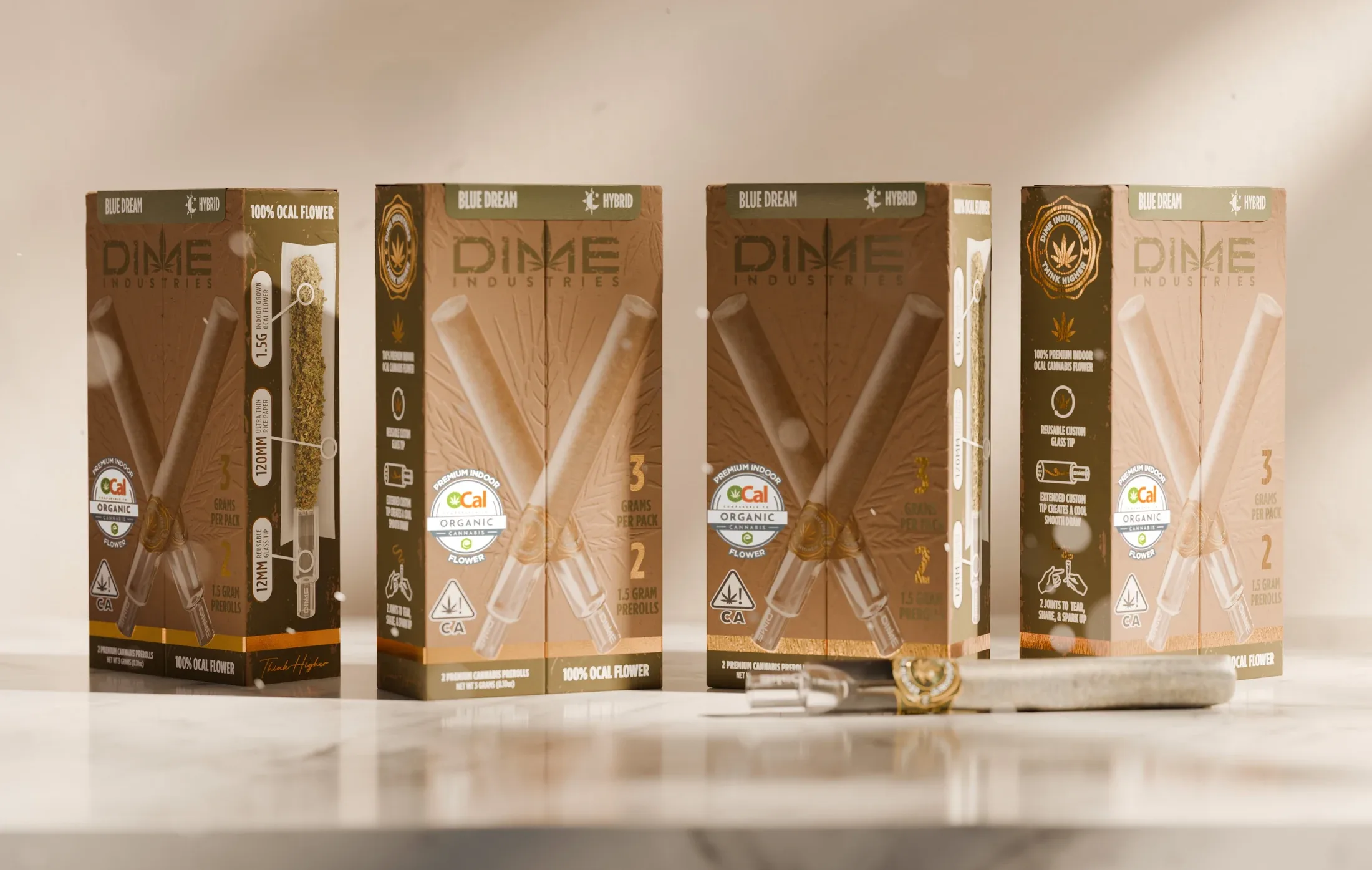
Dime Industries × Surreal Yields
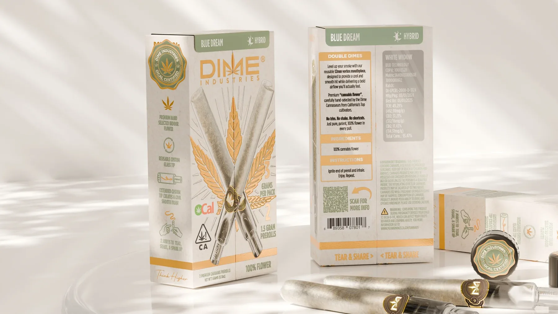
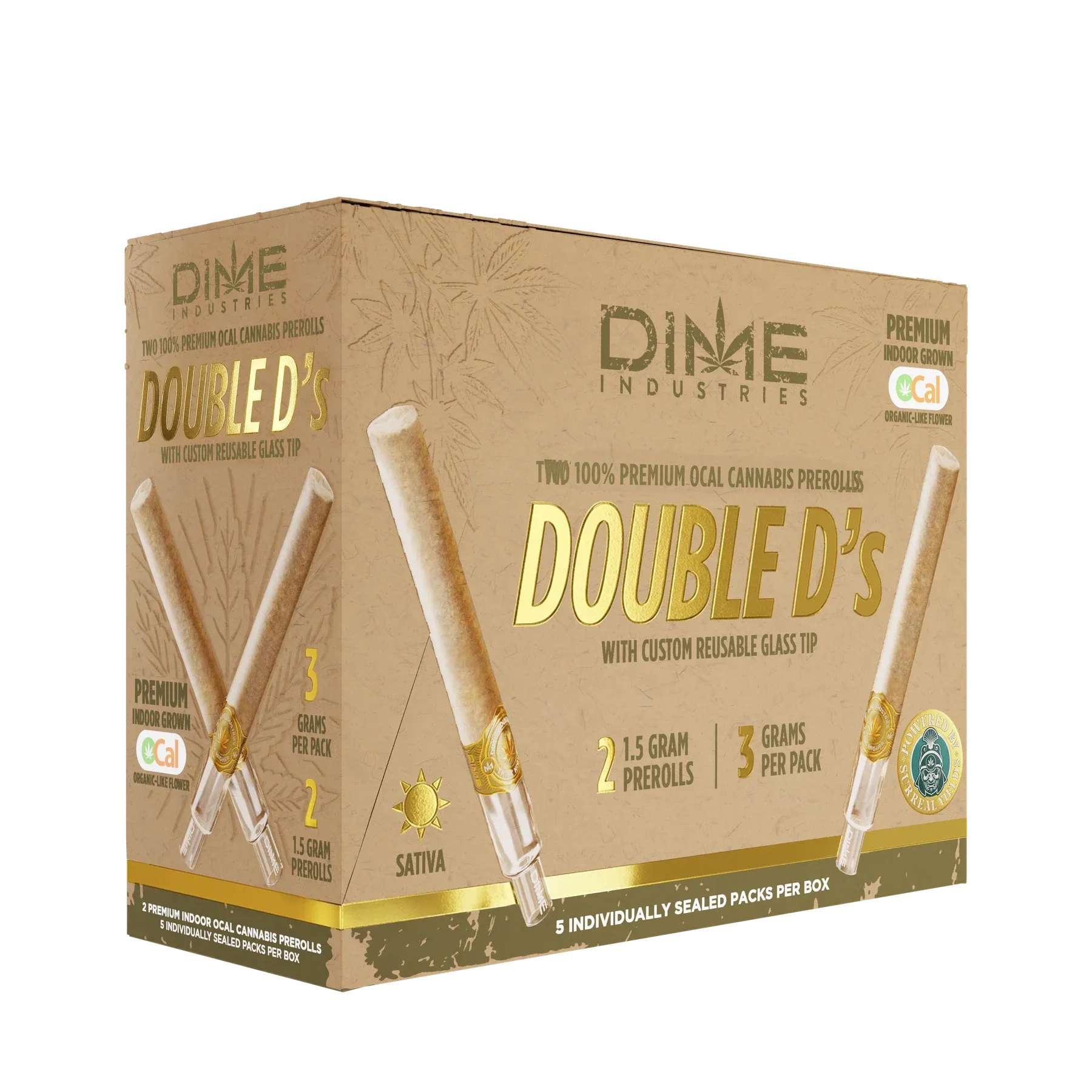
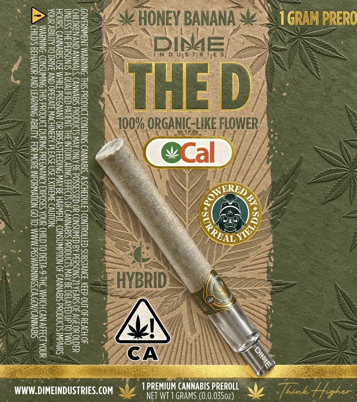
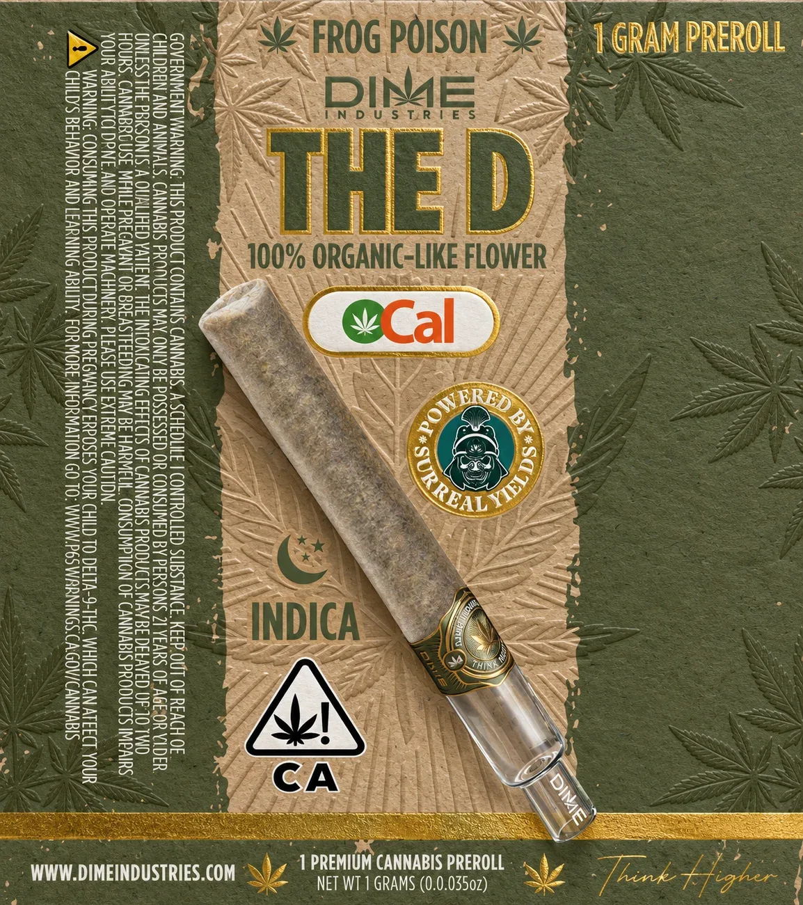
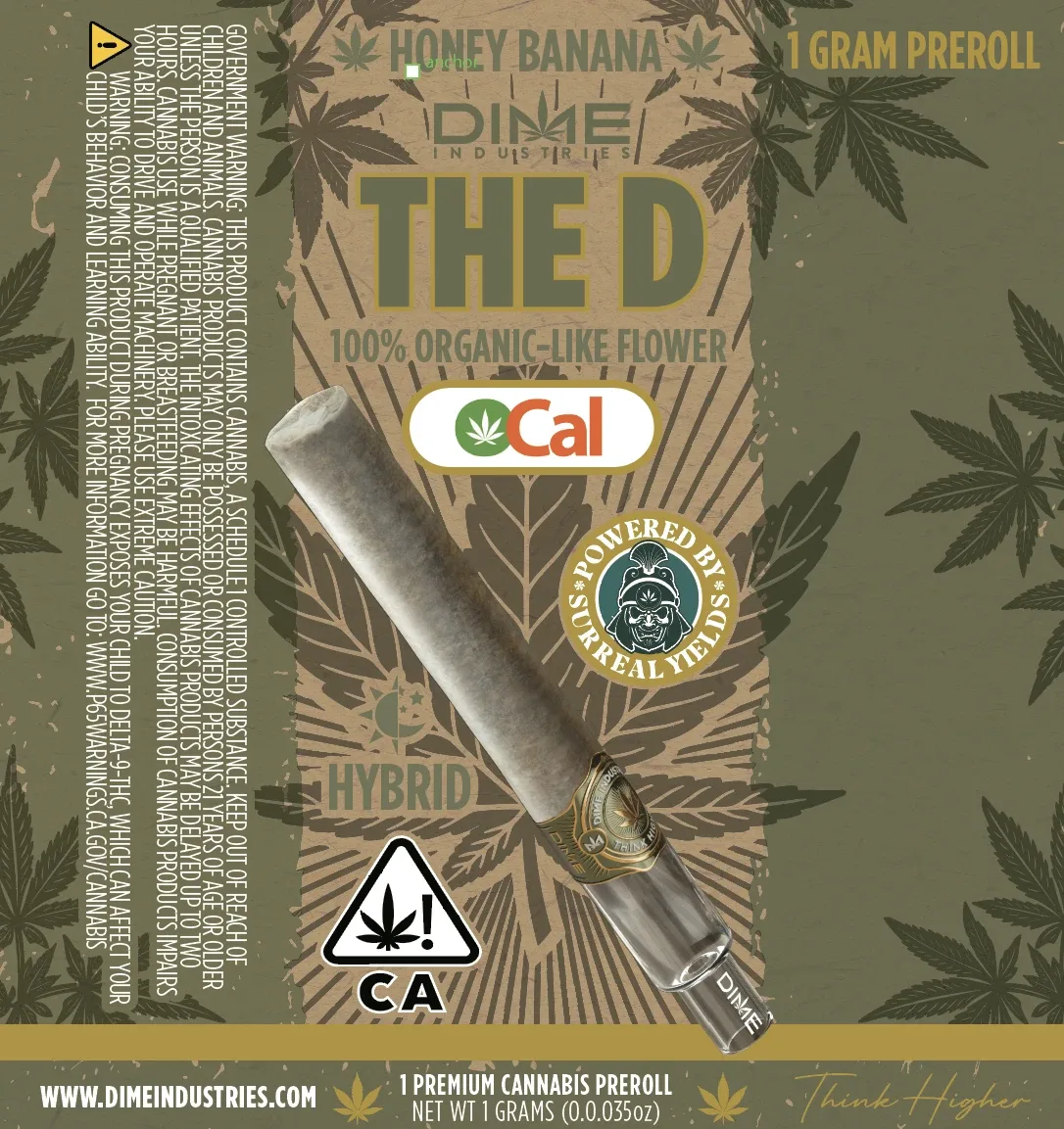
The Double D’s split pack reworked for the OCal collaboration, from the retail box and master display to The D sample tube.
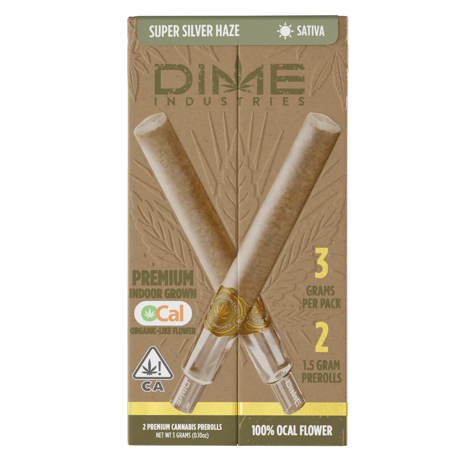
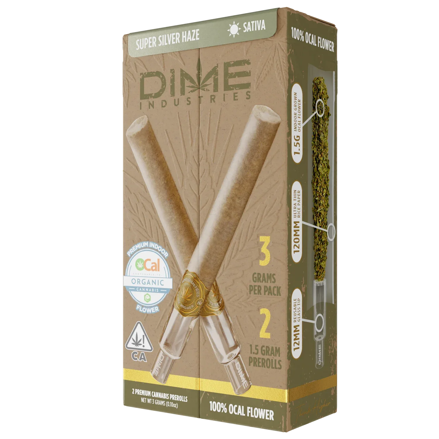
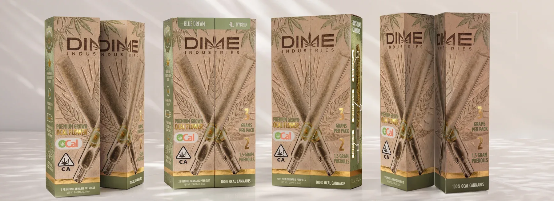
The Surreal Yields collaboration needed its own look within the Double D’s range. The brief called for a natural-paper direction built on the existing split-pack dieline, with room for both brands and the OCal mark.
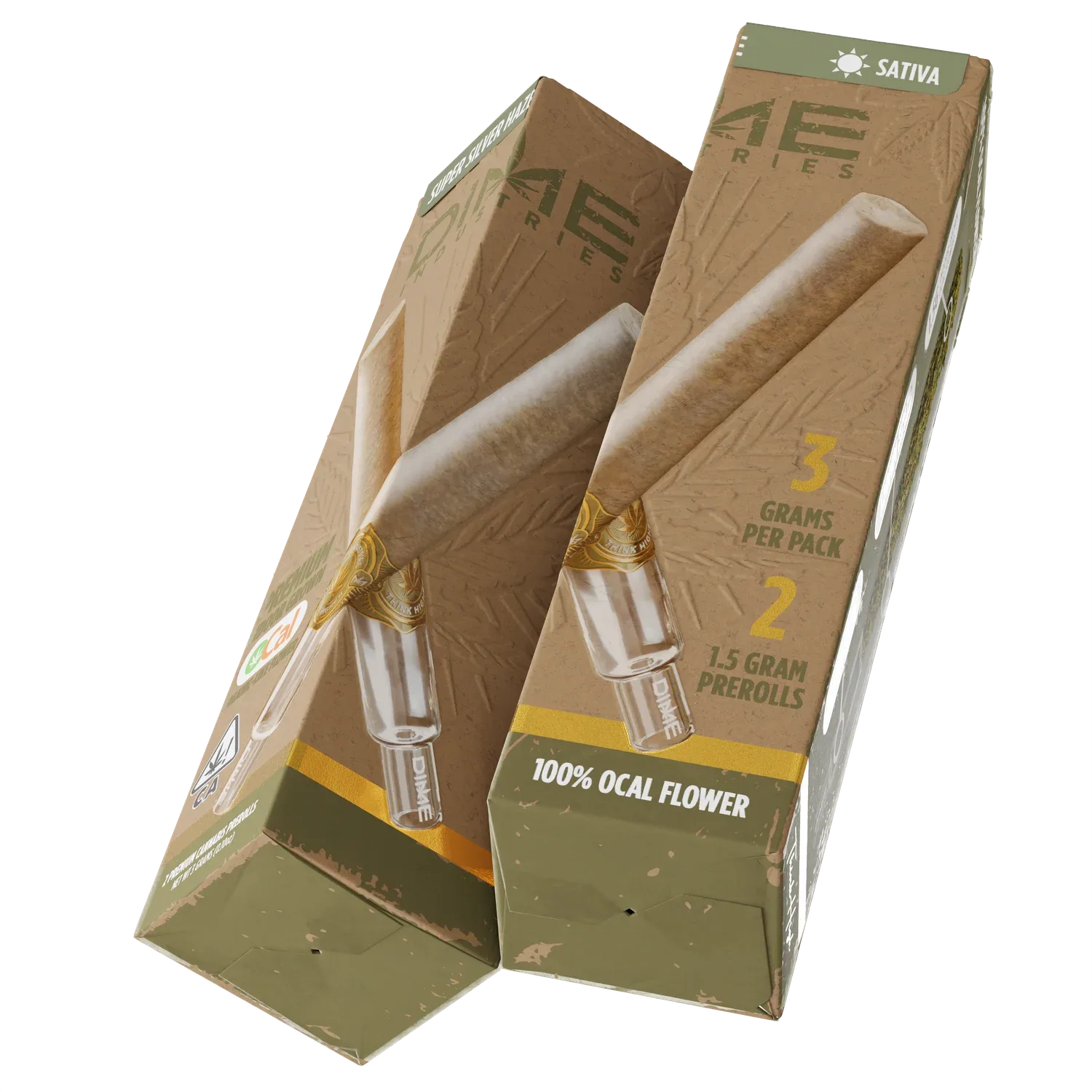
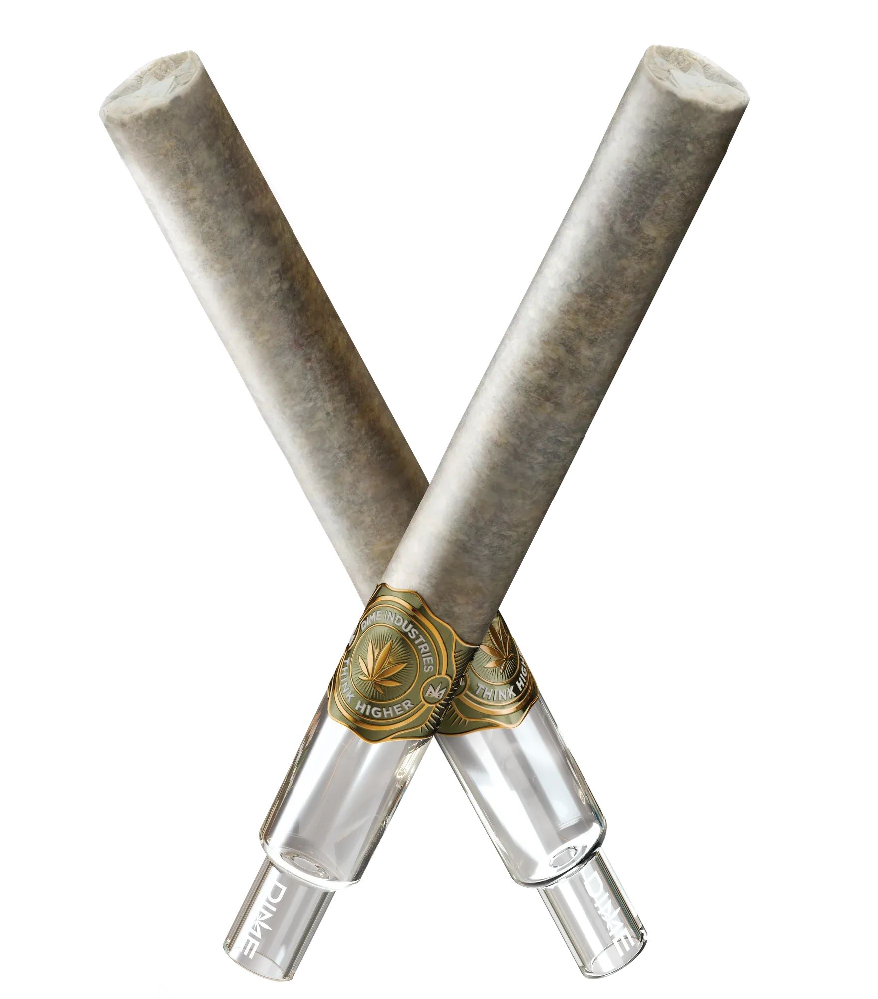
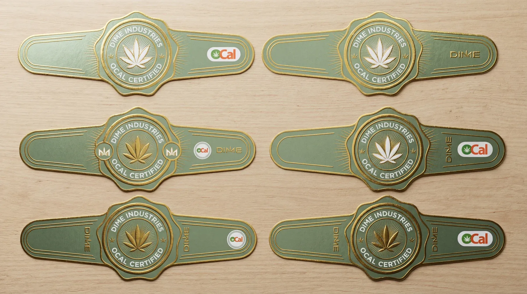
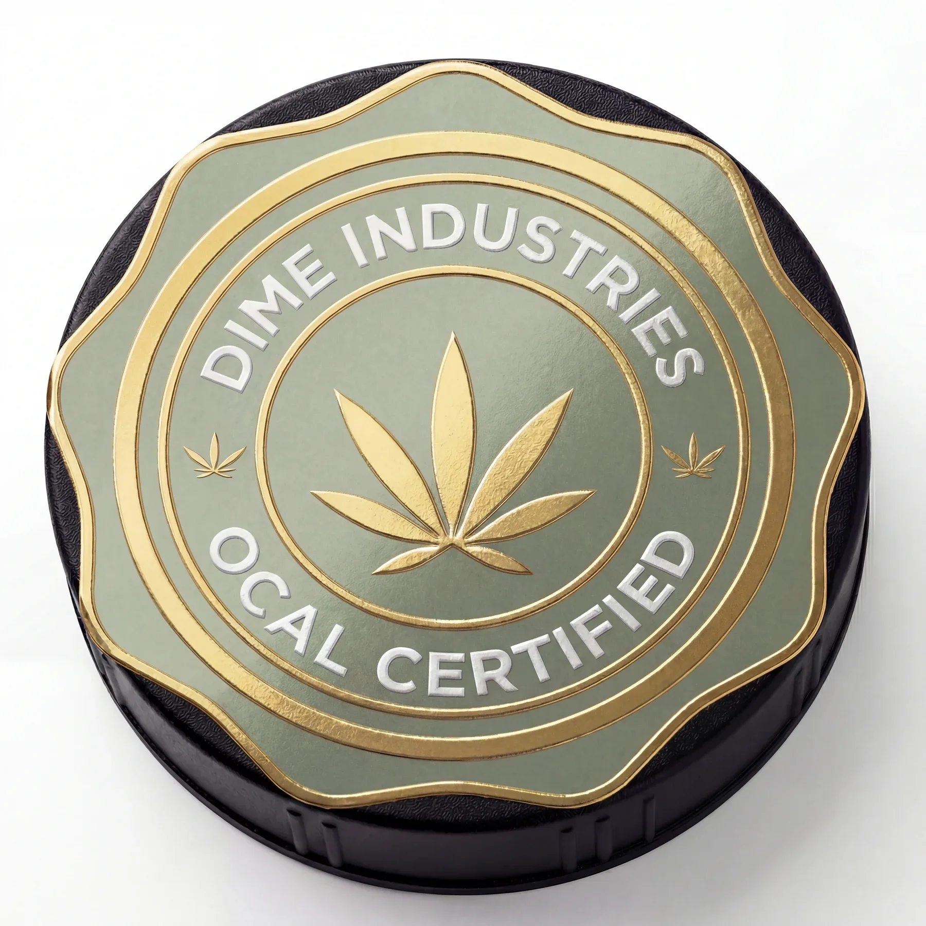
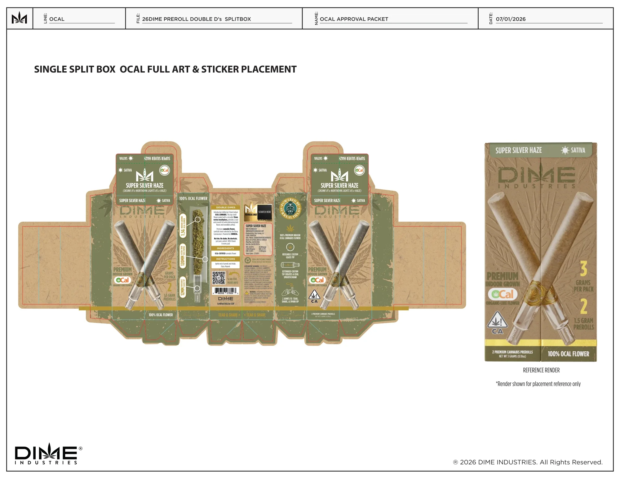
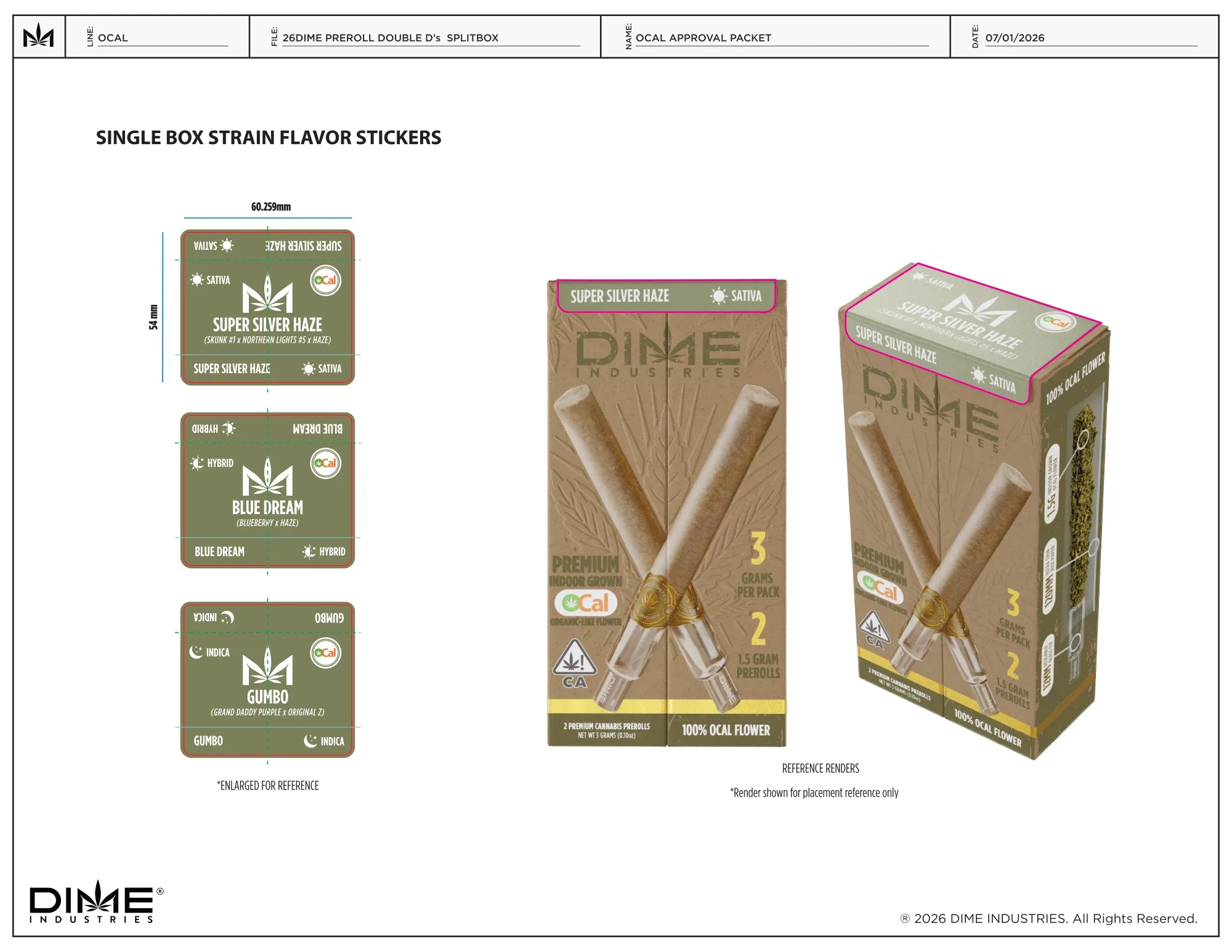
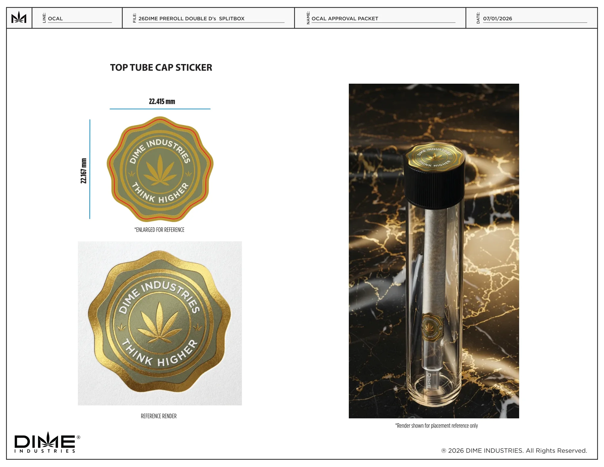
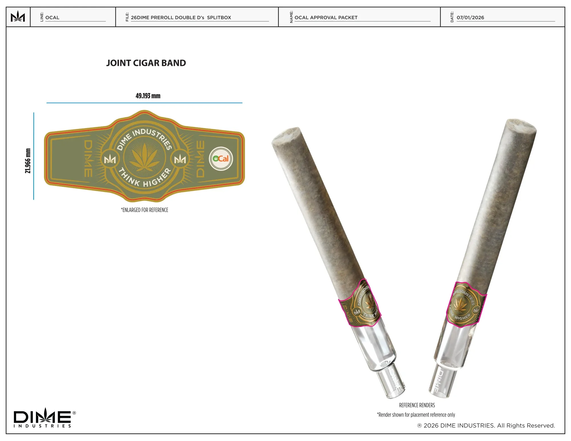
The crossed pre-rolls still span the split. Olive panels, textured paper and gold detailing give this edition a distinct finish. I developed the artwork across the retail pack, master display, seals and sample tube, then assembled the layouts and mockups for review.
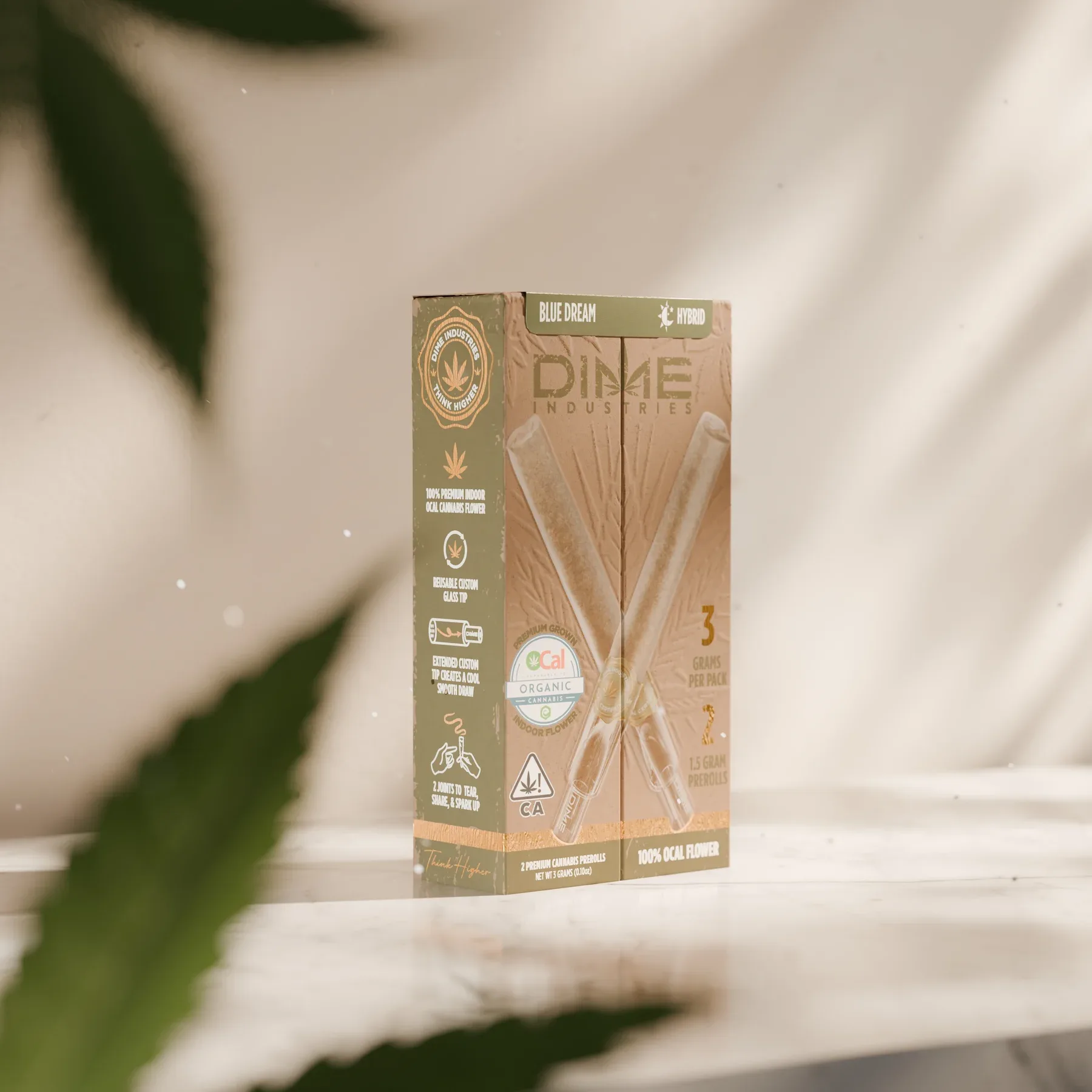
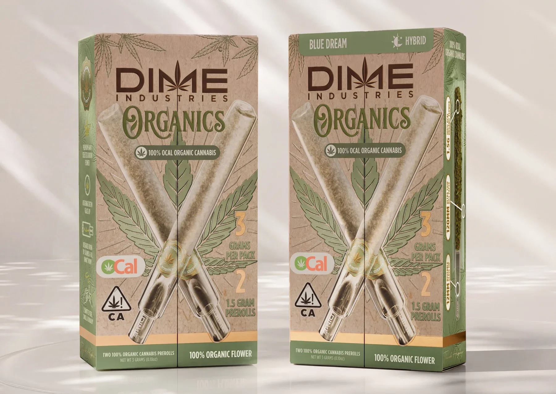
Earlier directions explored how much the material and branding could shift on the same dieline. A lighter paper treatment, a separate Organics wordmark and a more prominent green panel each changed the balance of the front artwork.
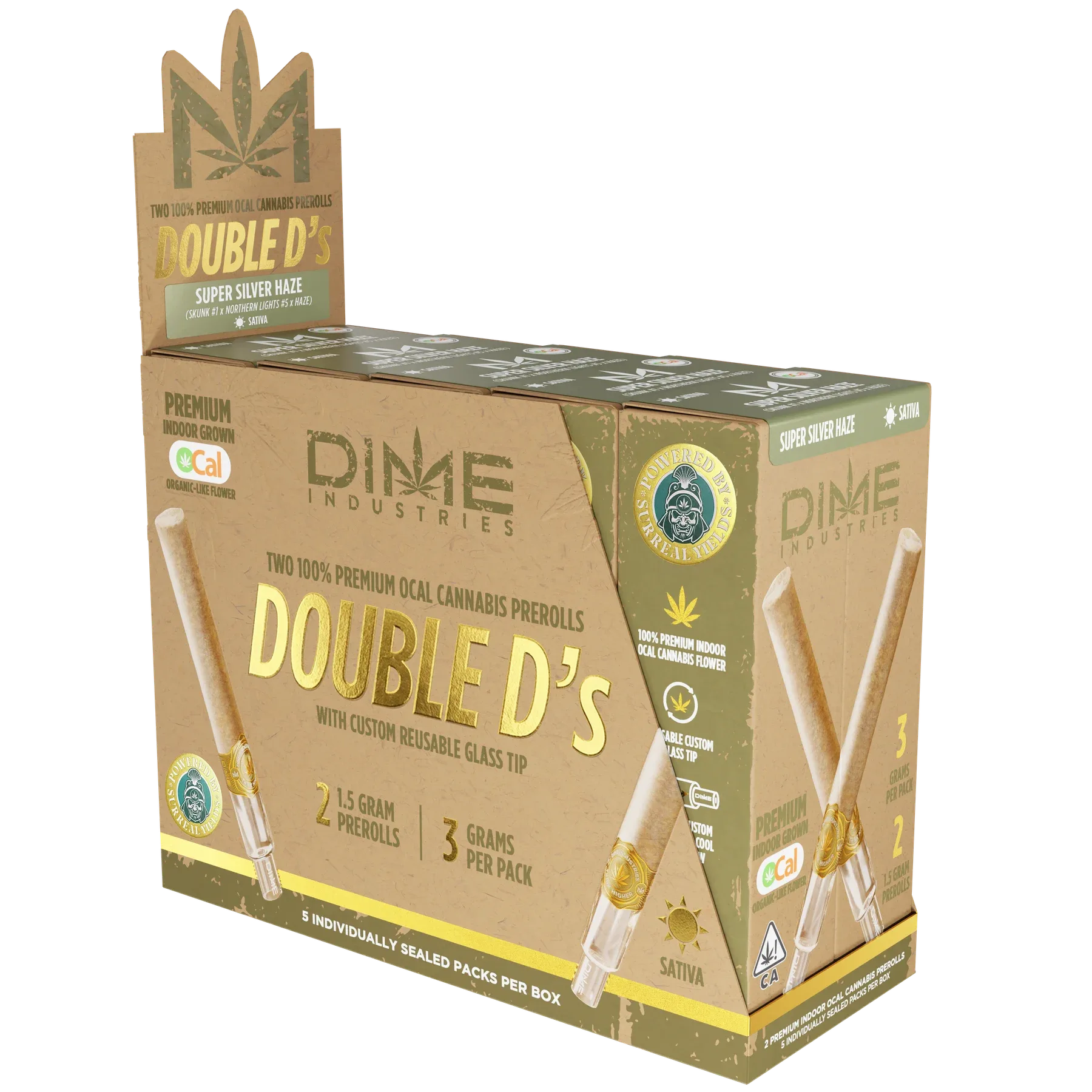
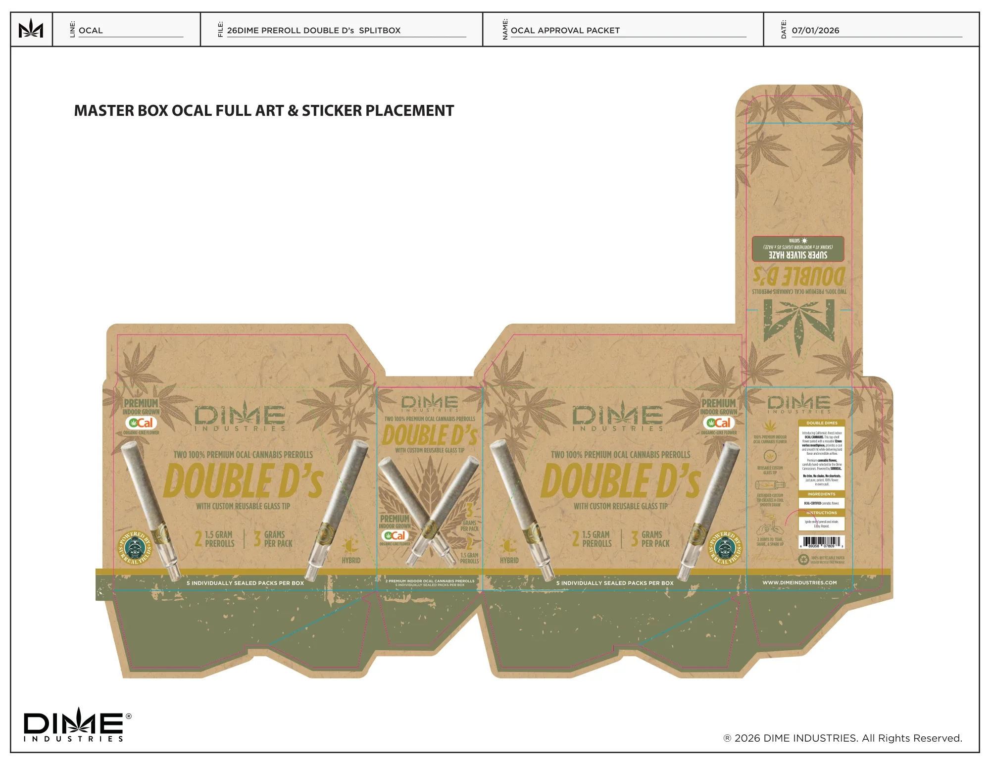
The master box carries the same paper texture, botanical artwork and olive labels onto a larger format. The open display brings the Double D’s name above the packs. The closed view shows how the artwork reads before the header folds up.
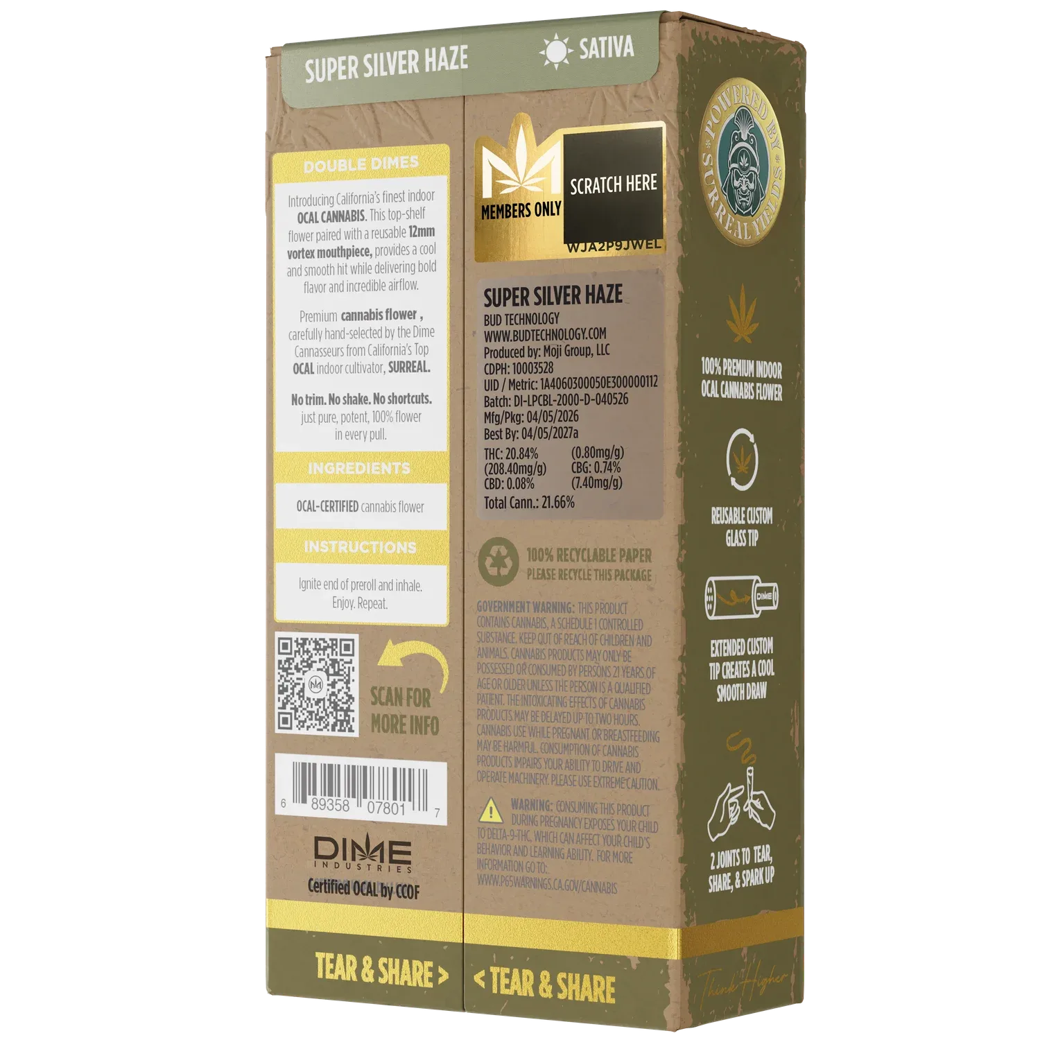
I assembled the pack layouts, strain labels, seals and joint band into a review packet. These excerpts show how the artwork and label placement were documented across the single pack and master box.